
We are a specialized creative agency building slick, modern experiences across videography, social media, web design, and graphic design. Explore our digital rogue gallery below.
Videography & Editing
Videography & Editing
Videography & Editing
Videography & Editing
Social Media
Social Media
Web Design
Web Design
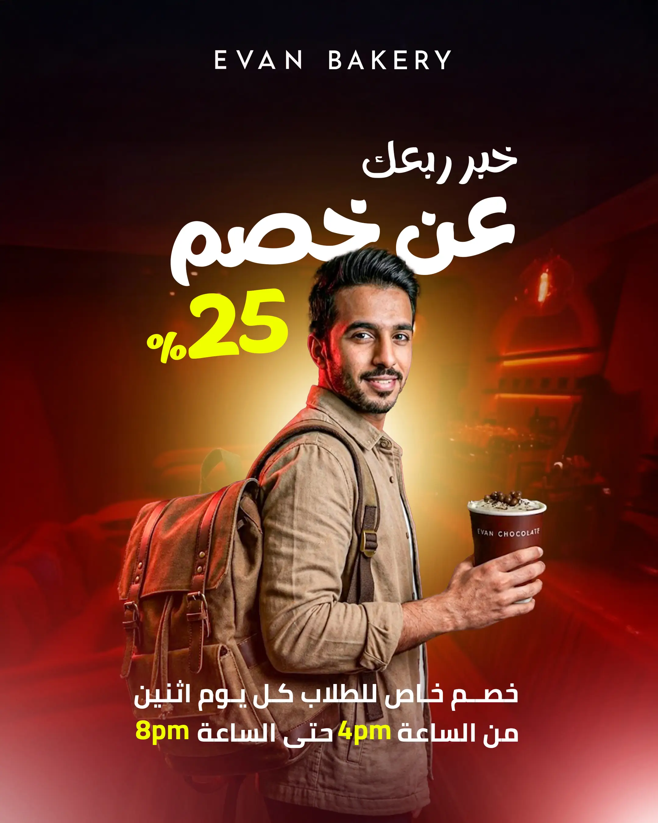
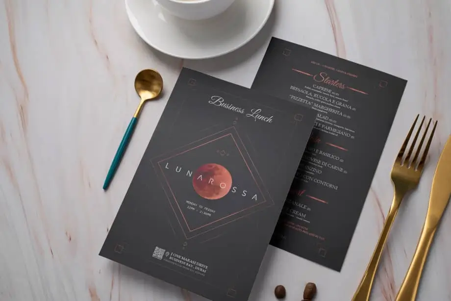
Graphic Design
Graphic Design
Graphic Design
Graphic Design
This is an editorial style placeholder description. We will replace this with custom content for each project individually. The content here will highlight the core features, challenges faced, and the rogue solutions we provided.
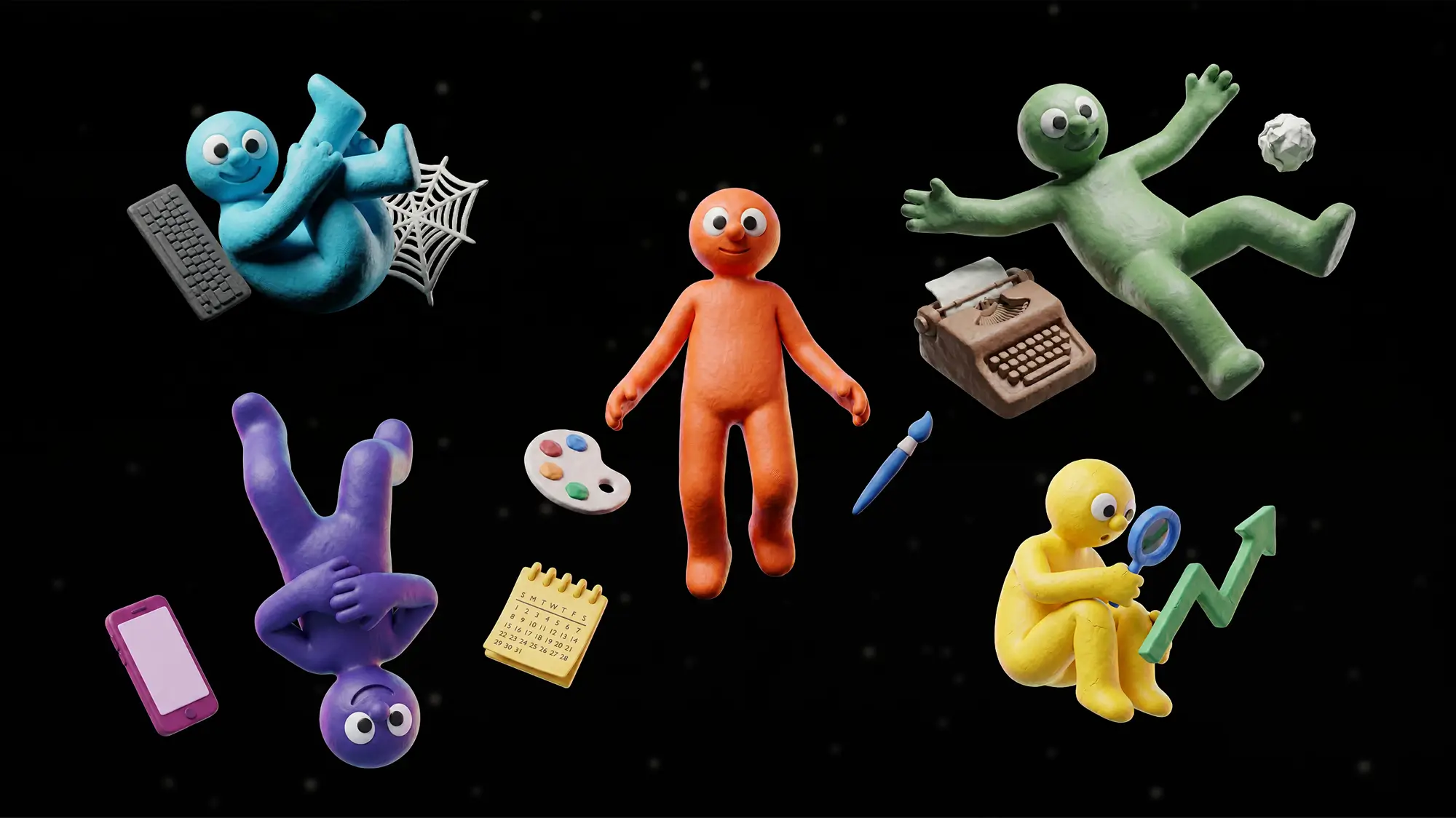

Entrepreneurs and small businesses are drowning in operational drag. They need elite specialized talent to scale but the traditional agency model is financially gated. The market is flooded with AI tools that are buried behind cold interfaces, abstract glowing orbs and highly technical jargon. Putty was built to shatter this barrier by offering a complete digital workforce for the price of a daily lunch. They needed an identity that felt approachable, tangible and unmistakably premium. The core challenge was humanizing artificial intelligence while maintaining the absolute authority of a high end marketing firm.
At Rogue we do not just design flat assets. We build comprehensive 360 creative ecosystems. For Putty we developed a visual architecture that grounds complex digital automation in a highly tactile physical reality. We introduced a team of bespoke claymation characters to serve as the literal face of the AI workforce. This distinct visual language transforms abstract code into a cohesive unit of friendly, dedicated and highly competent specialists.
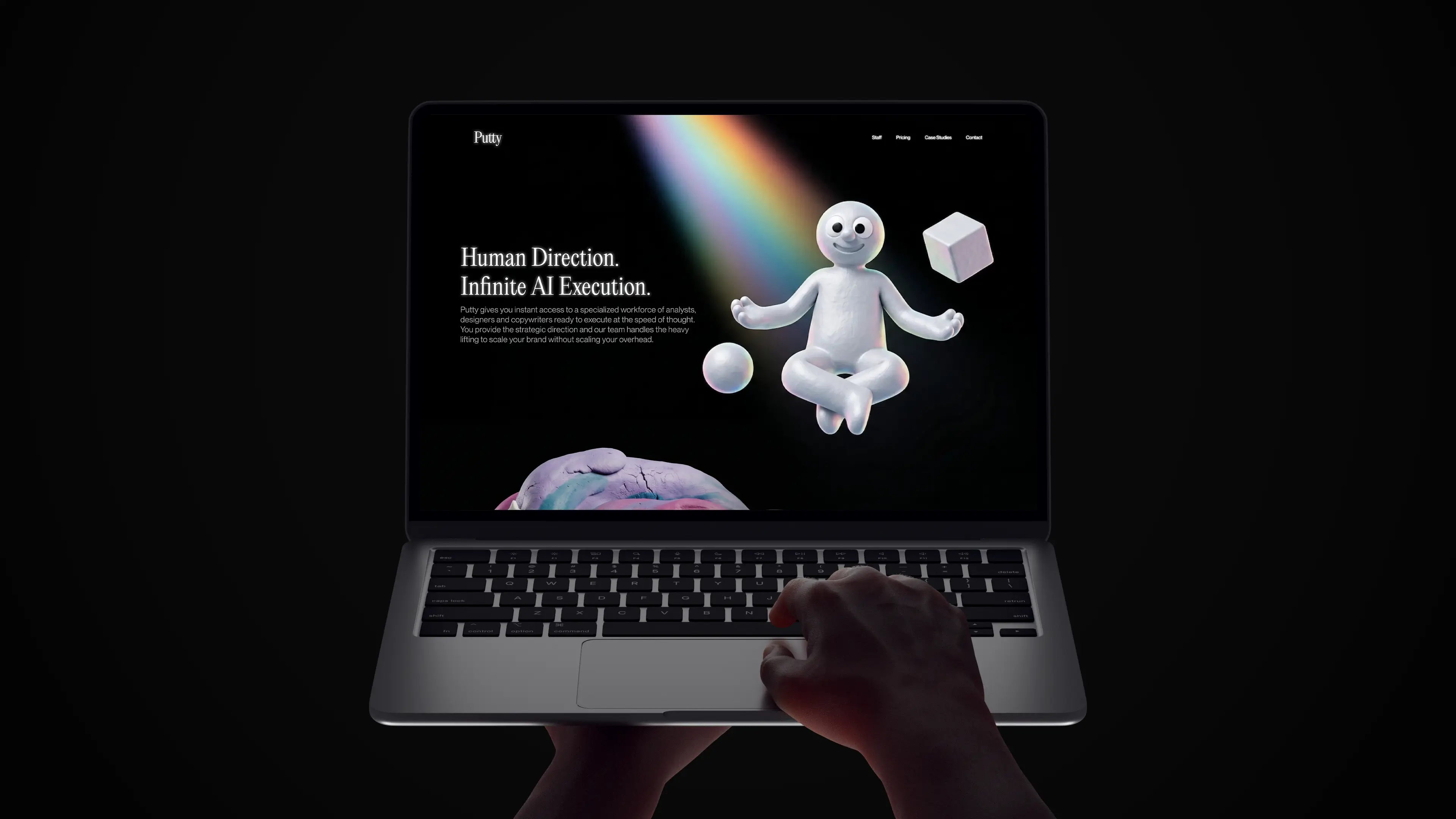
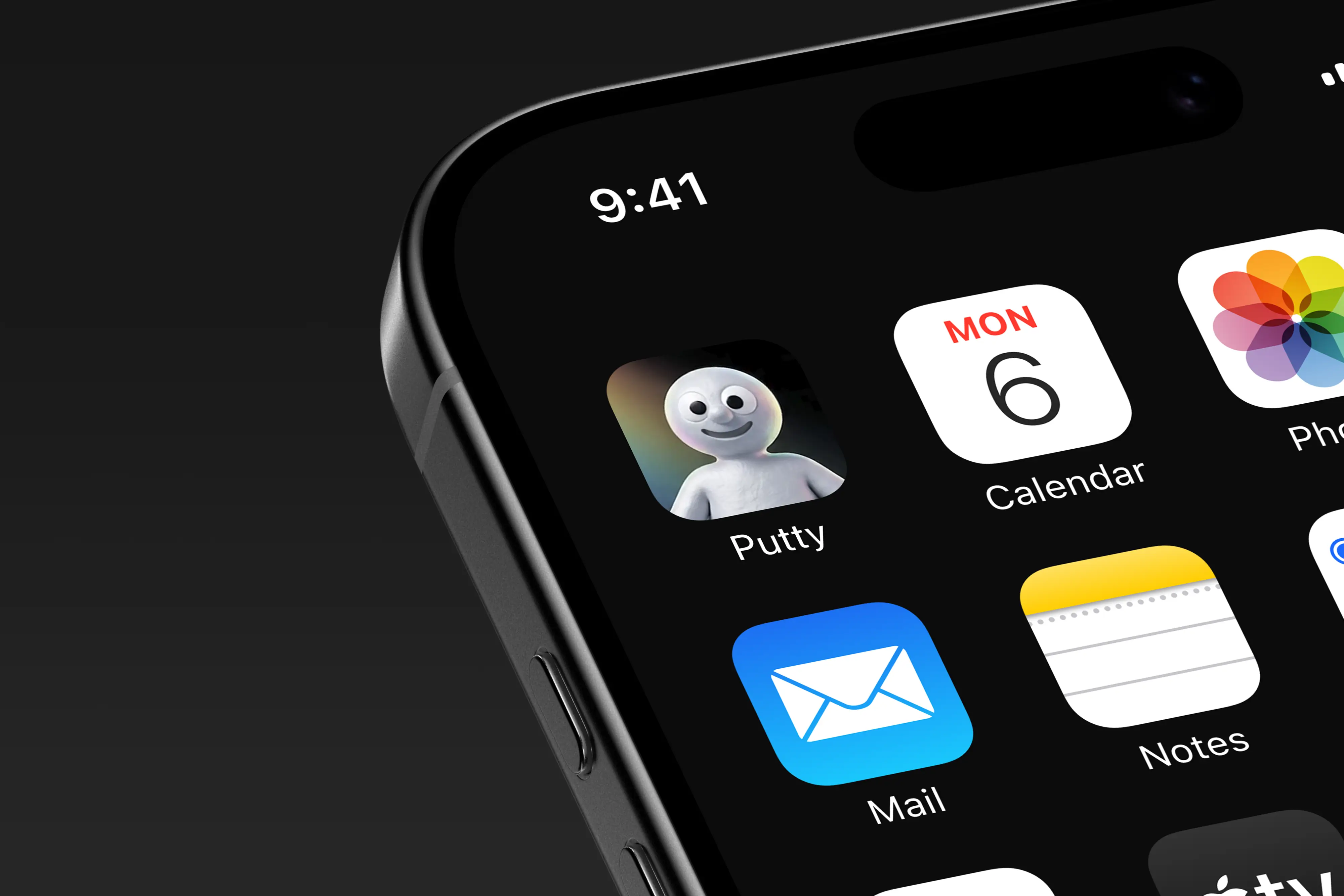
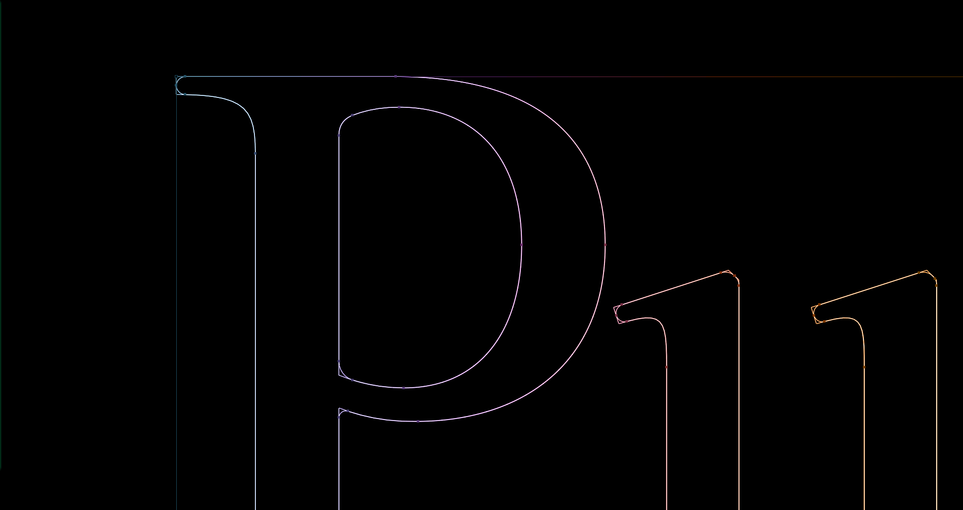
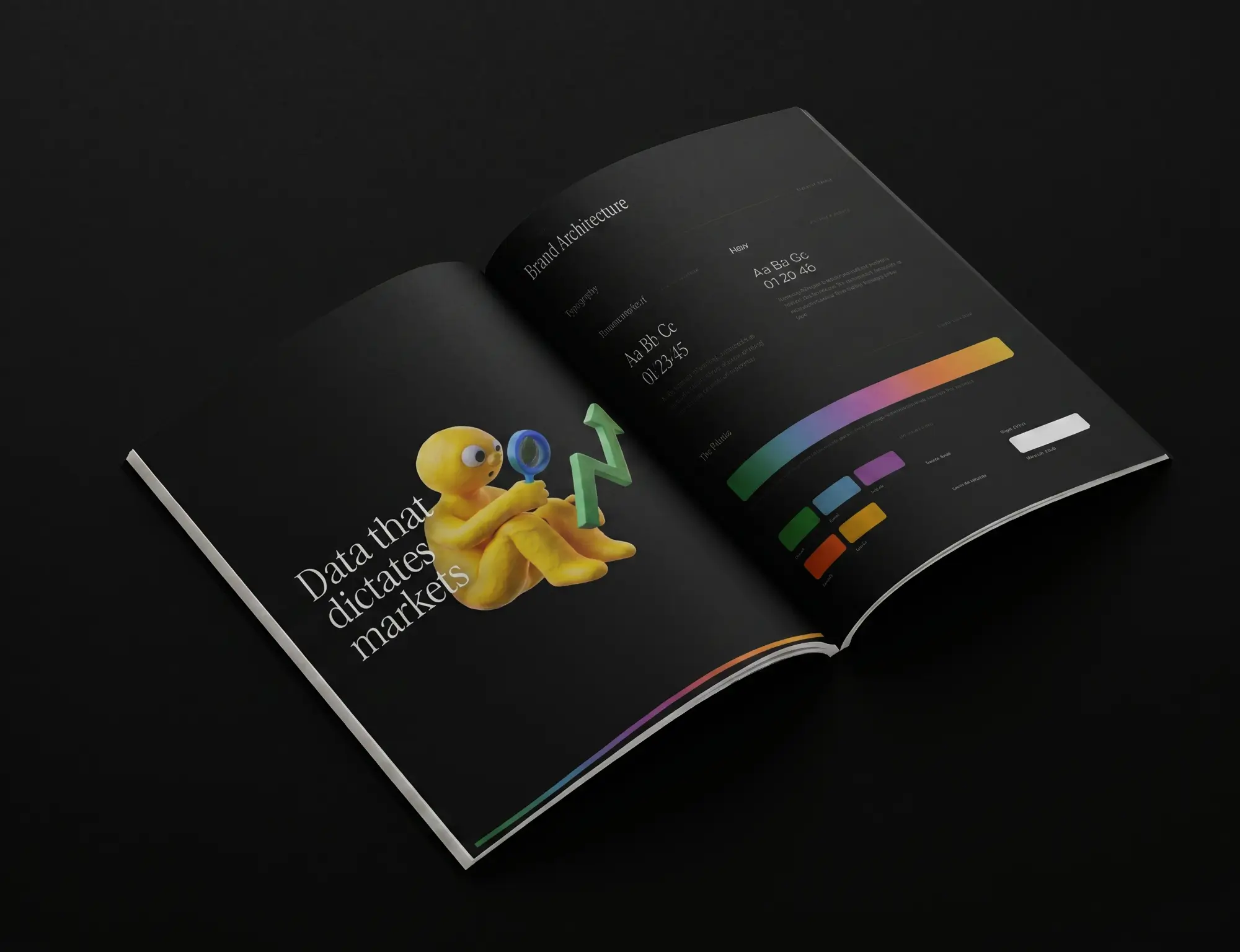
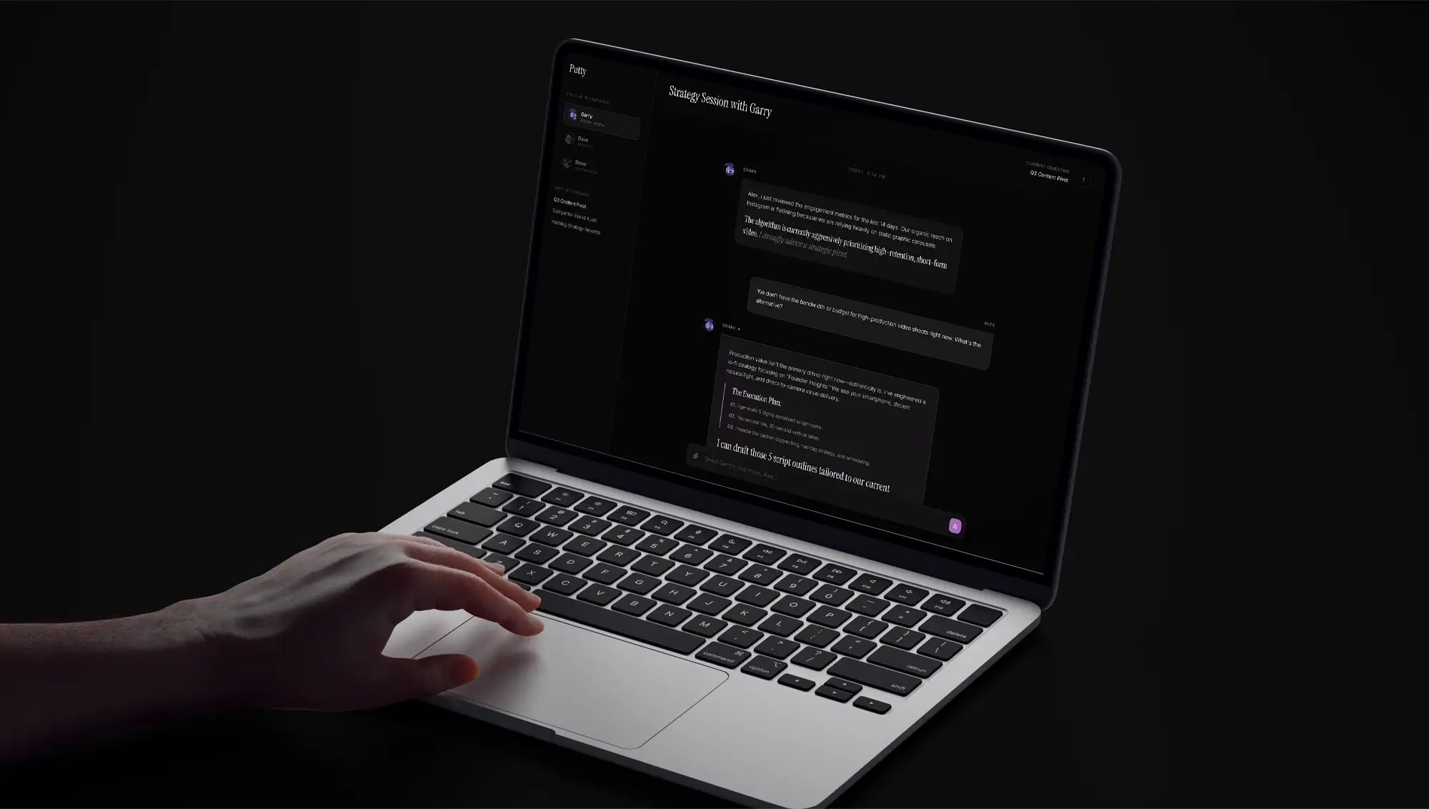
Our multidisciplinary approach covered branding & identity, visual language, desktop and mobile front end web development and a complete marketing rollout. We engineered a brutalist dark mode digital environment. We paired this with high contrast typography using Instrument Serif to project deep editorial authority. The front end development translates this exact aesthetic into a seamless, high performance experience across both desktop and mobile platforms. Every touchpoint from the core brand guidelines to the interactive chat windows was rigorously crafted to build immediate trust.
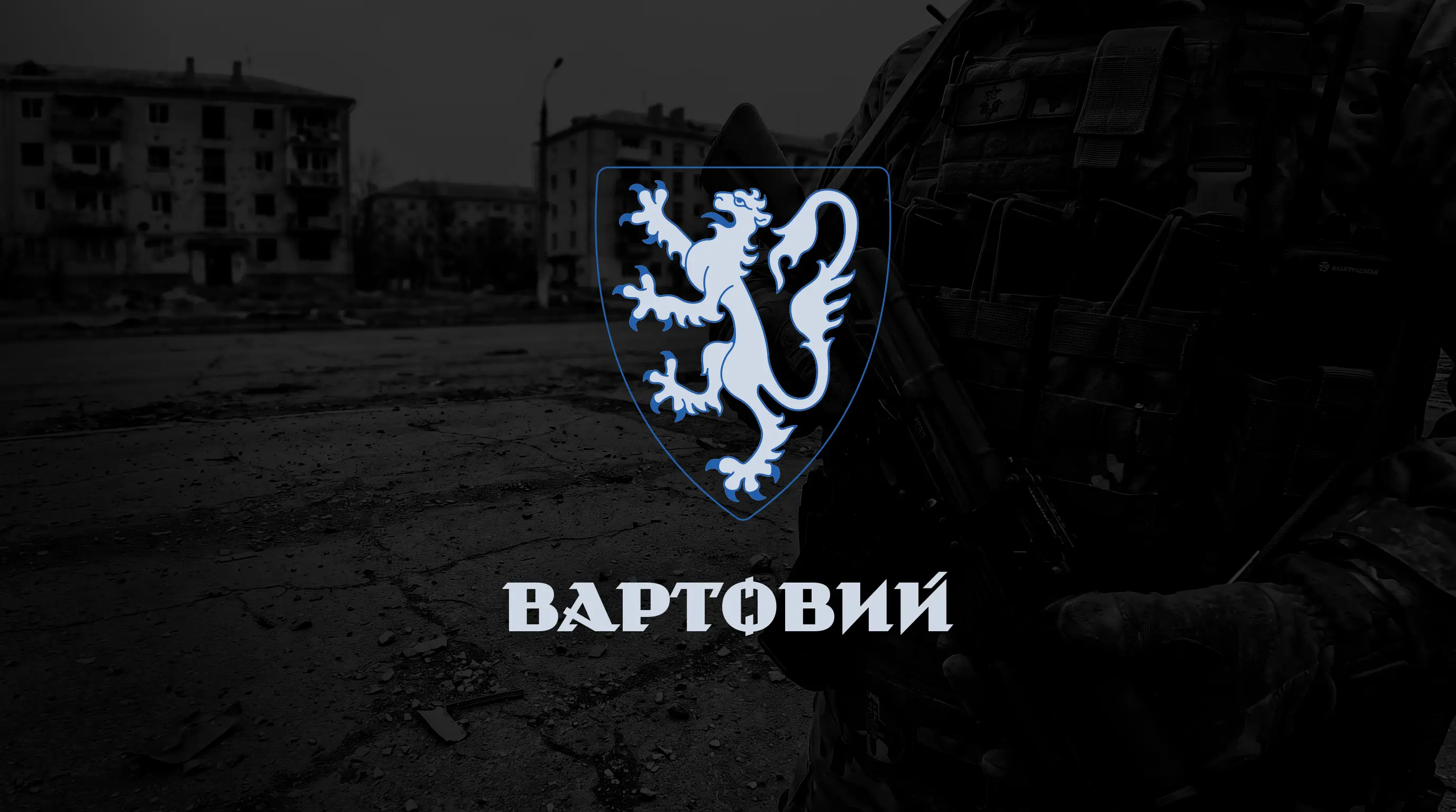
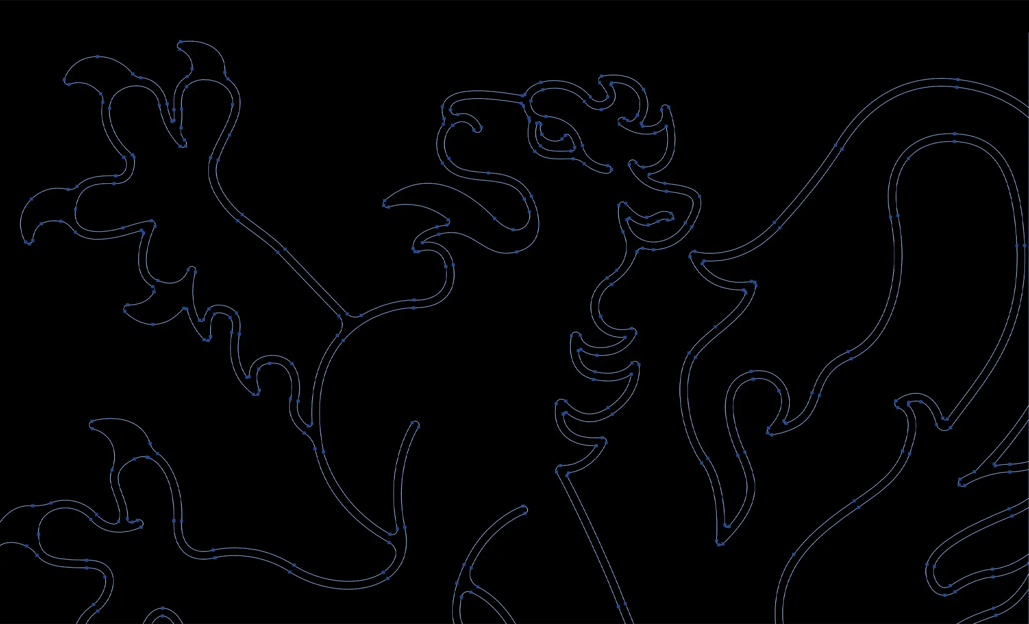
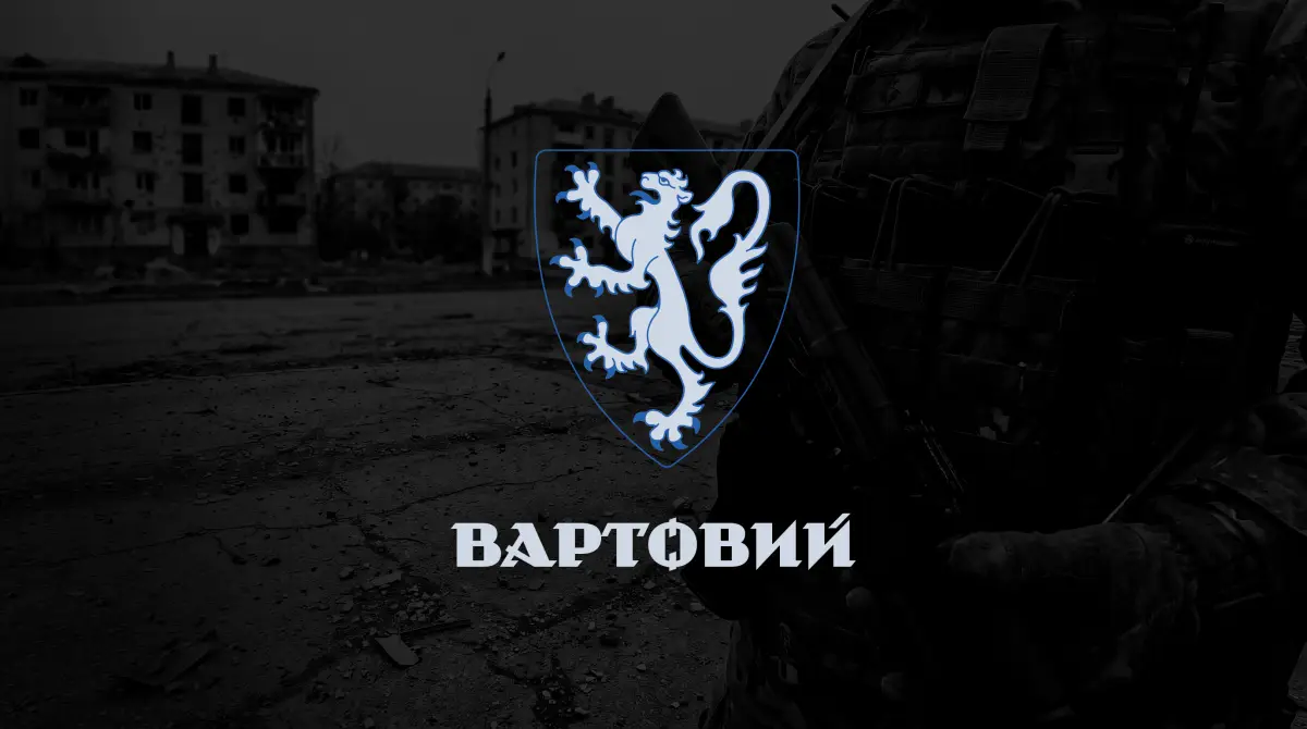
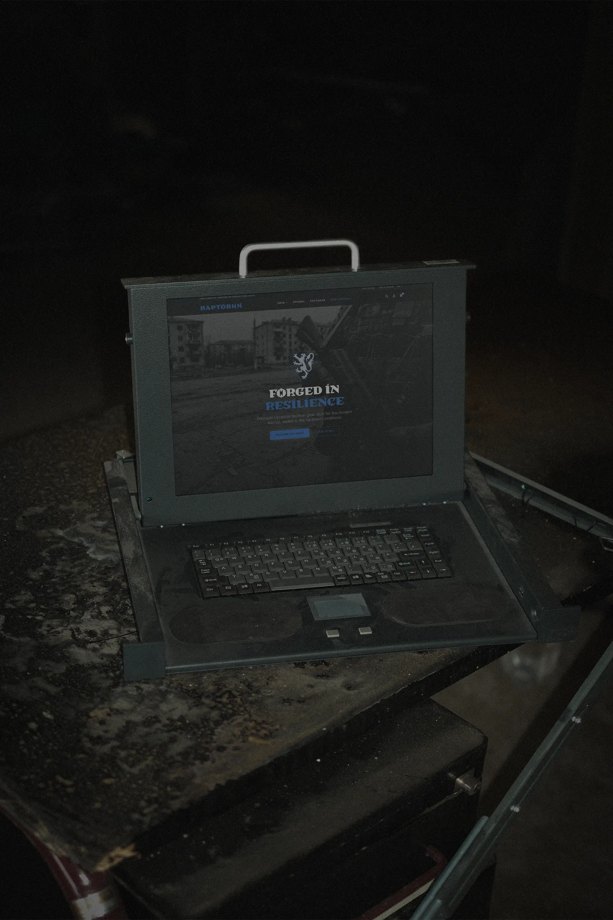
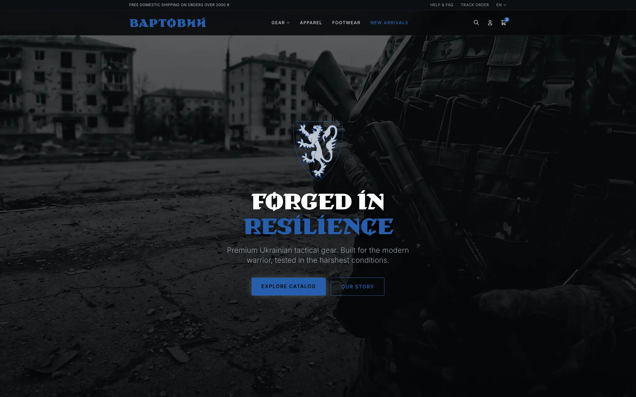
Military supply stores often rely on purely utilitarian, uninspired branding that fails to reflect the life-saving, premium nature of their equipment. Vartovey supplies critical tactical gear—from ballistic armor and helmets to modular webbing and heavy-duty footwear—directly out of Lviv. The market is saturated with generic camouflage and basic aesthetics that blend together. Vartovey needed an identity that felt distinctly authoritative, technical, and unmistakably premium. The core challenge was elevating a tactical retail store into an elite, professional-grade military authority while respecting the gravity of the equipment they provide.
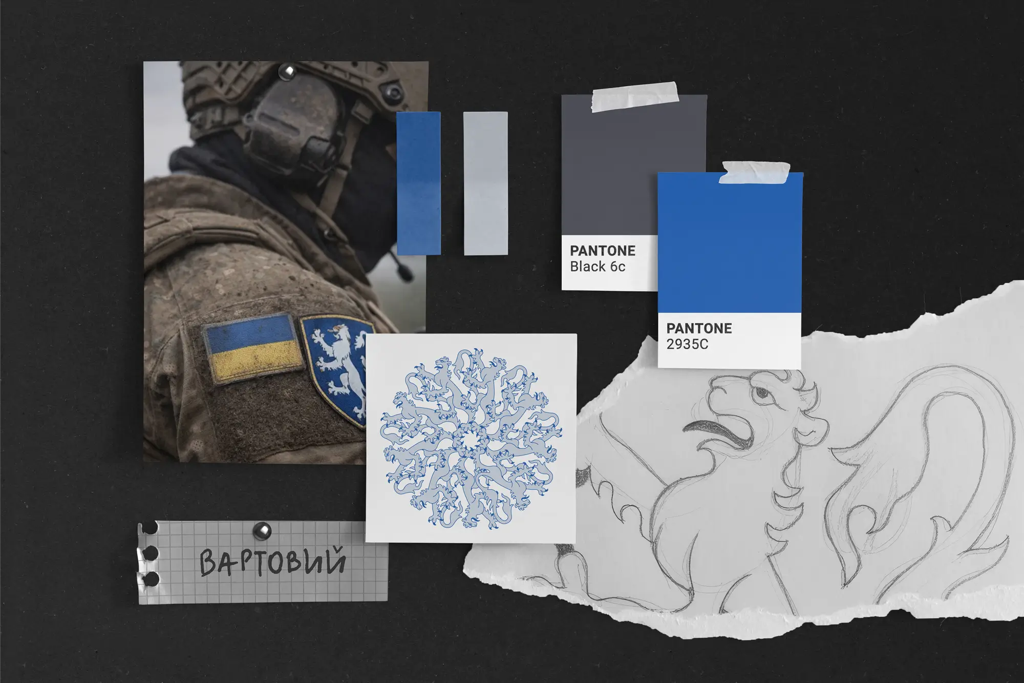
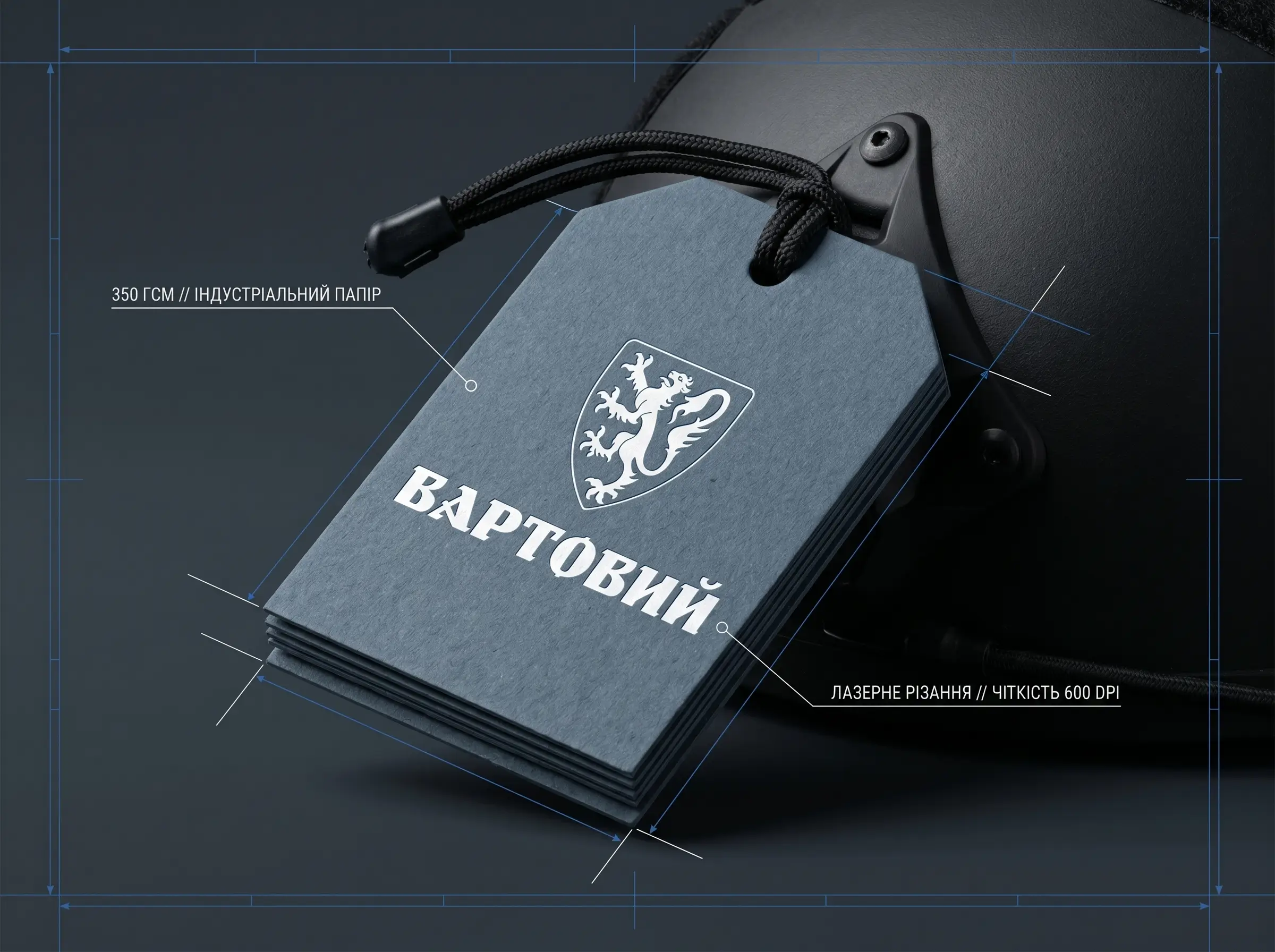
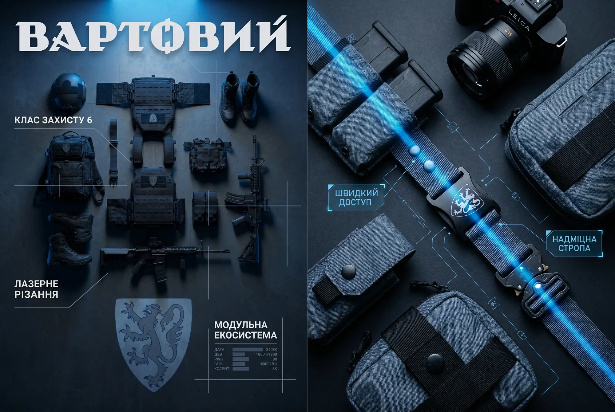
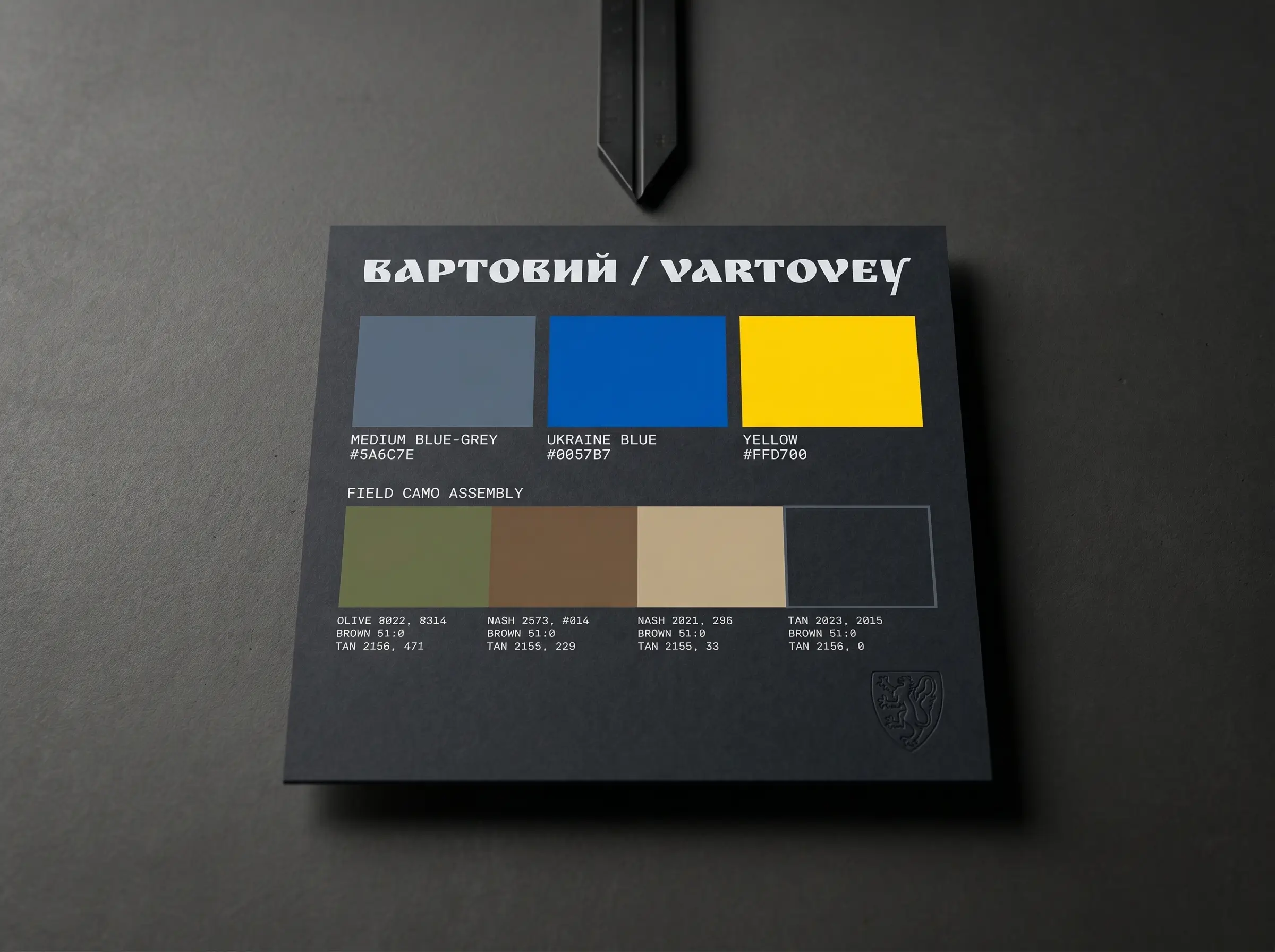
At Rogue, we do not just design flat assets. We build comprehensive 360 creative ecosystems. For Vartovey, we developed a visual architecture that grounds physical tactical hardware in a highly analytical, blueprint-driven reality. We introduced a strict, high-contrast visual system that acts as a technical HUD, analyzing the gear rather than just displaying it. This distinct visual language transforms raw materials, ballistic plates, and nylon webbing into a cohesive system of engineered precision and absolute reliability.
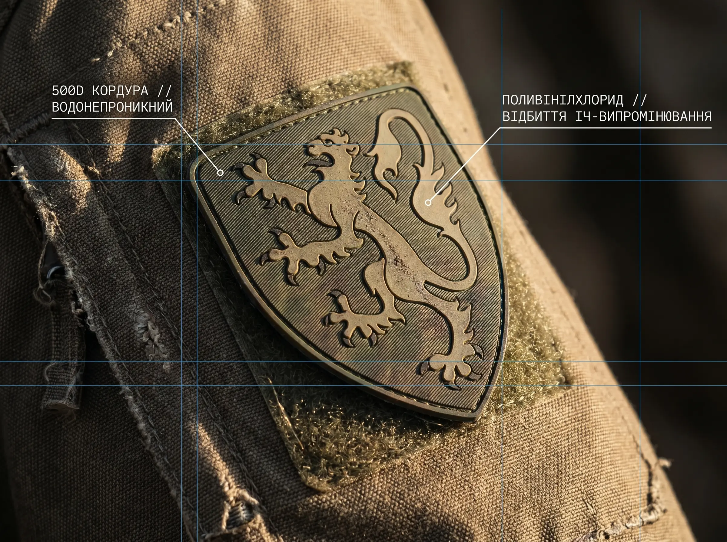
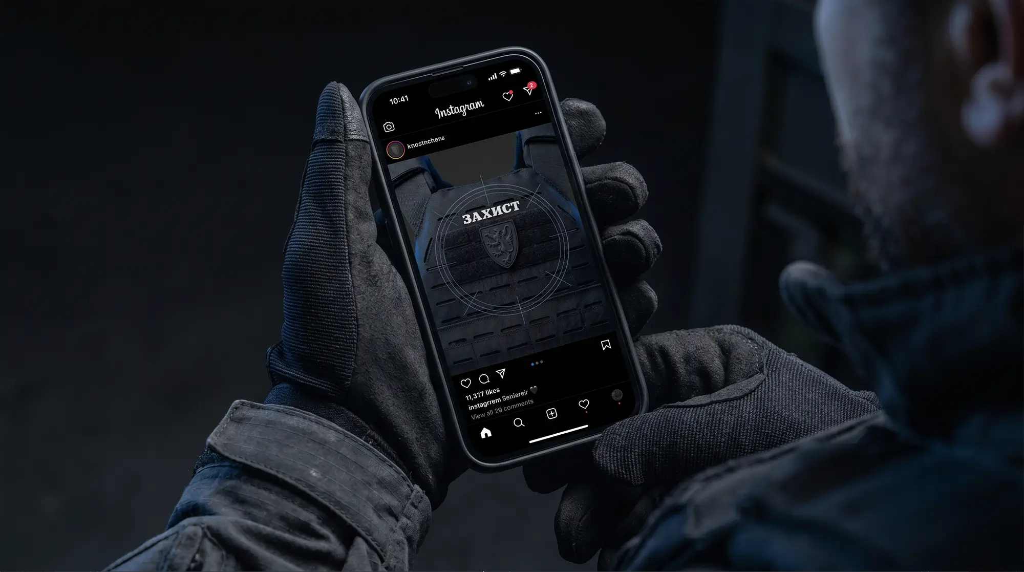
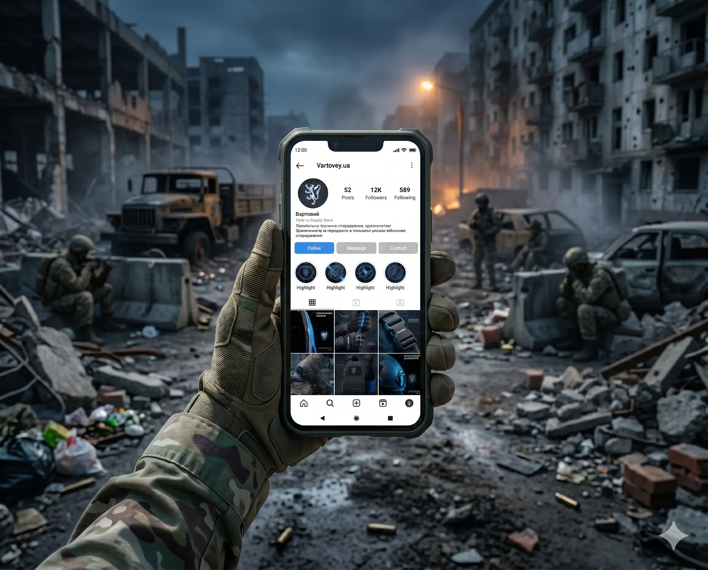
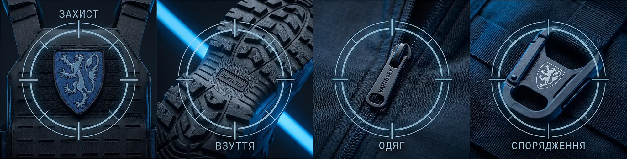
Our multidisciplinary approach covered branding & identity, visual language, social media grid architecture, and physical product applications. We engineered a neo-brutalist dark mode environment built on a specialized Ukraine Blue and medium blue-grey color palette. We paired this with high-contrast, aggressive Ukrainian typography to project clinical accuracy and deep technical authority. Every touchpoint—from the macro-detail digital product breakdowns and 9-post social grids to the physical woven PVC morale patches and industrial 350 GSM hang tags—was rigorously crafted to build immediate trust.
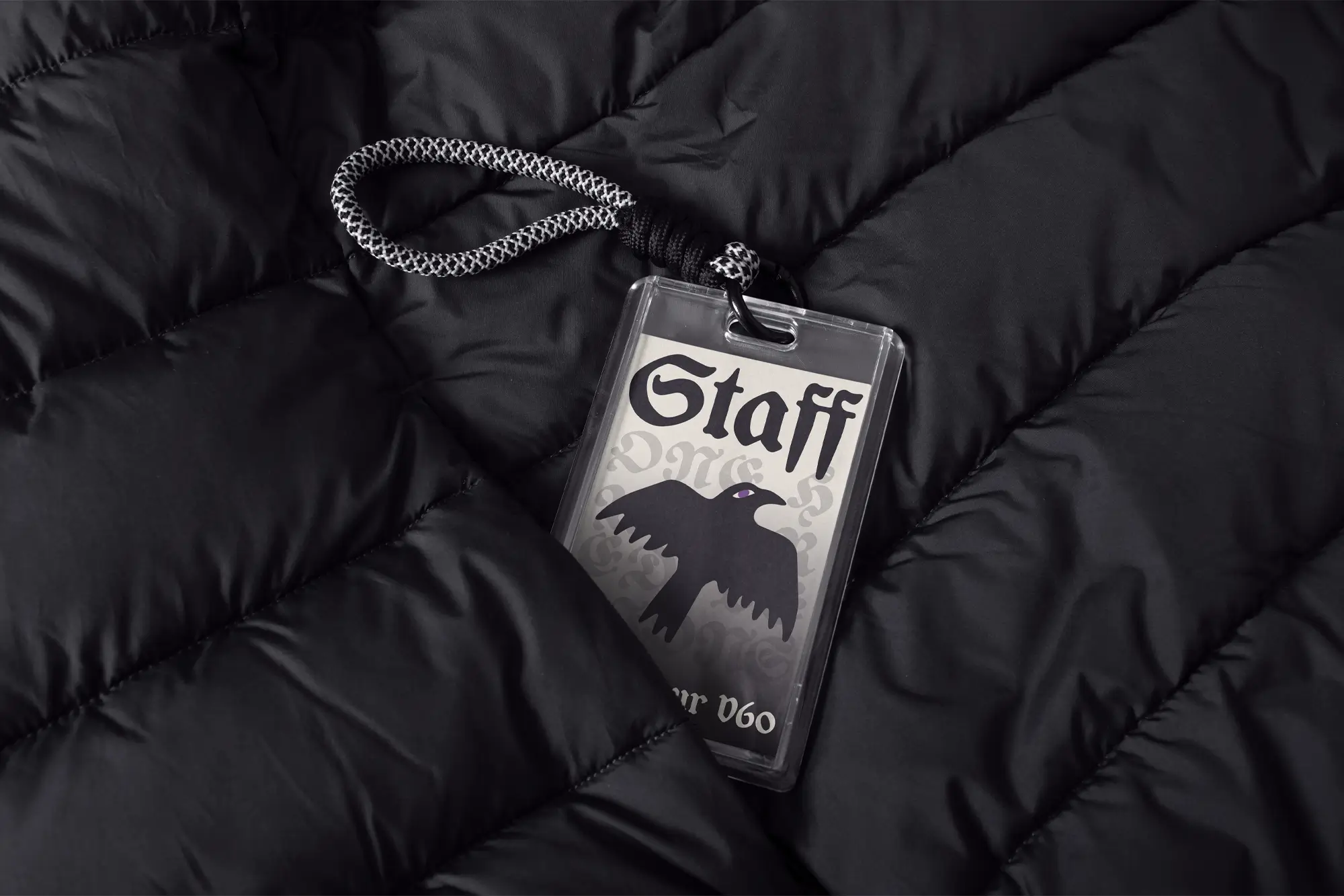
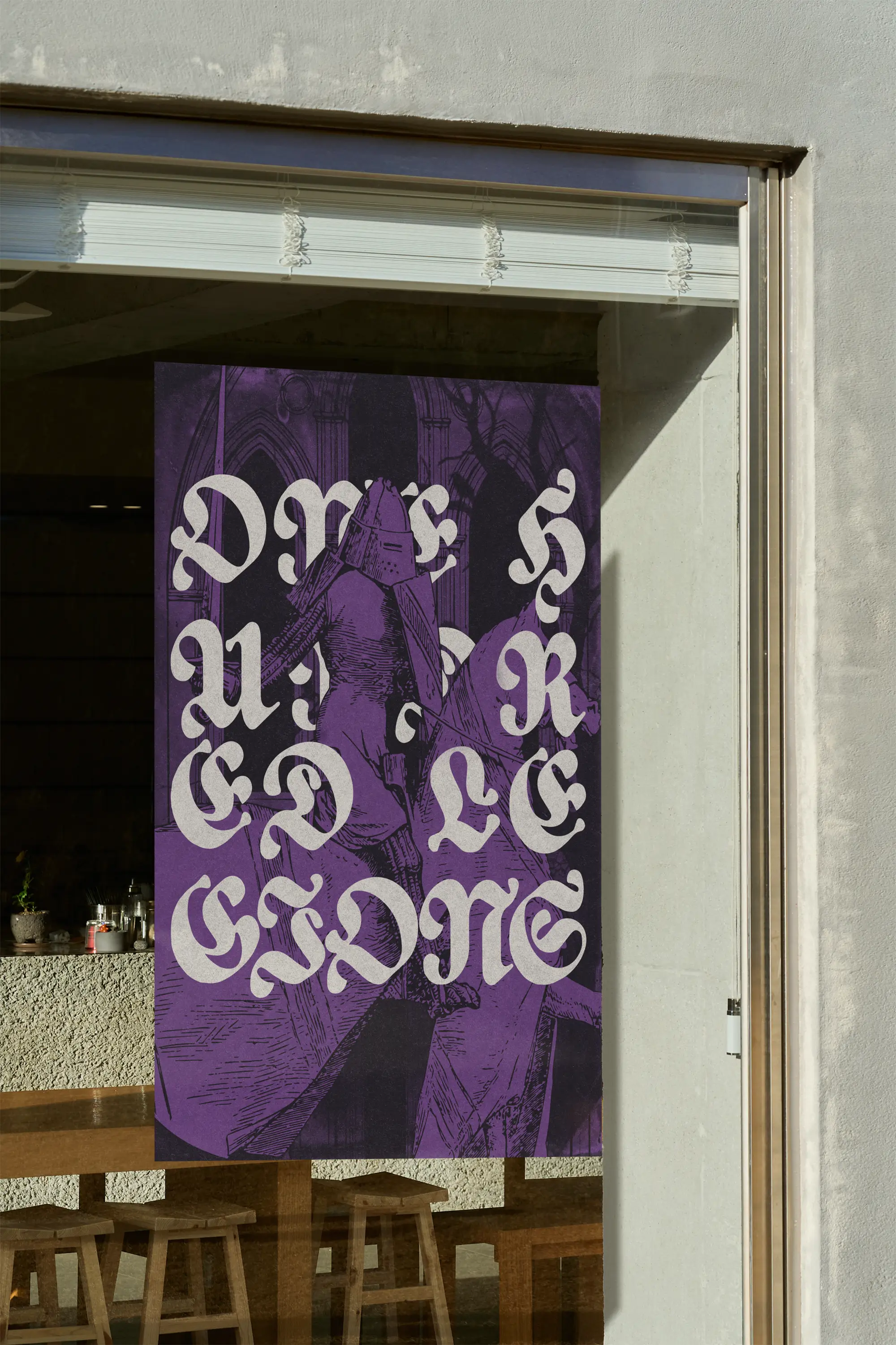
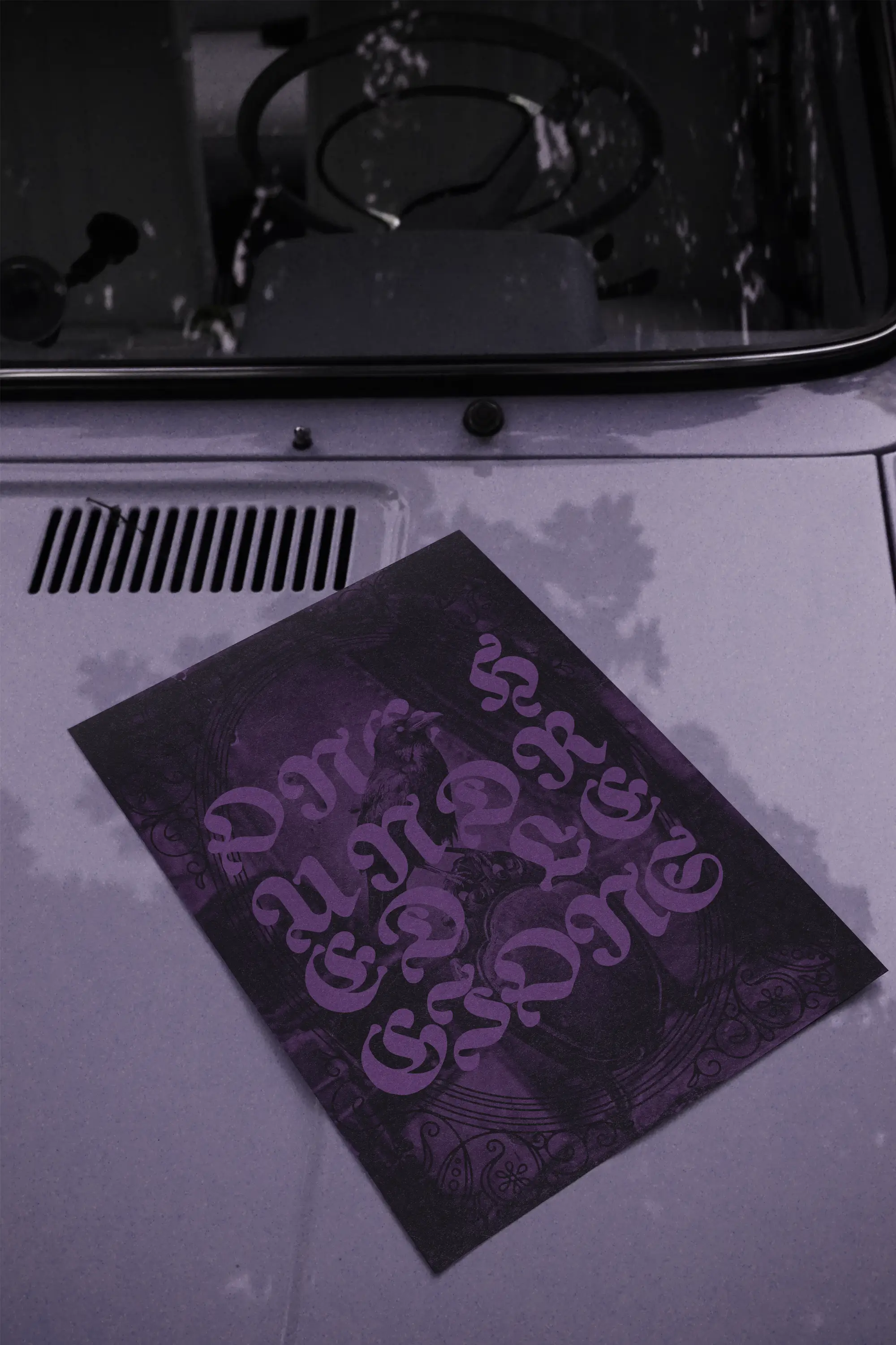
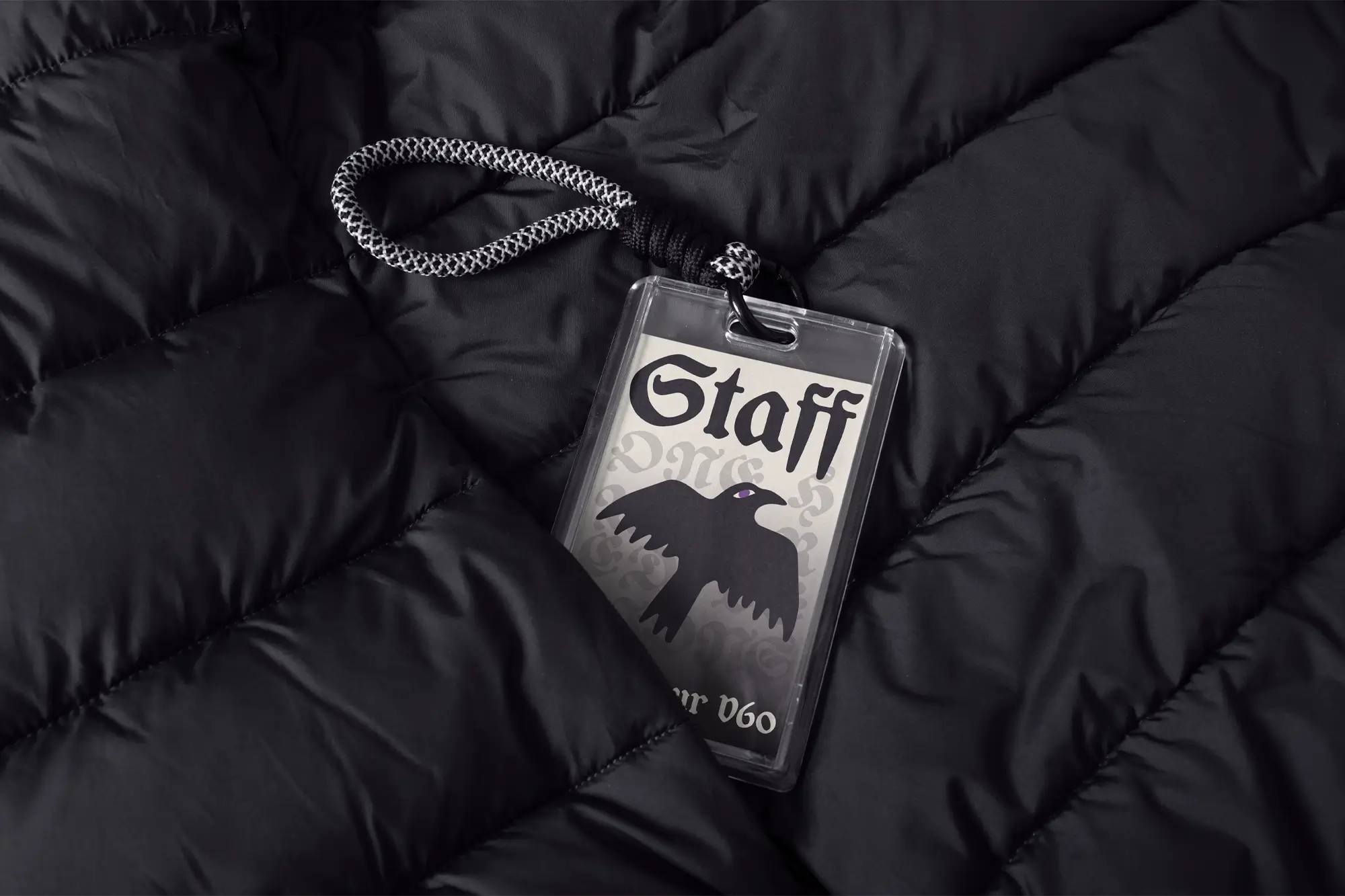
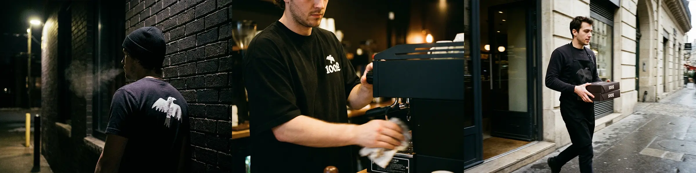
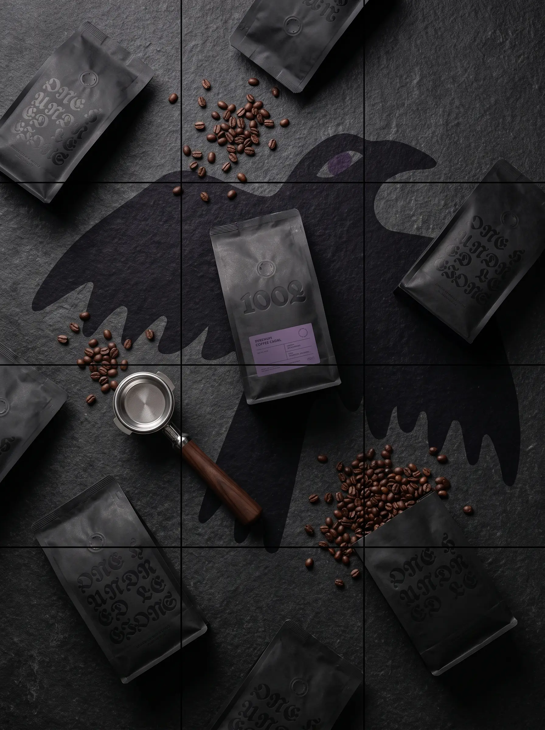
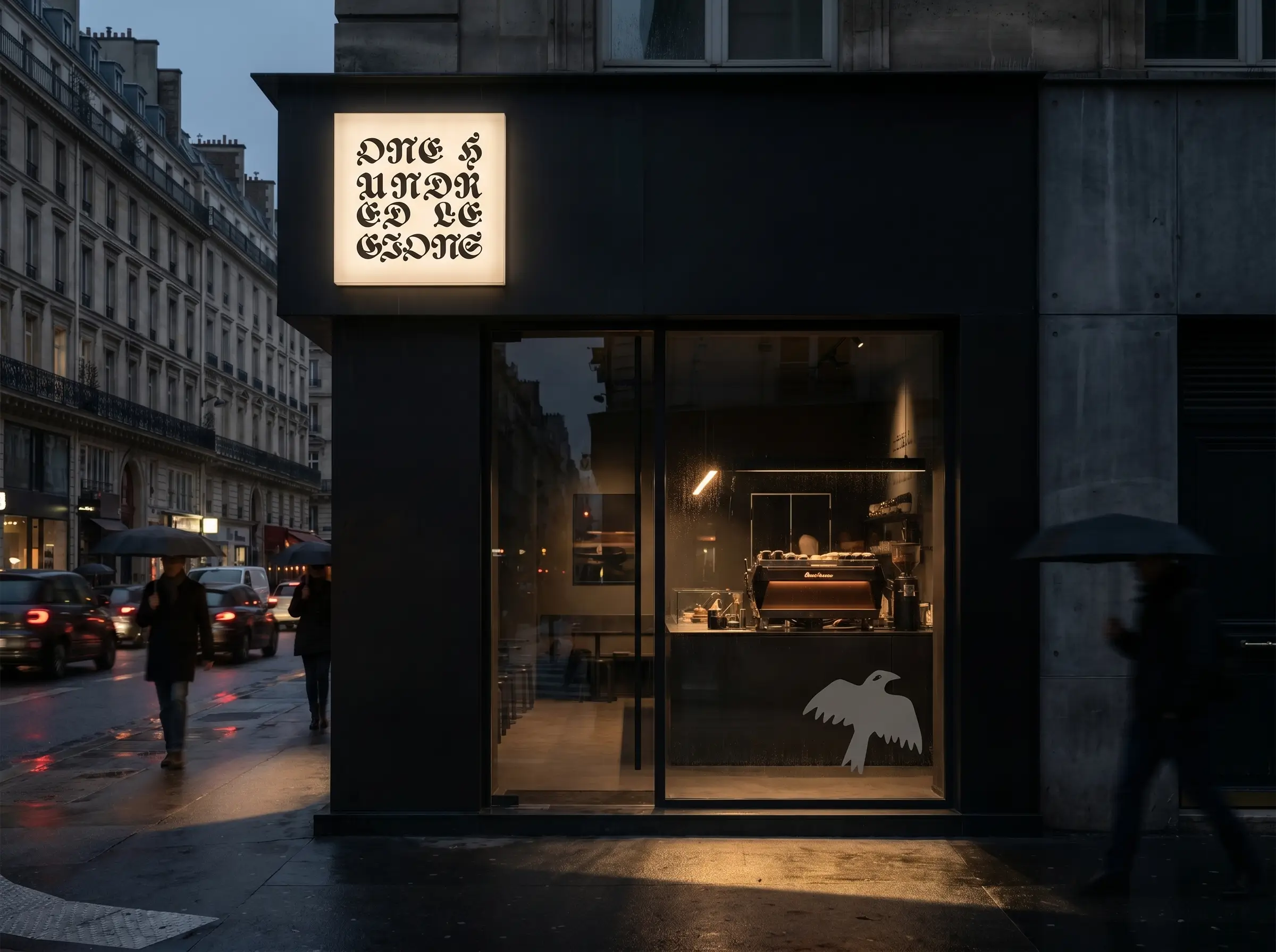
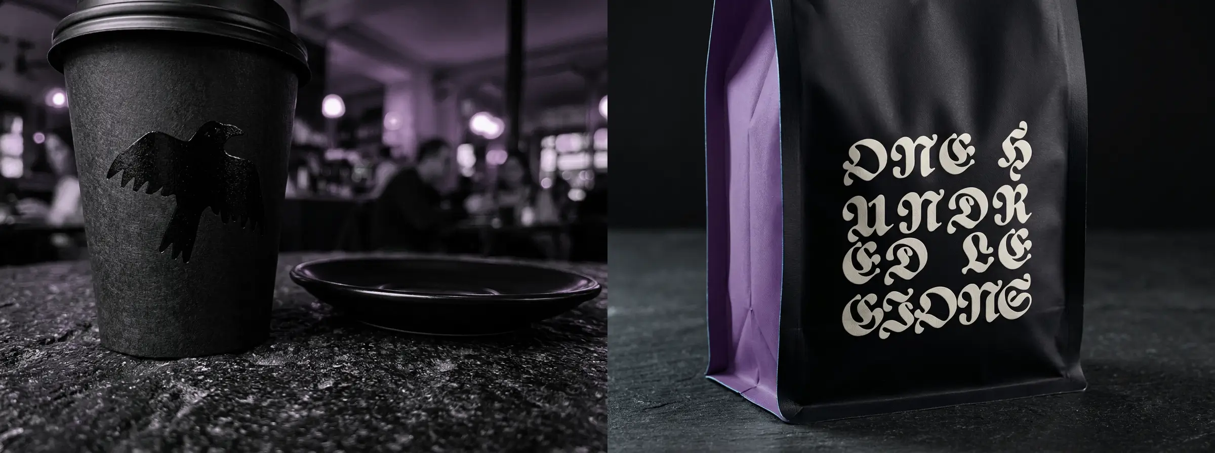
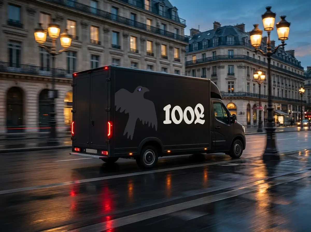
Establish a comprehensive brand identity and digital presence for a 4th-wave cafe and coffee roastery in central Paris. The objective is to create a dark, uncompromising and highly structural visual system.
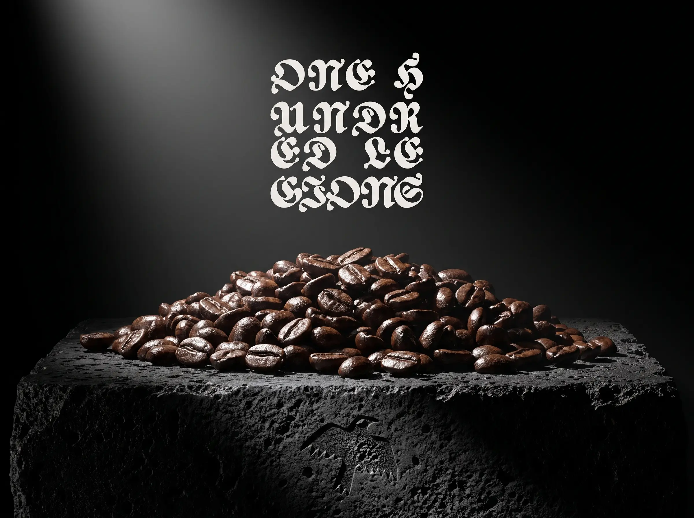
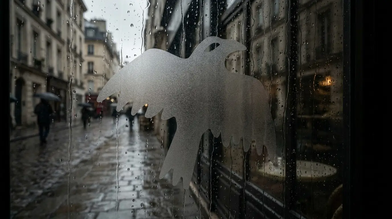
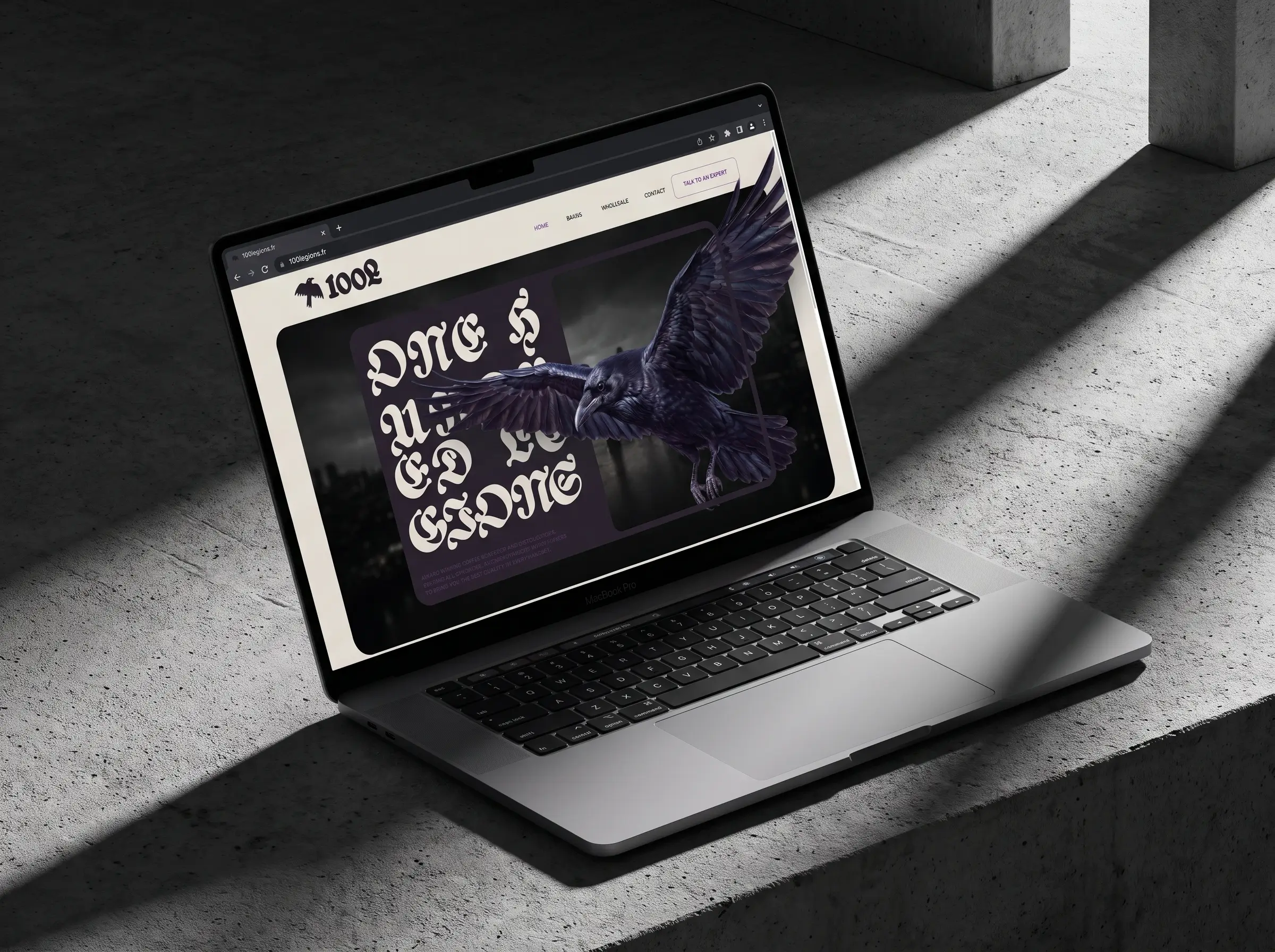
The identity relies on a stark dark-minimalist aesthetic. The primary marque is an unembellished raven icon set against complex calligraphic typography. The color palette is restricted to a brutalist dark charcoal base and precise gradients of muted clinical purples.
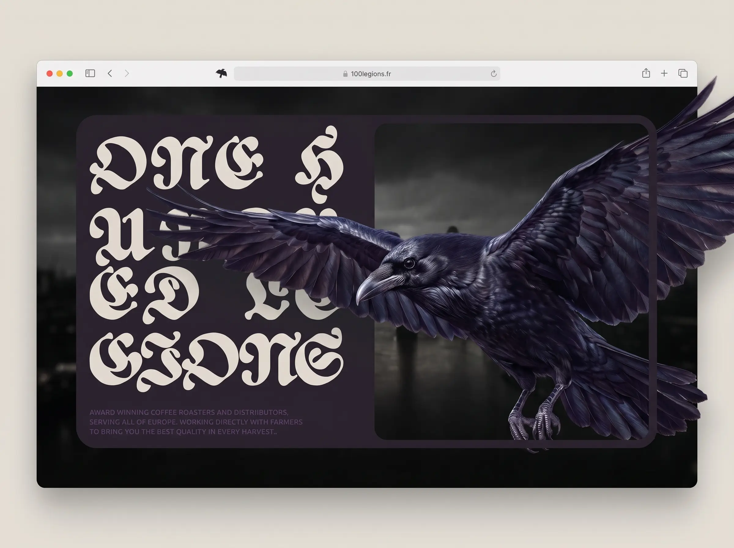
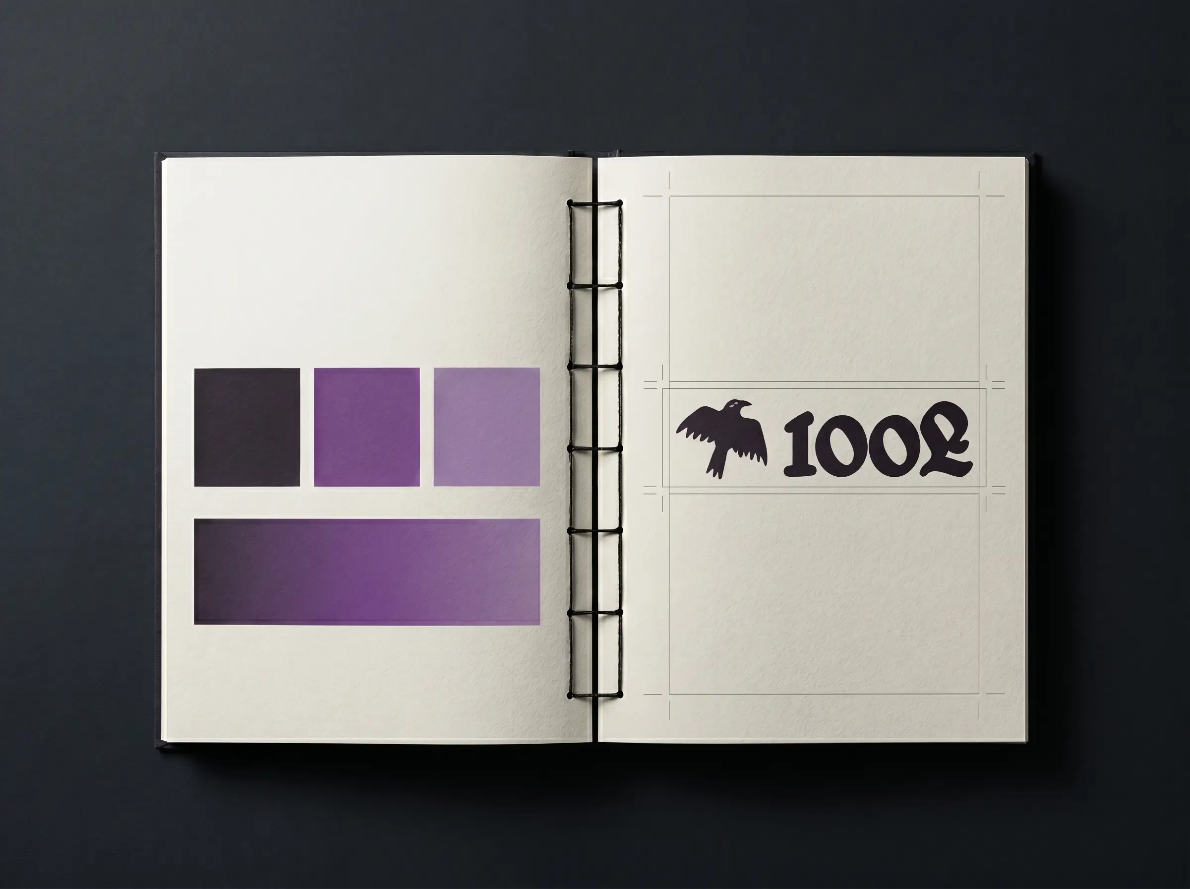
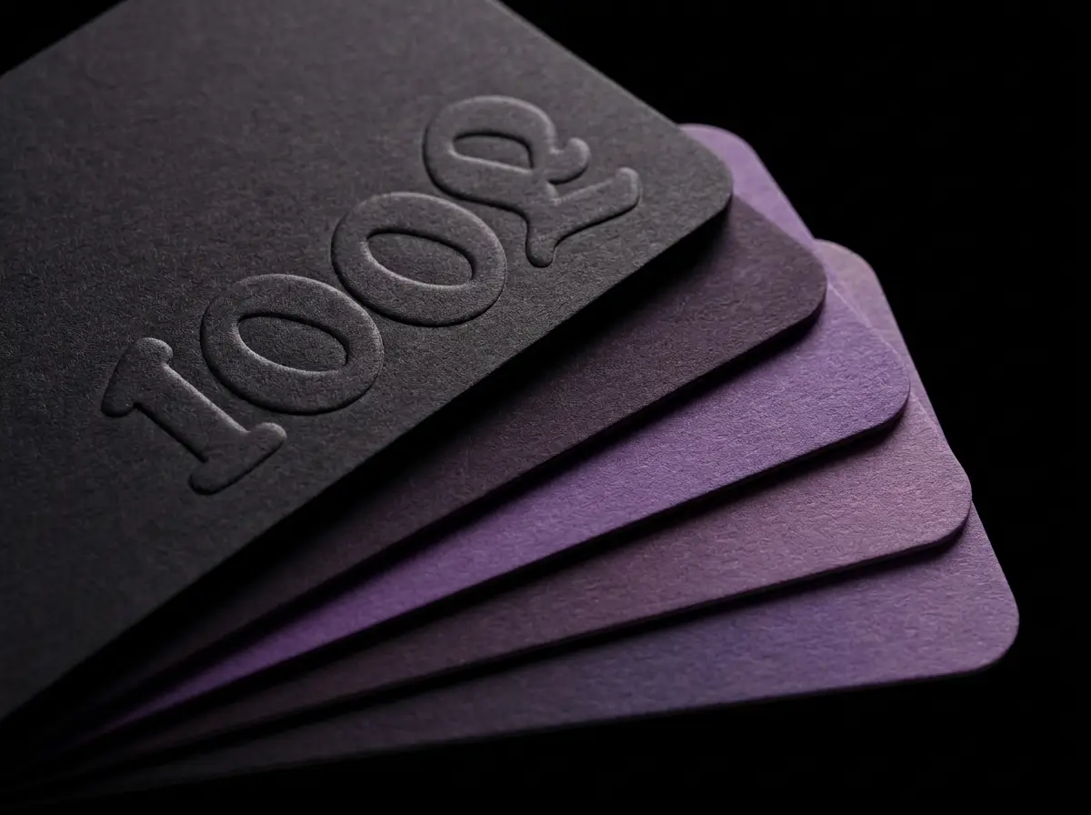
This is a comprehensive physical and digital brand rollout. The project encompasses heavy-weight tactile print collateral, matte black soft-touch packaging, industrial roastery assets and a fully responsive web experience. The resulting environment is moody, premium and unapologetically modern.
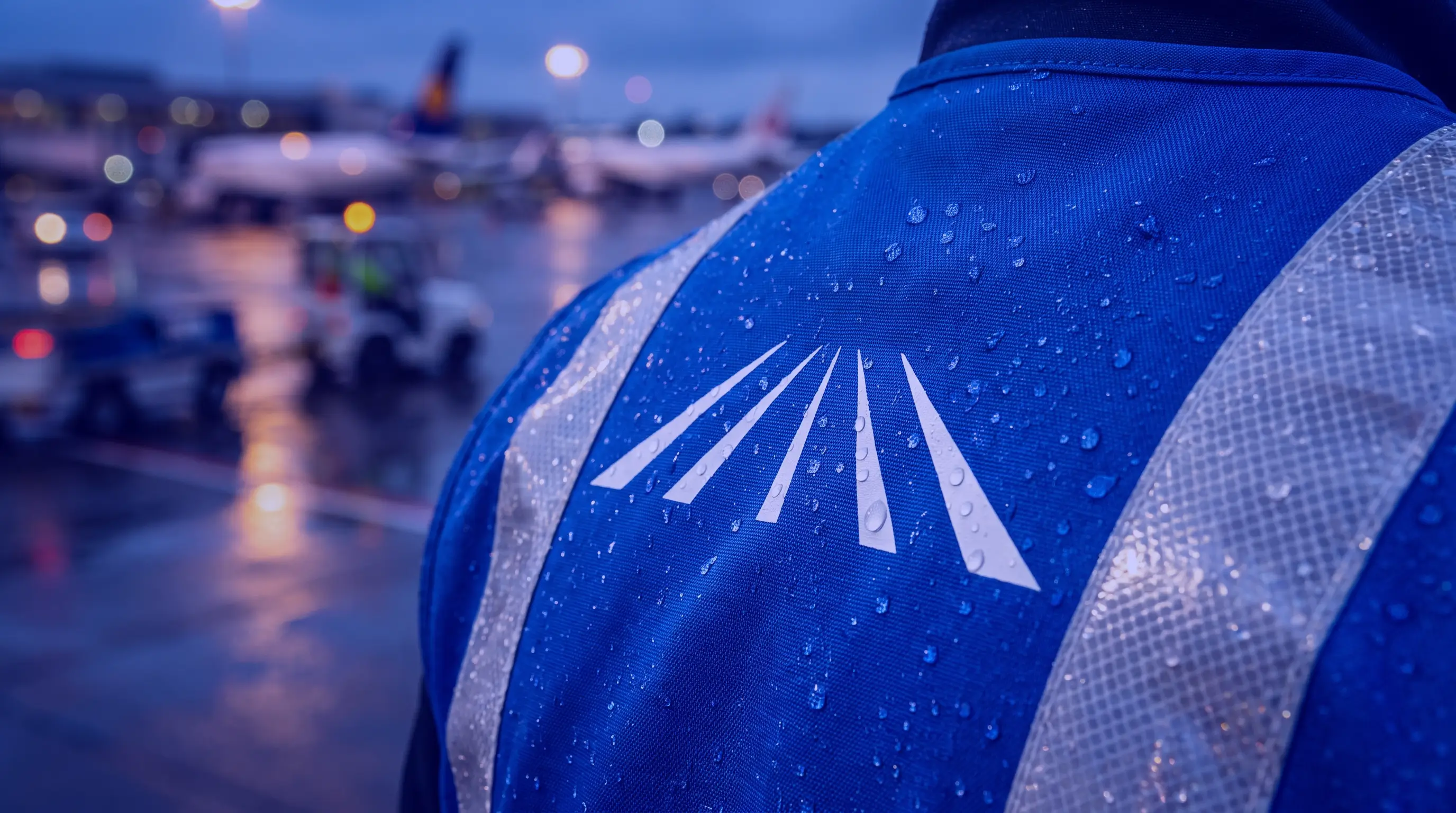
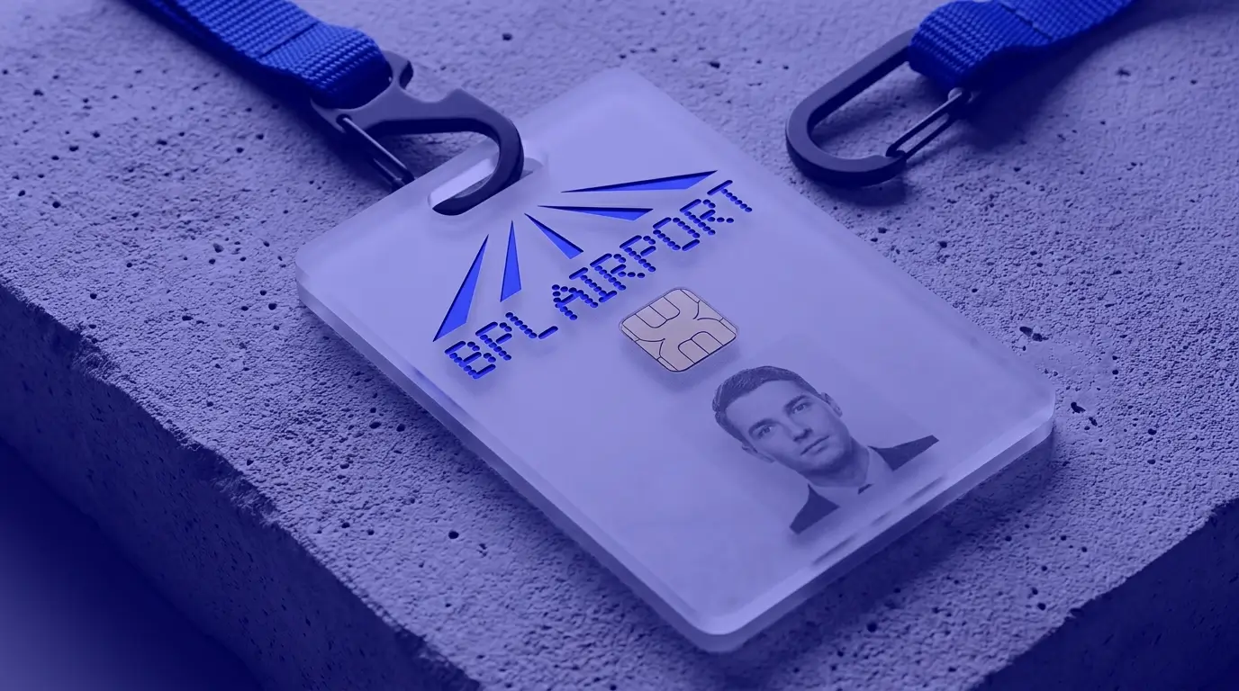
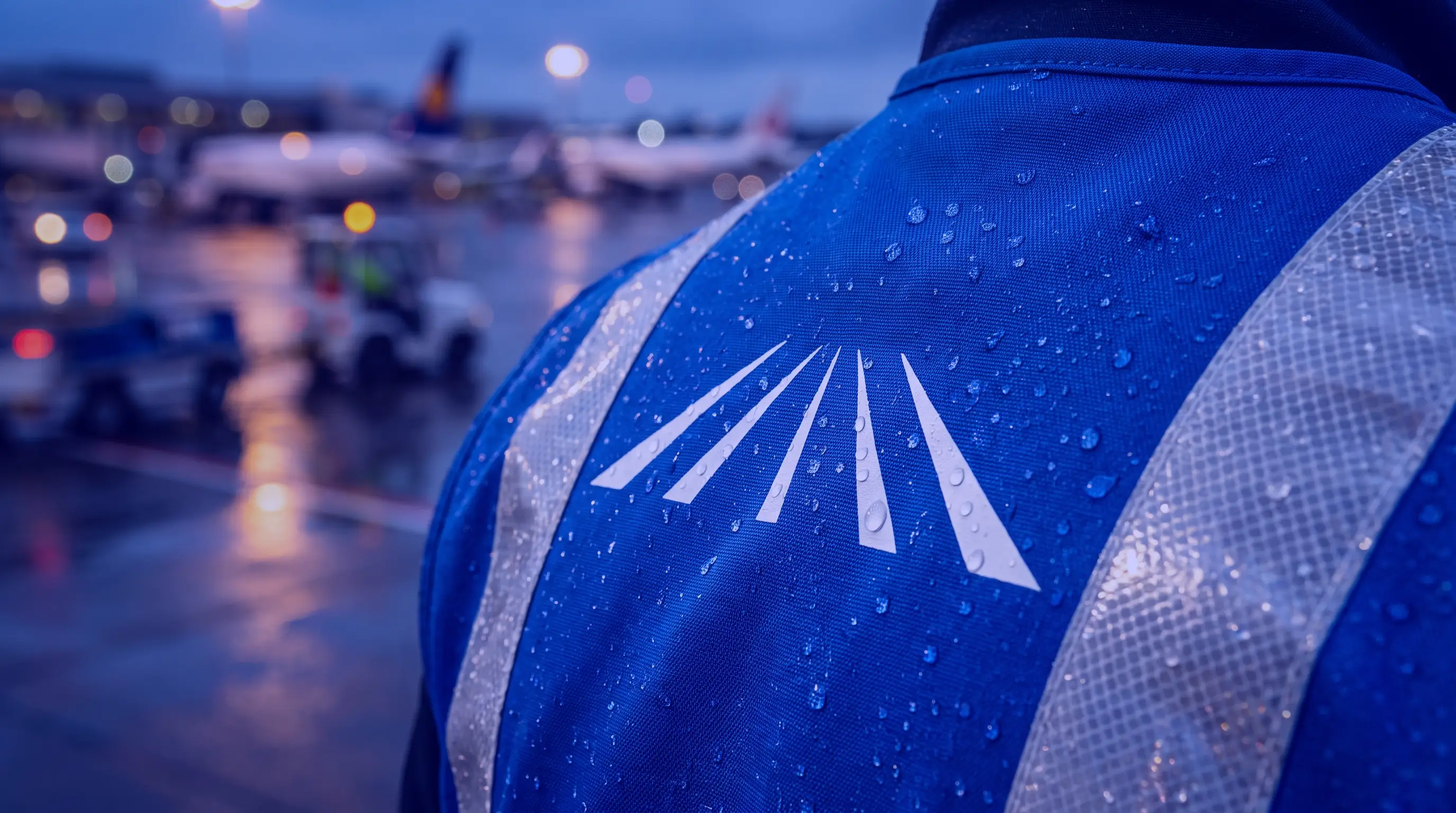
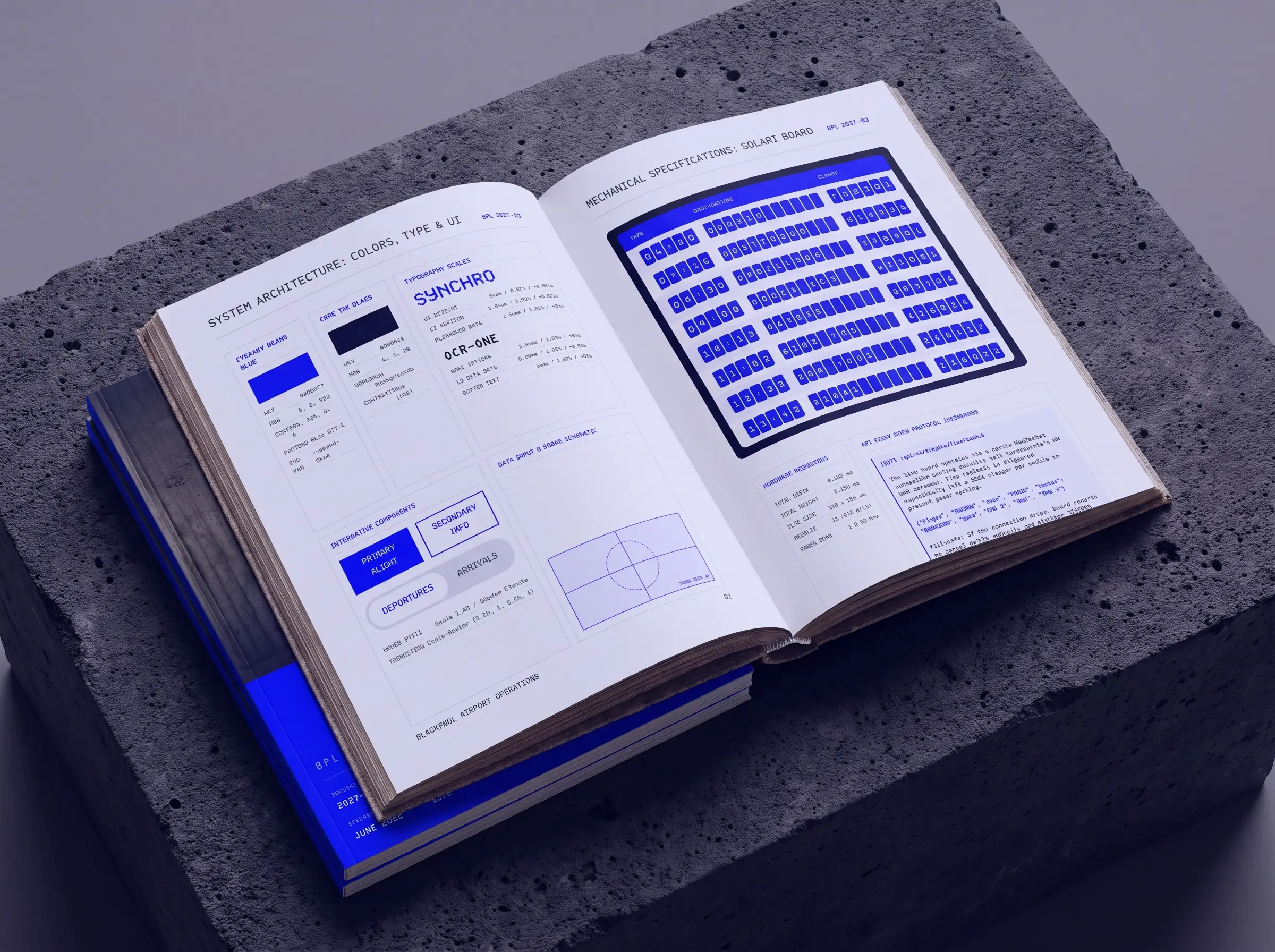
Blackpool International Airport required a complete modernization to strip away outdated aesthetics and establish the facility as a serious functional transit hub. The legacy branding lacked the operational authority needed for a modern terminal and failed to translate effectively across new physical wayfinding and digital touchpoints. We needed to build an infrastructure that felt monumental yet entirely frictionless for travelers.
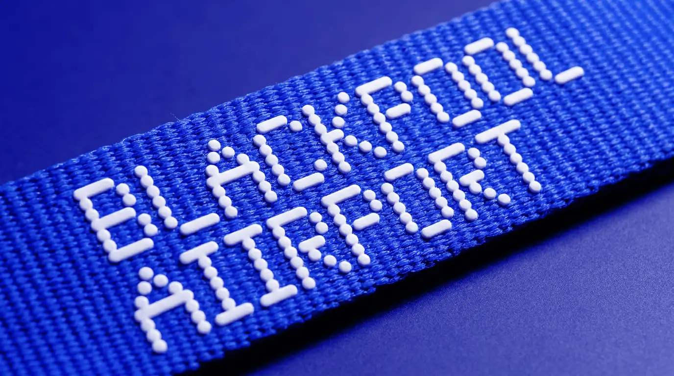
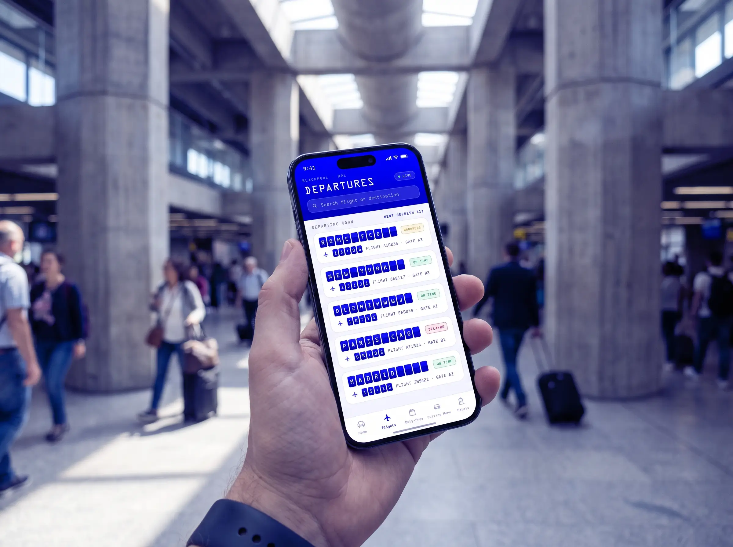
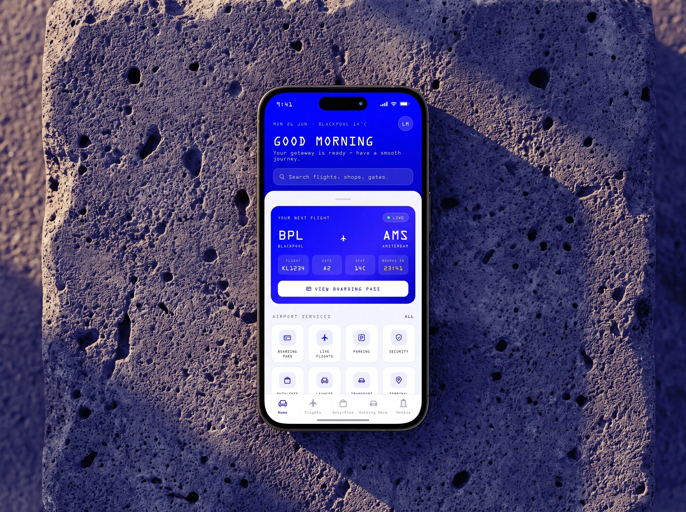
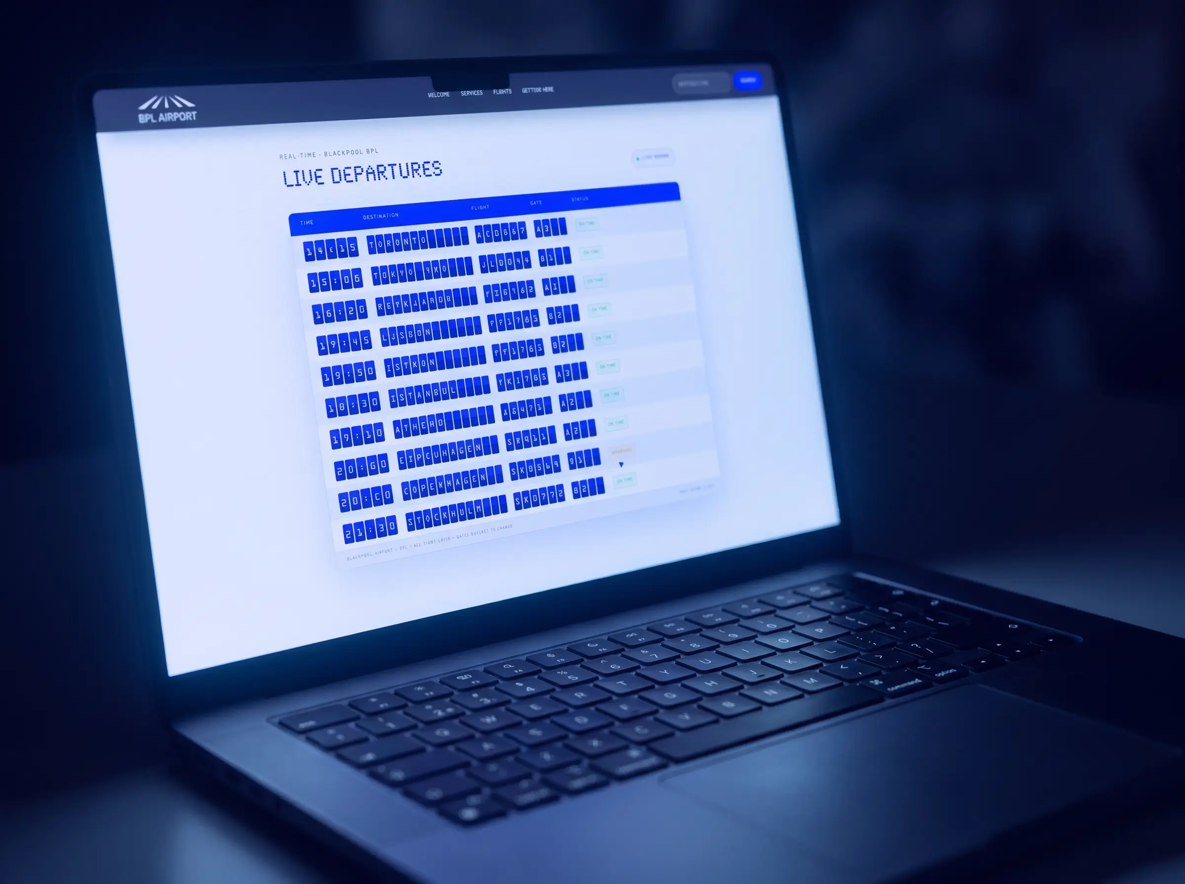
We engineered a neo-brutalist identity system deeply rooted in heavy aviation logistics and raw concrete architecture. By adopting a stark high-contrast visual language we replaced visual noise with absolute clinical precision. We utilized a custom digital-first dot-matrix typography to ensure perfect readability whether displayed on massive suspended LED terminal screens or native mobile interfaces.
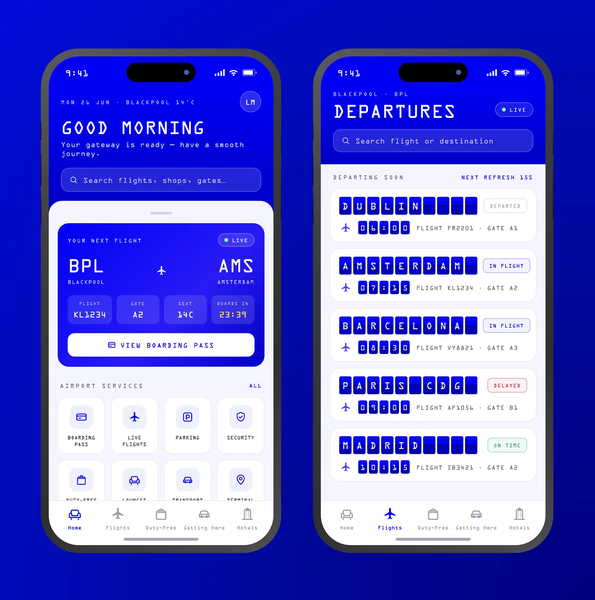
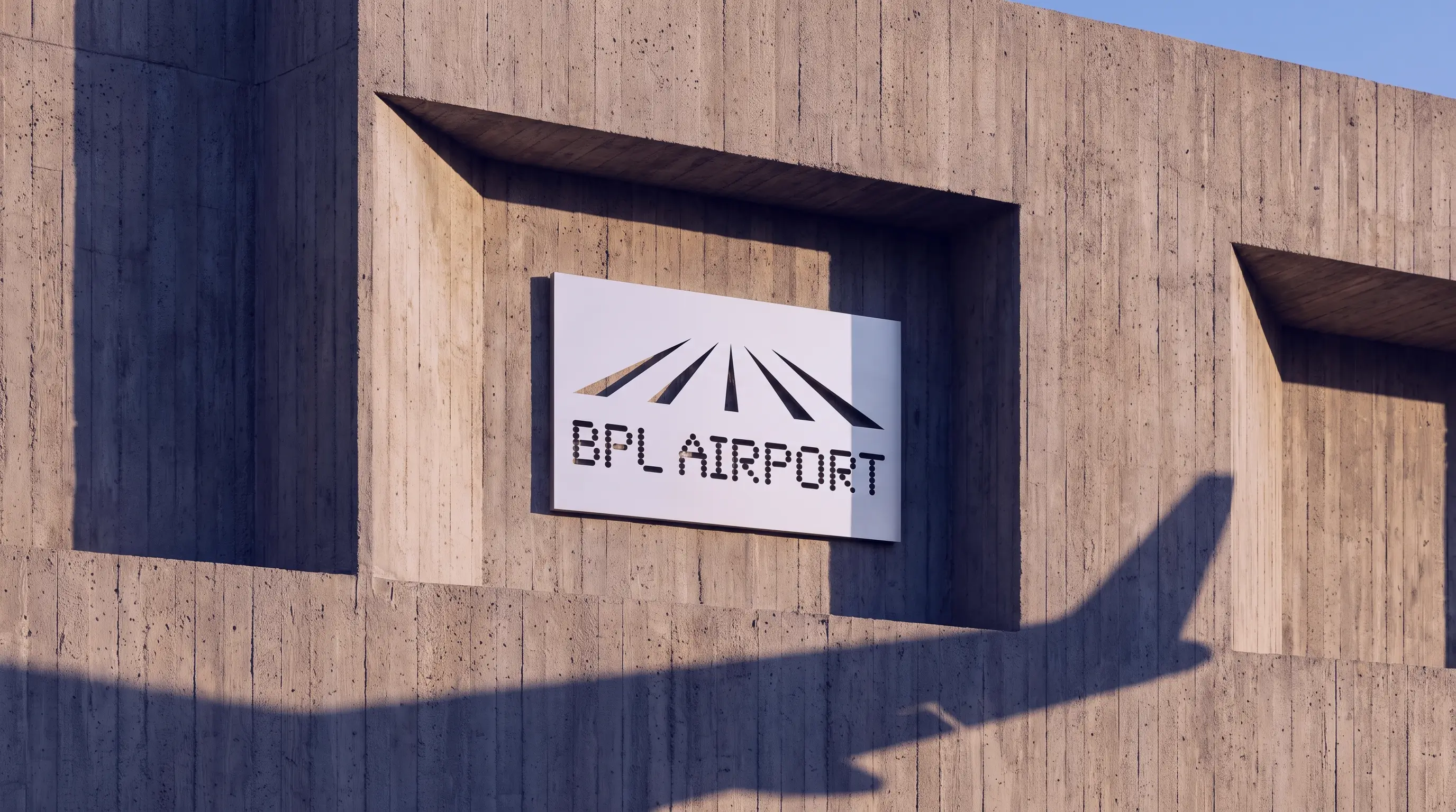
The vision was realized through a comprehensive rollout of physical and digital products. We designed premium staff hardware and robust architectural signage before fully developing a bespoke front-end website and a highly intuitive native application. This unified ecosystem ensures a seamless passenger journey from the departure gate directly to the smartphone to create a commanding and uncompromised operational presence.
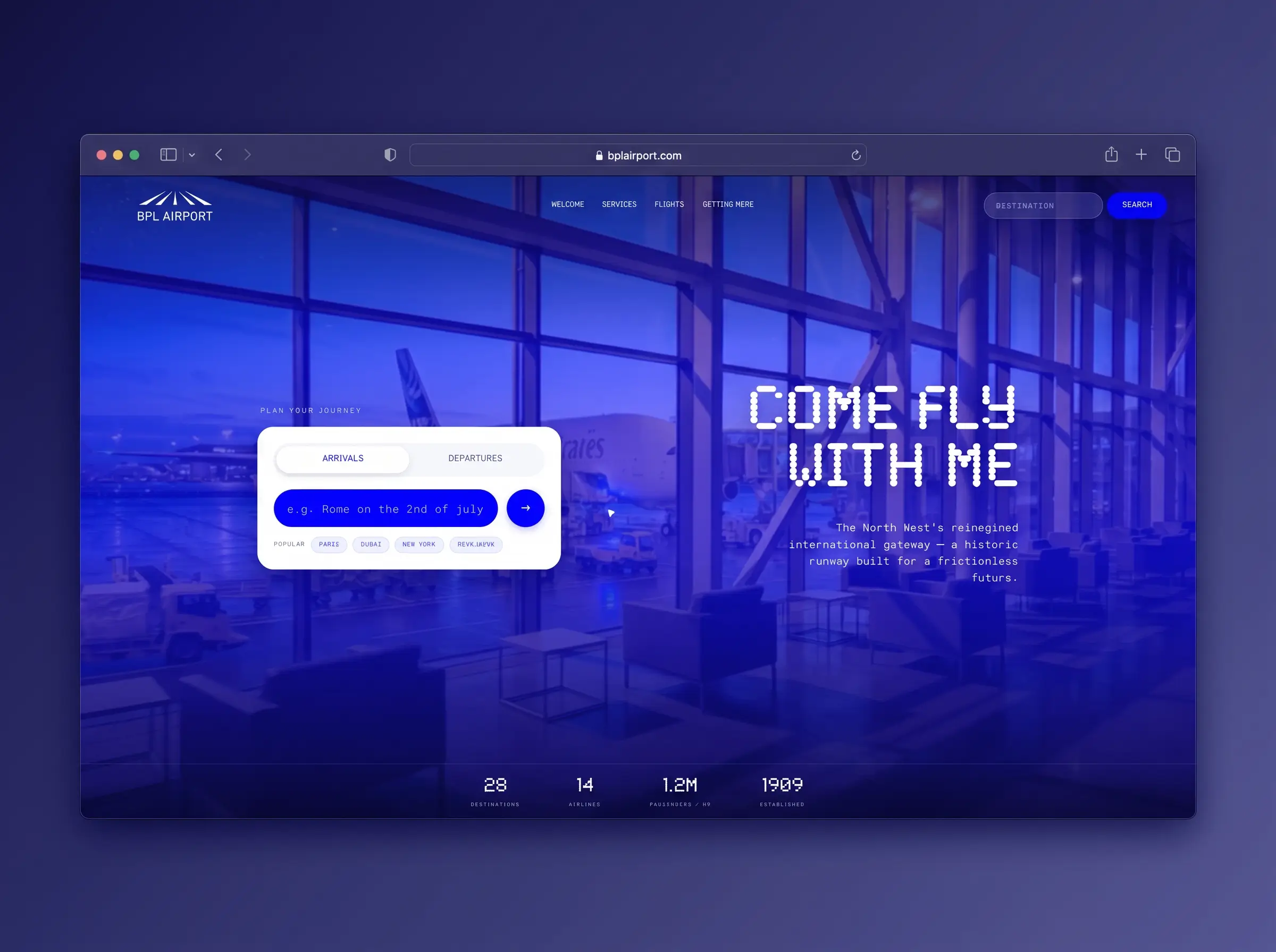
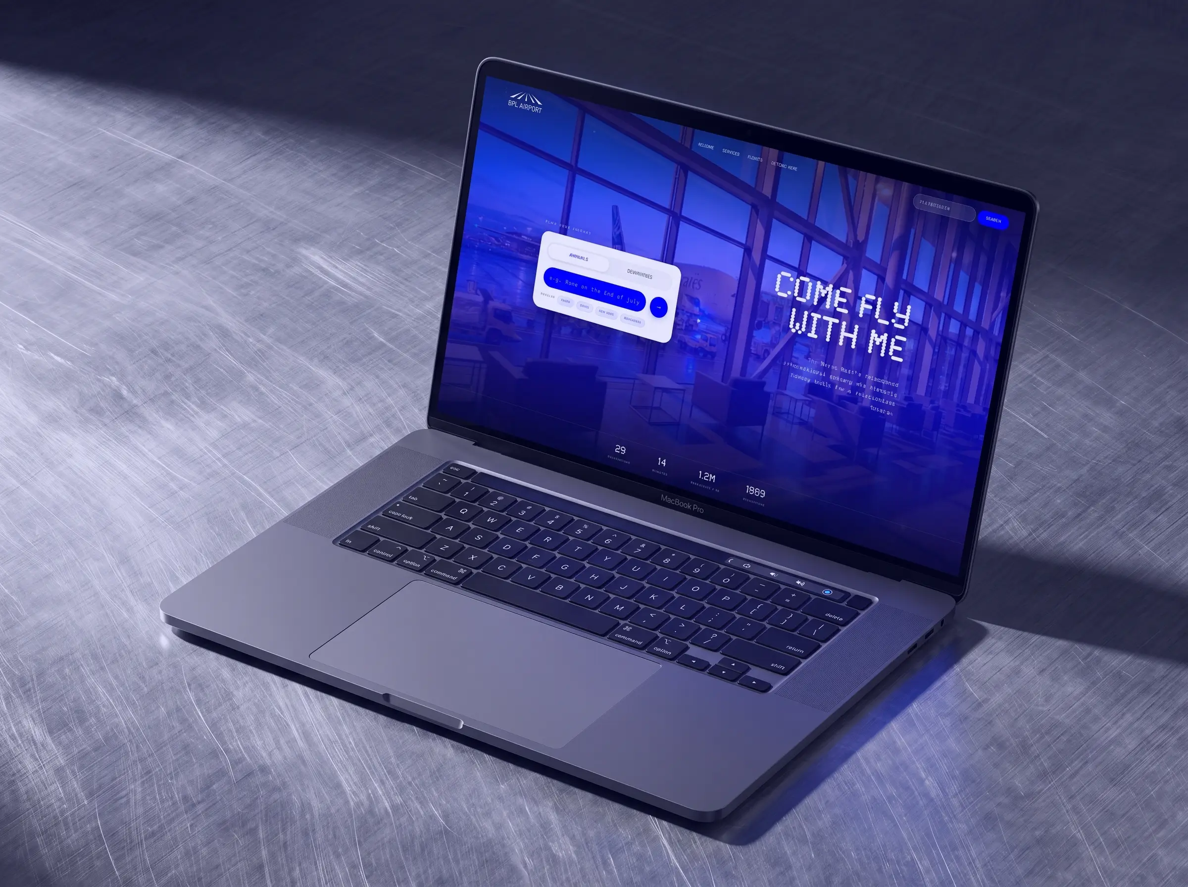
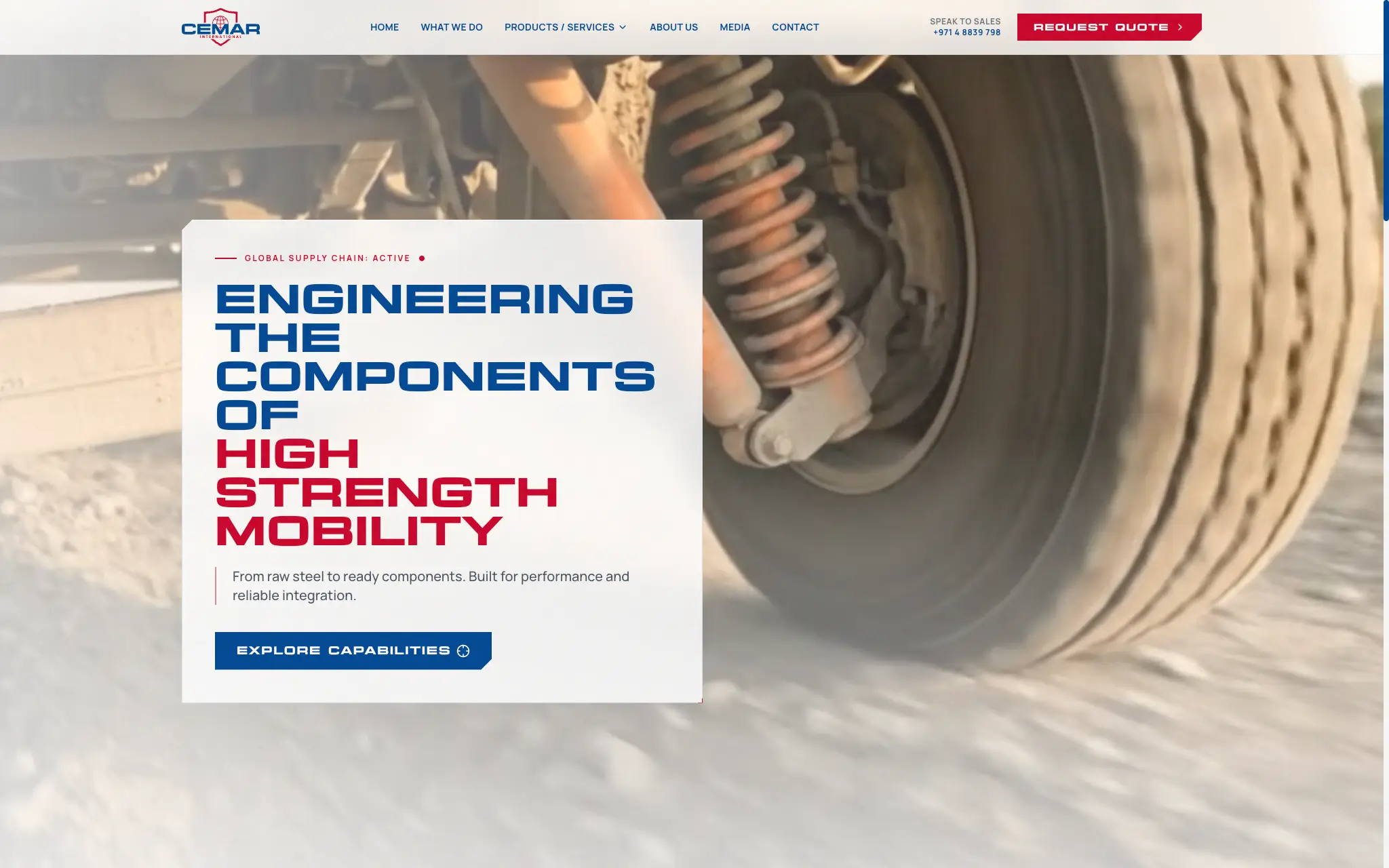
New updated homepage with animated hero section
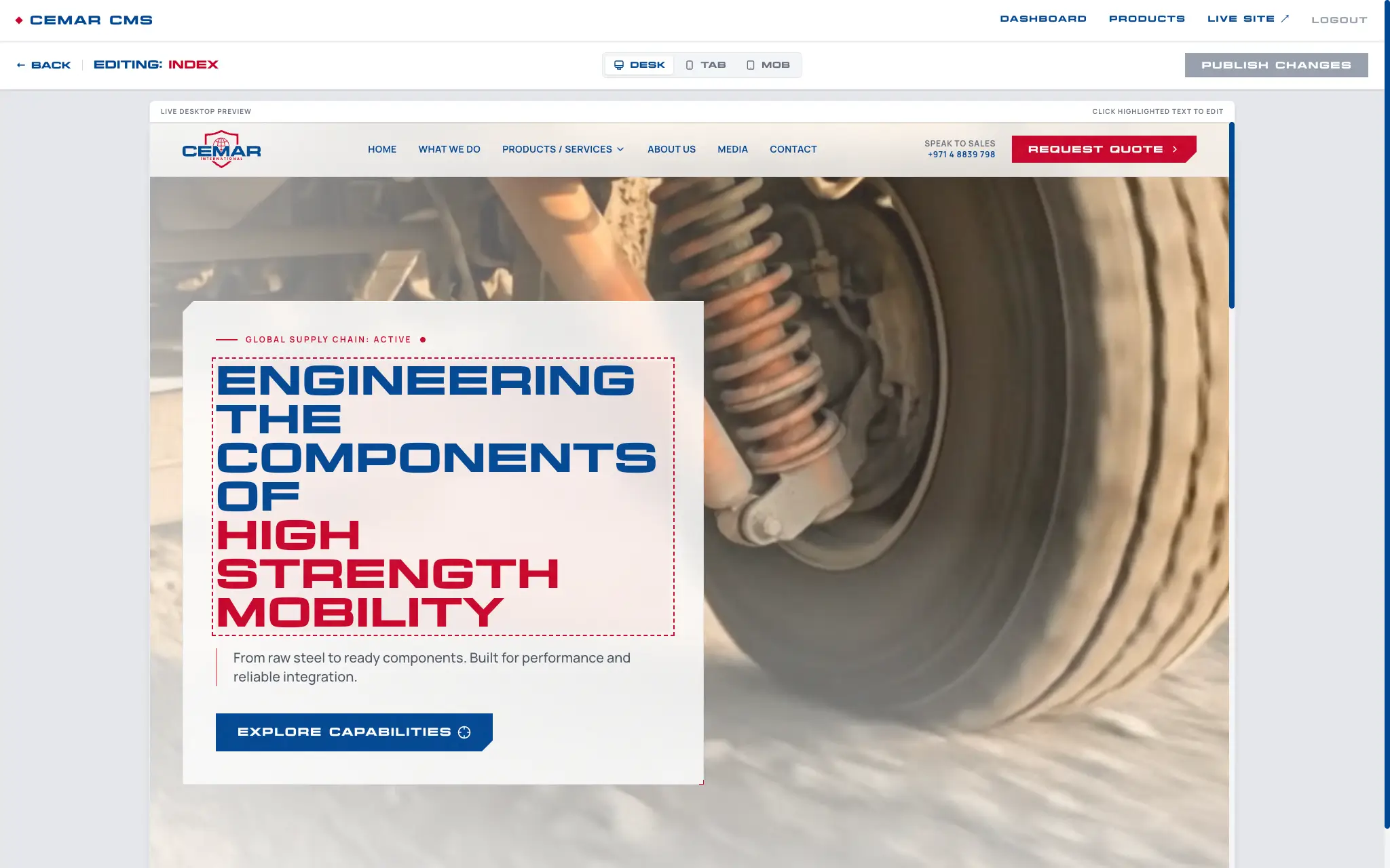
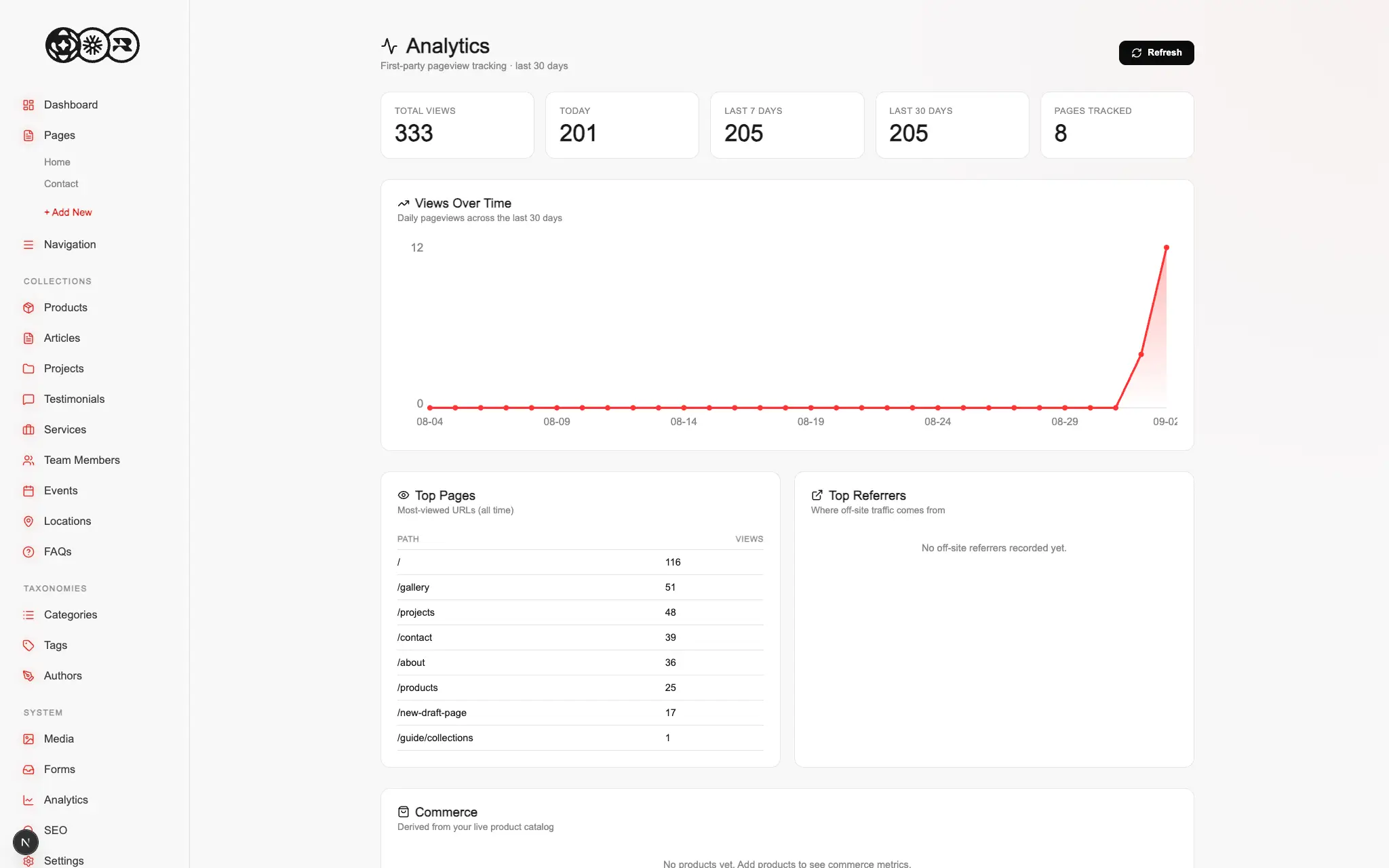
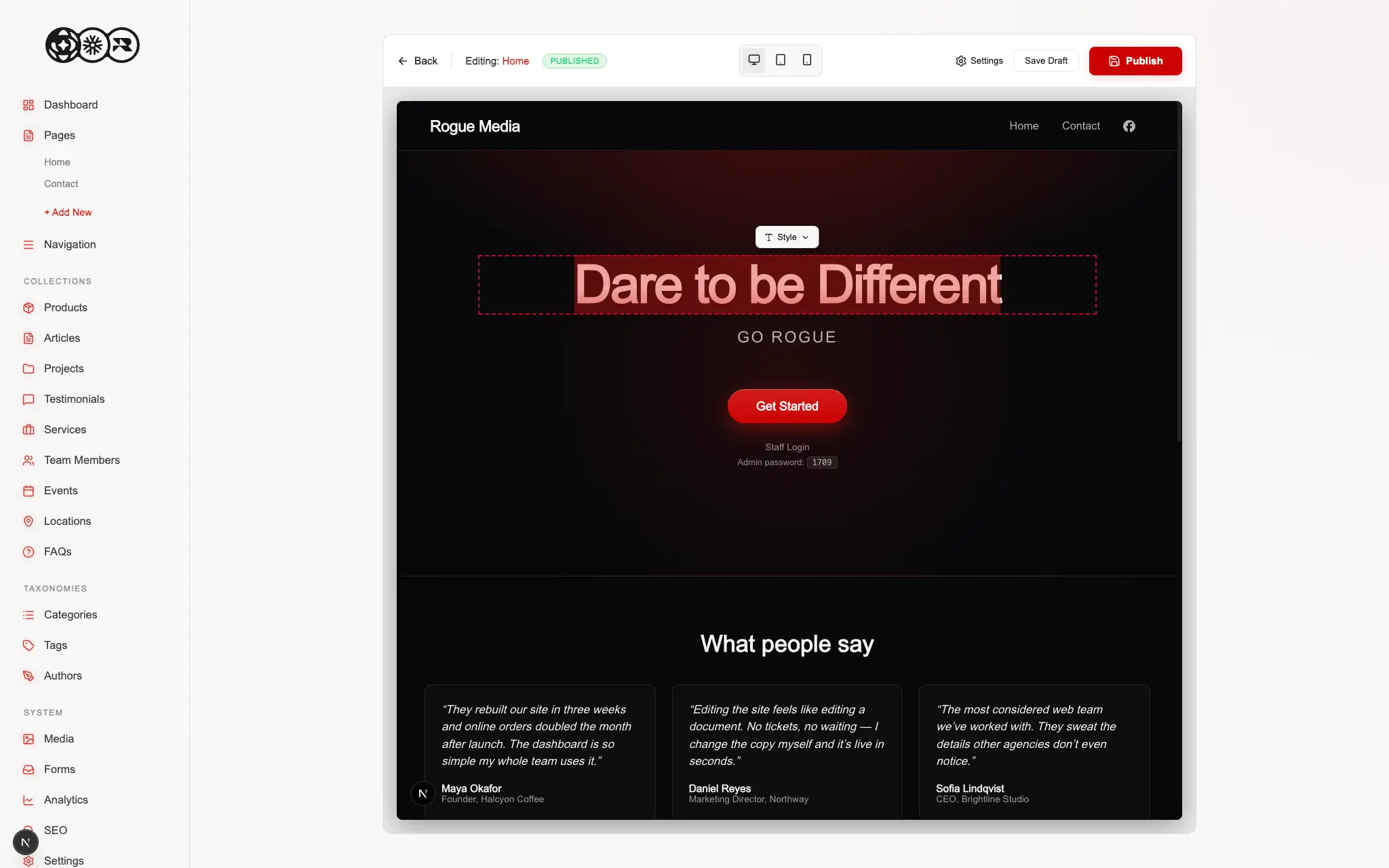
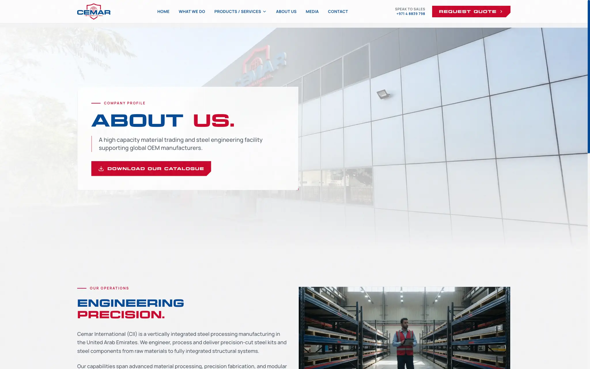
A look at the landing page inside the custom CMS page editor
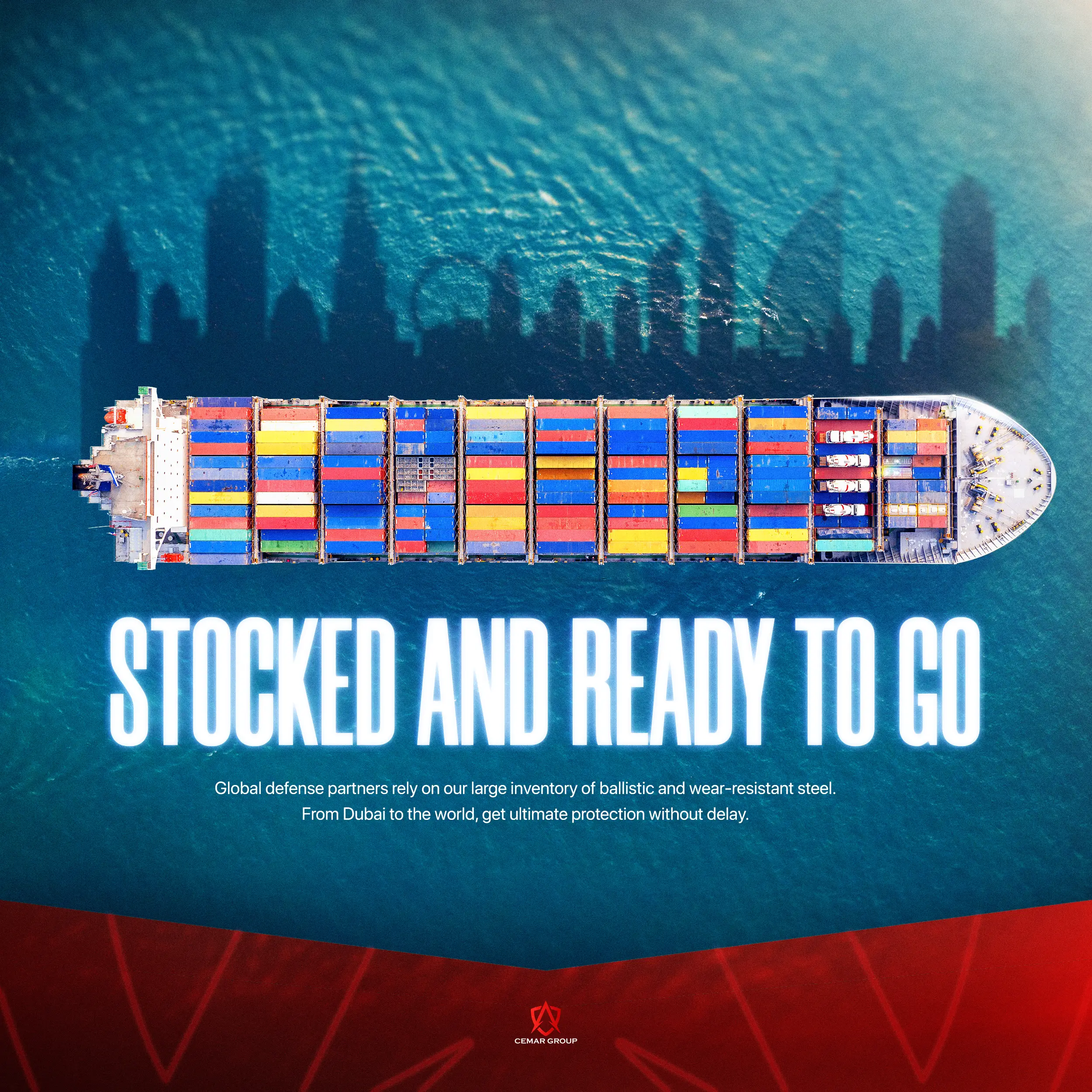
Cemar International operates at the highest levels of the defense and manufacturing sectors, producing armored vehicles, specialized glass, and industrial steel out of Dubai. The issue was that their digital presence completely failed to reflect the scale and precision of their physical operations. Their legacy website was rigid and outdated, creating a massive bottleneck whenever their internal team needed to update a highly complex and expanding product catalog for global defense clients.
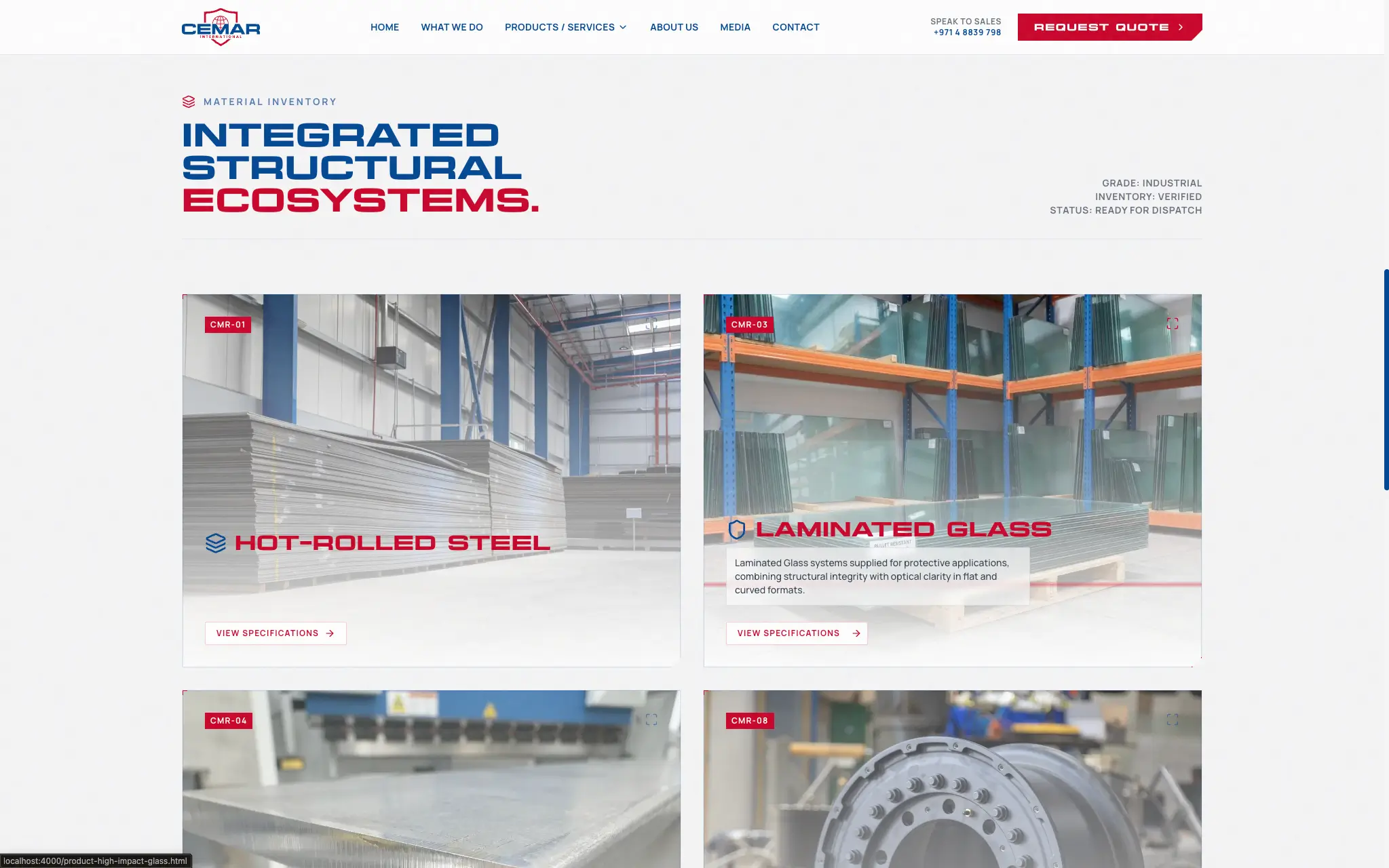
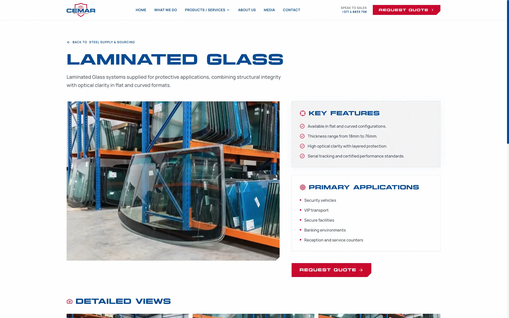
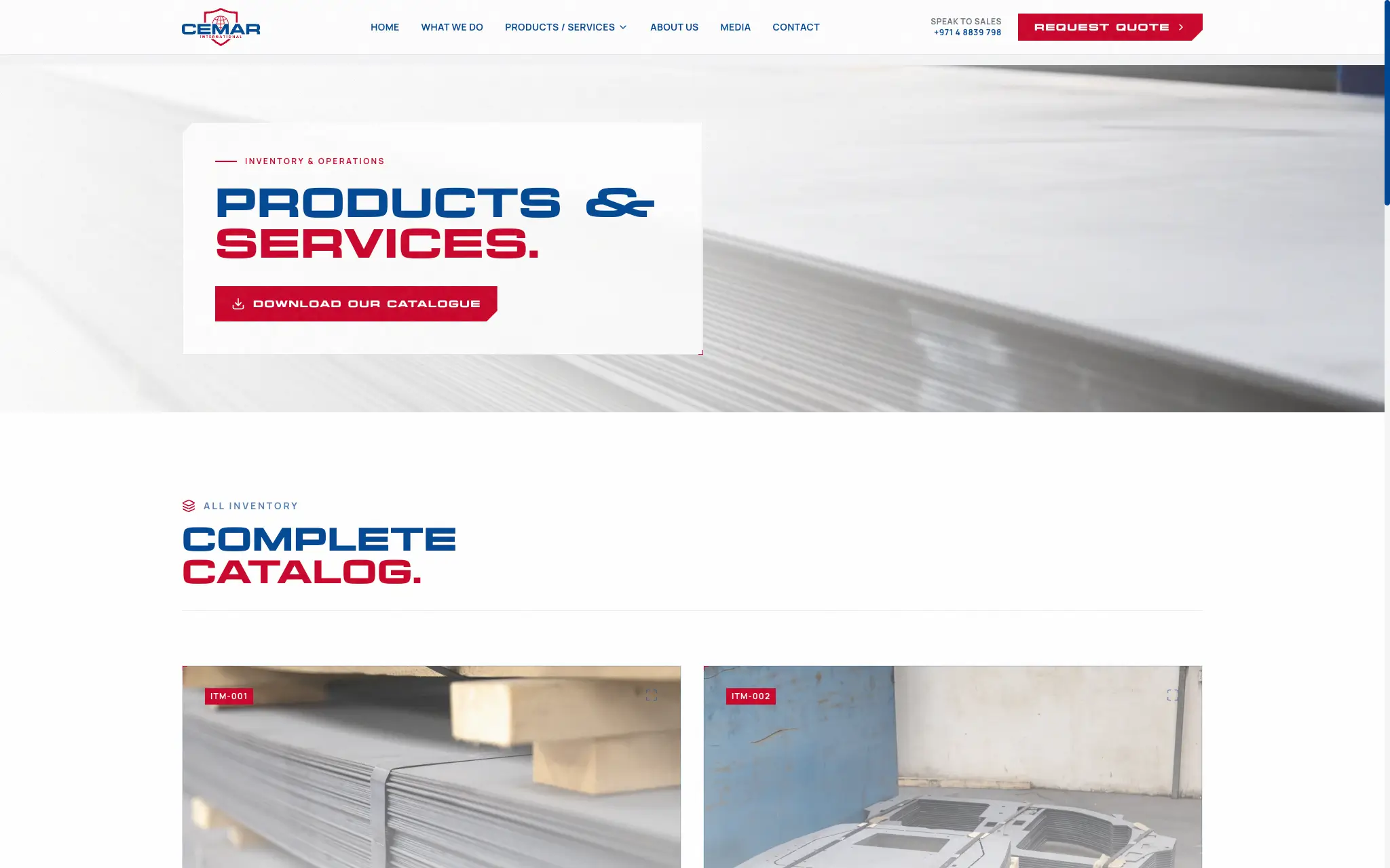
We scrapped the outdated architecture and built a completely new platform from the ground up to match their industry reputation. At the core of this upgrade was a custom content management system engineered specifically around their unique inventory needs. This new backend gave their team complete and expert control over their entire product catalogue, allowing them to instantly manage technical specifications, high-resolution media, and categorized data for their vehicles and materials without needing to call a developer for every minor change.
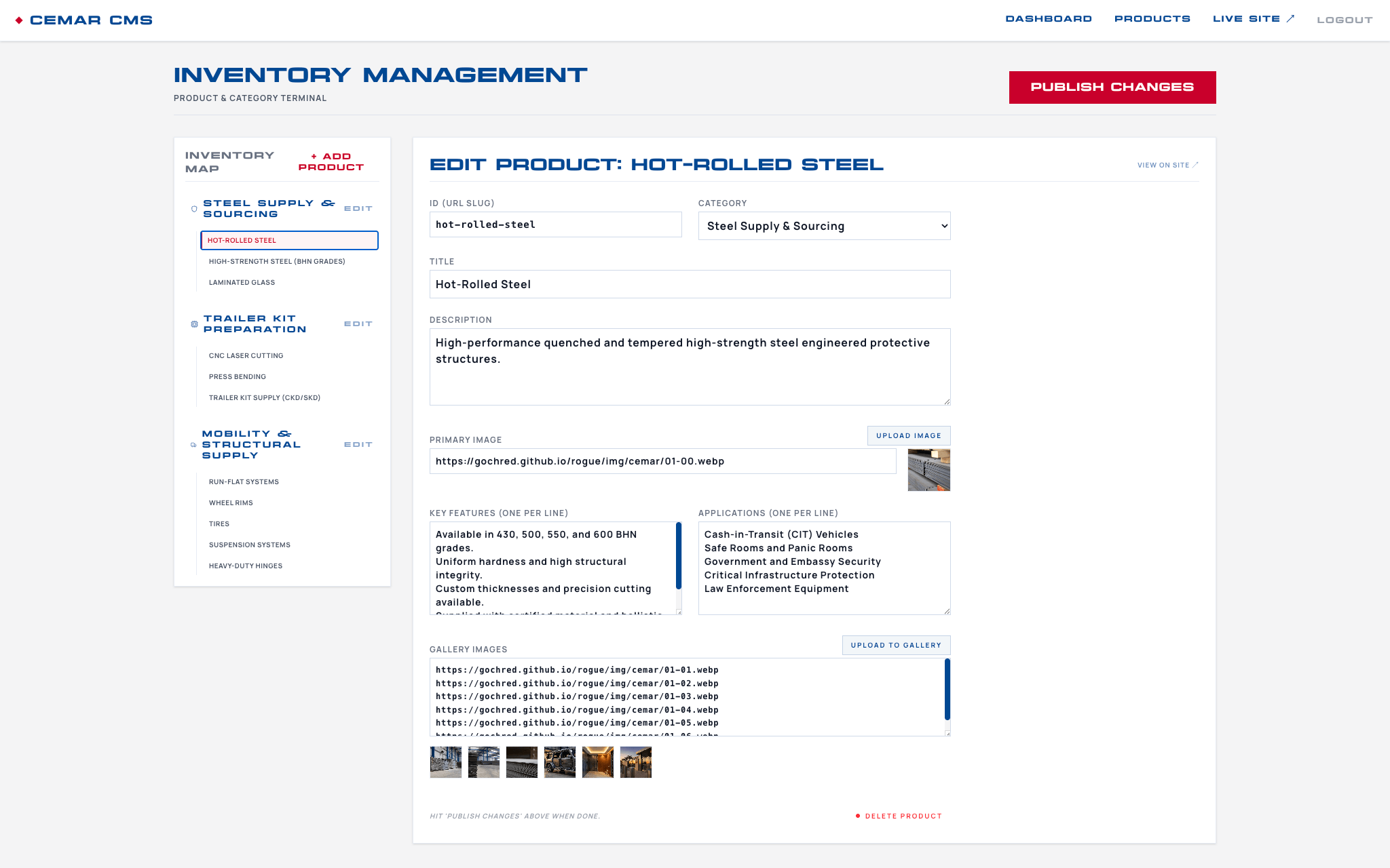
Editing products & services inside the CMS couldn't be easier and designed just for this project
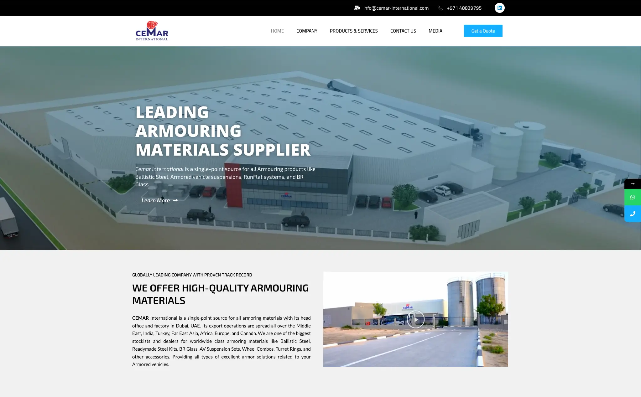
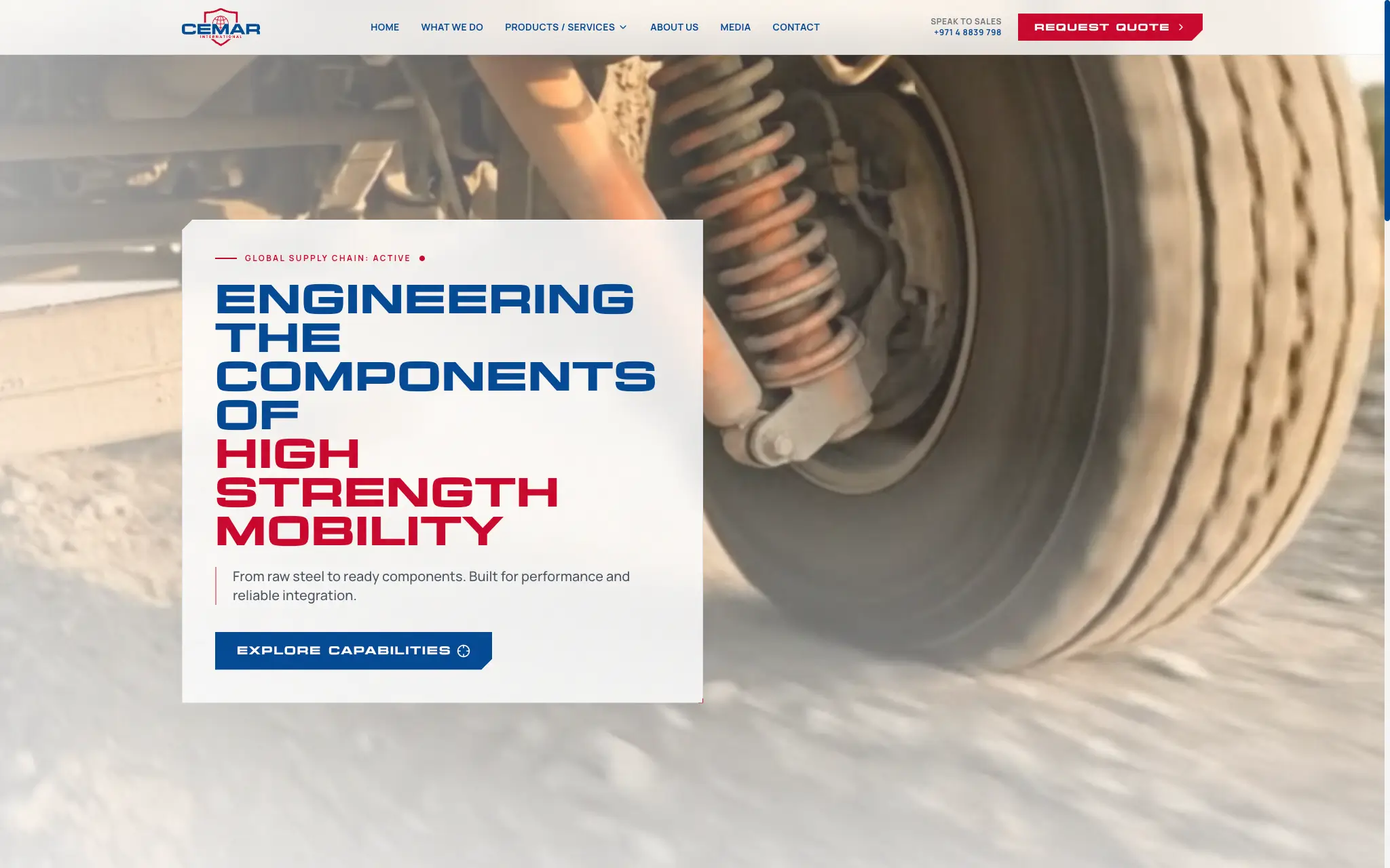
A view of the old website before we gutted the house
The build process focused on translating their heavy industrial output into a sleek and highly secure digital experience. We mapped out the complicated relationships between their steel, glass, and defense divisions to create a completely intuitive front-end catalog structure. From there, we developed a tailored administrative interface that requires absolutely zero technical training for their staff to operate. The final result is a high-performance website that positions them as a dominant force in the region while making day-to-day inventory management effortless.
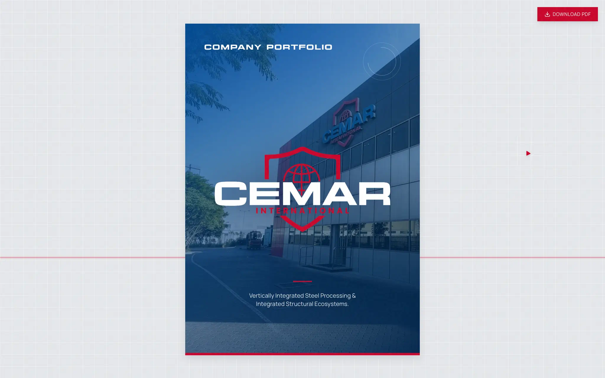
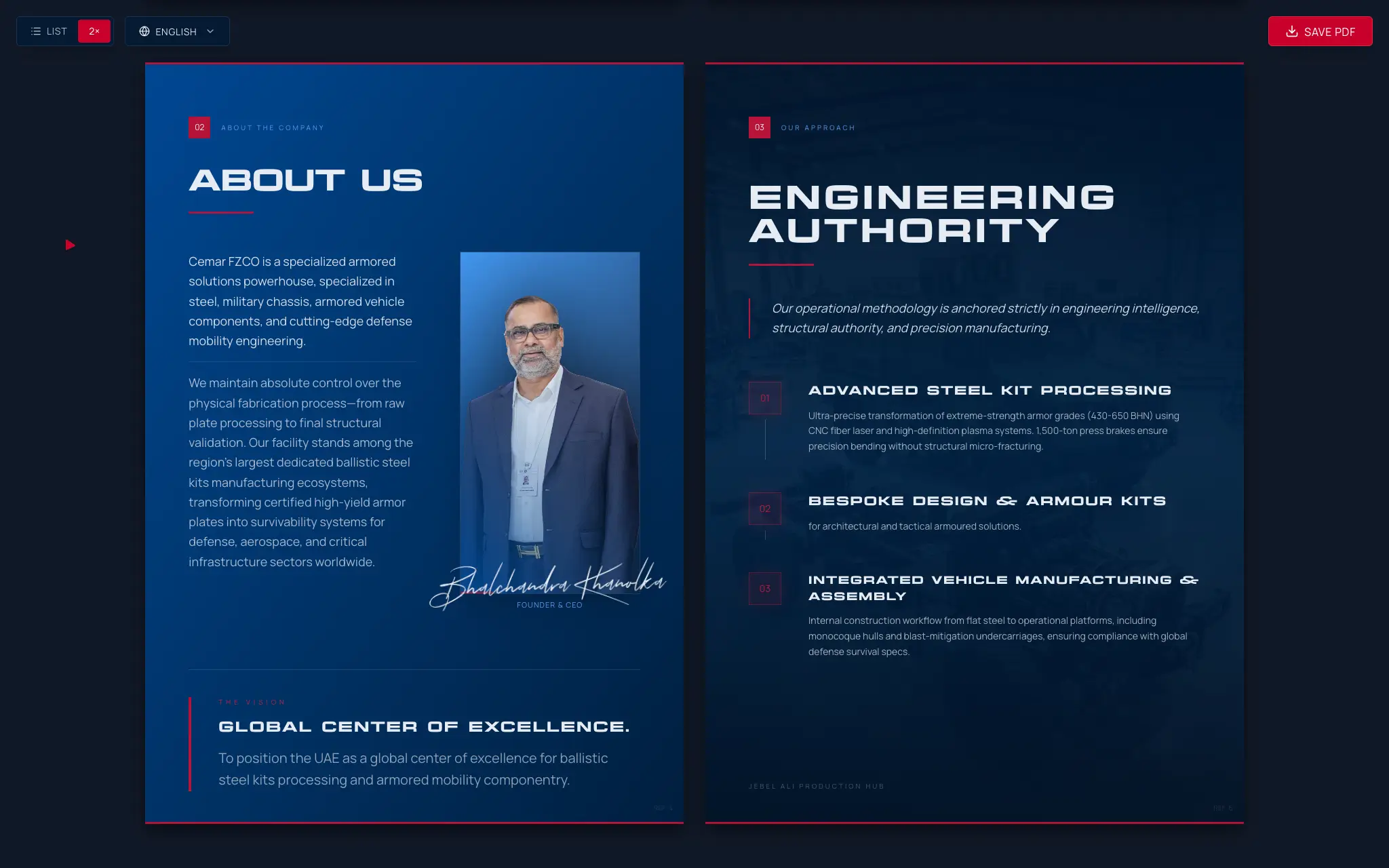
Custom on the fly PDF catelogue presentation, allows for easy updating and instant PDF export ready for printing or emailing to clients
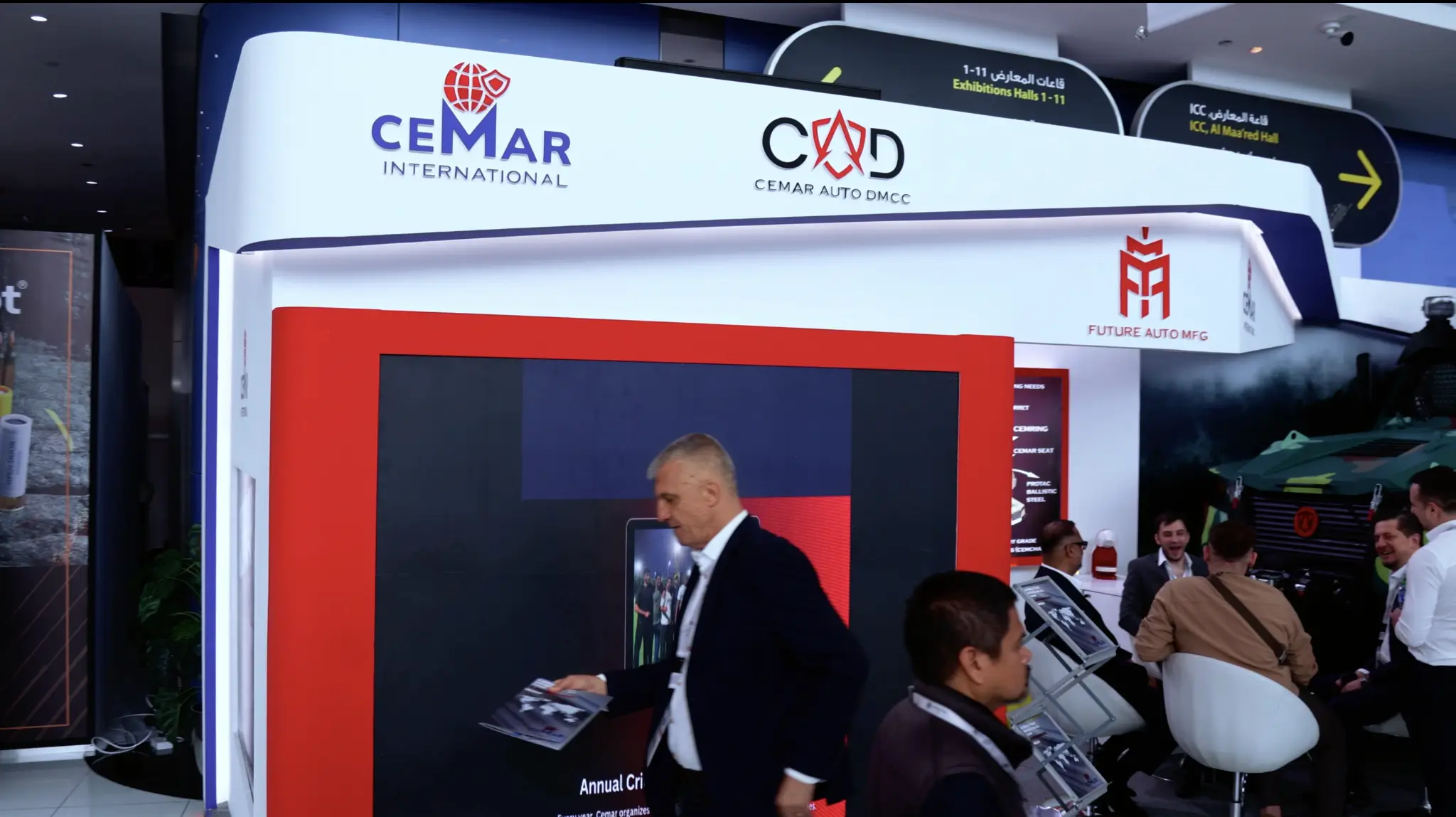
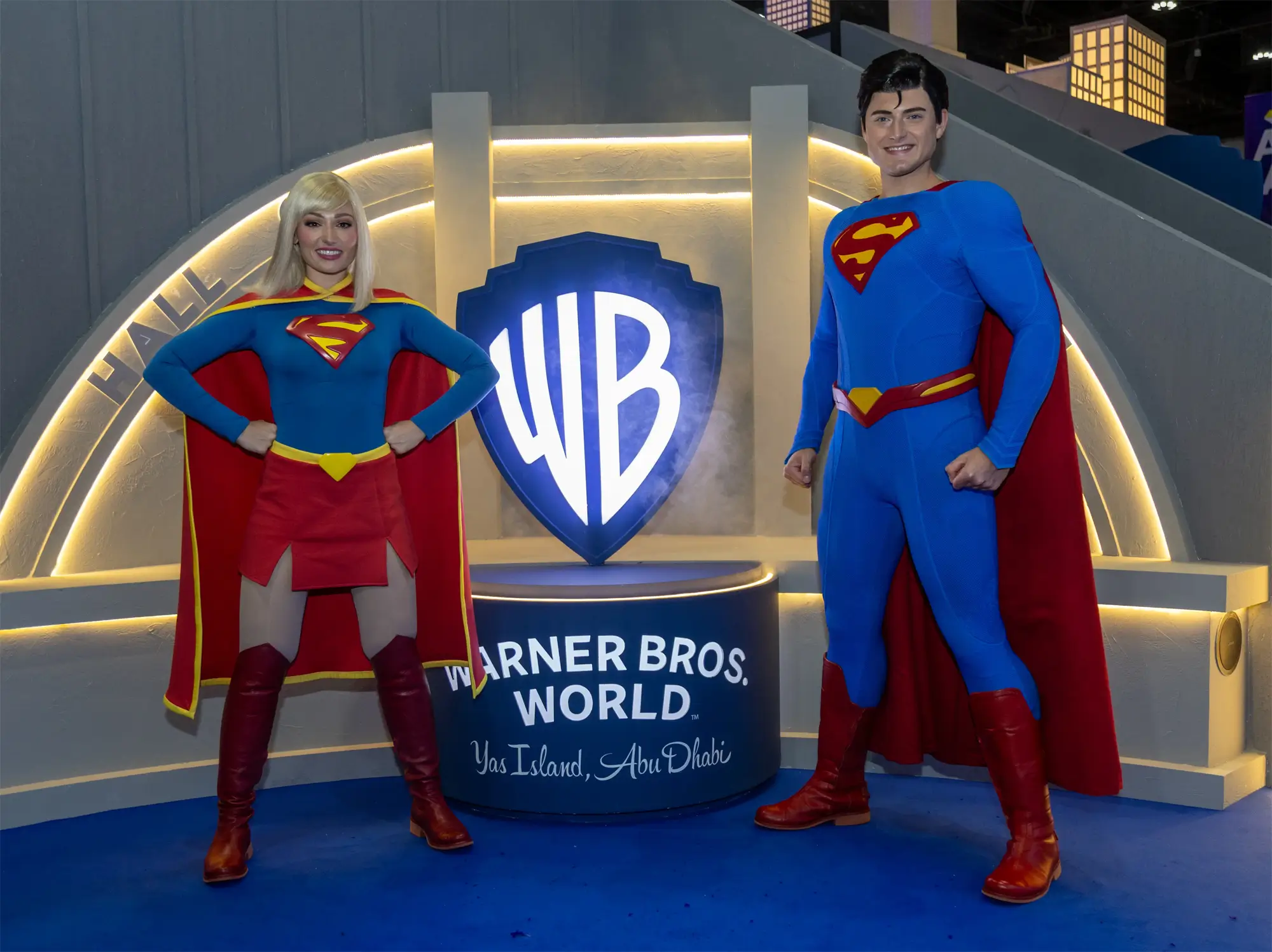
At the region’s premier defense exhibition, our goal was to elevate the Cemar stand above the noise of a massive, high-security B2B environment. We focused on making interviews, interacting with the crowd and facilitated media B-roll with potential partners and customers.
Delivered a comprehensive master asset library and rapid-turnaround wrap videos that Cemar utilized directly for their post-event B2B marketing and stakeholder reporting.
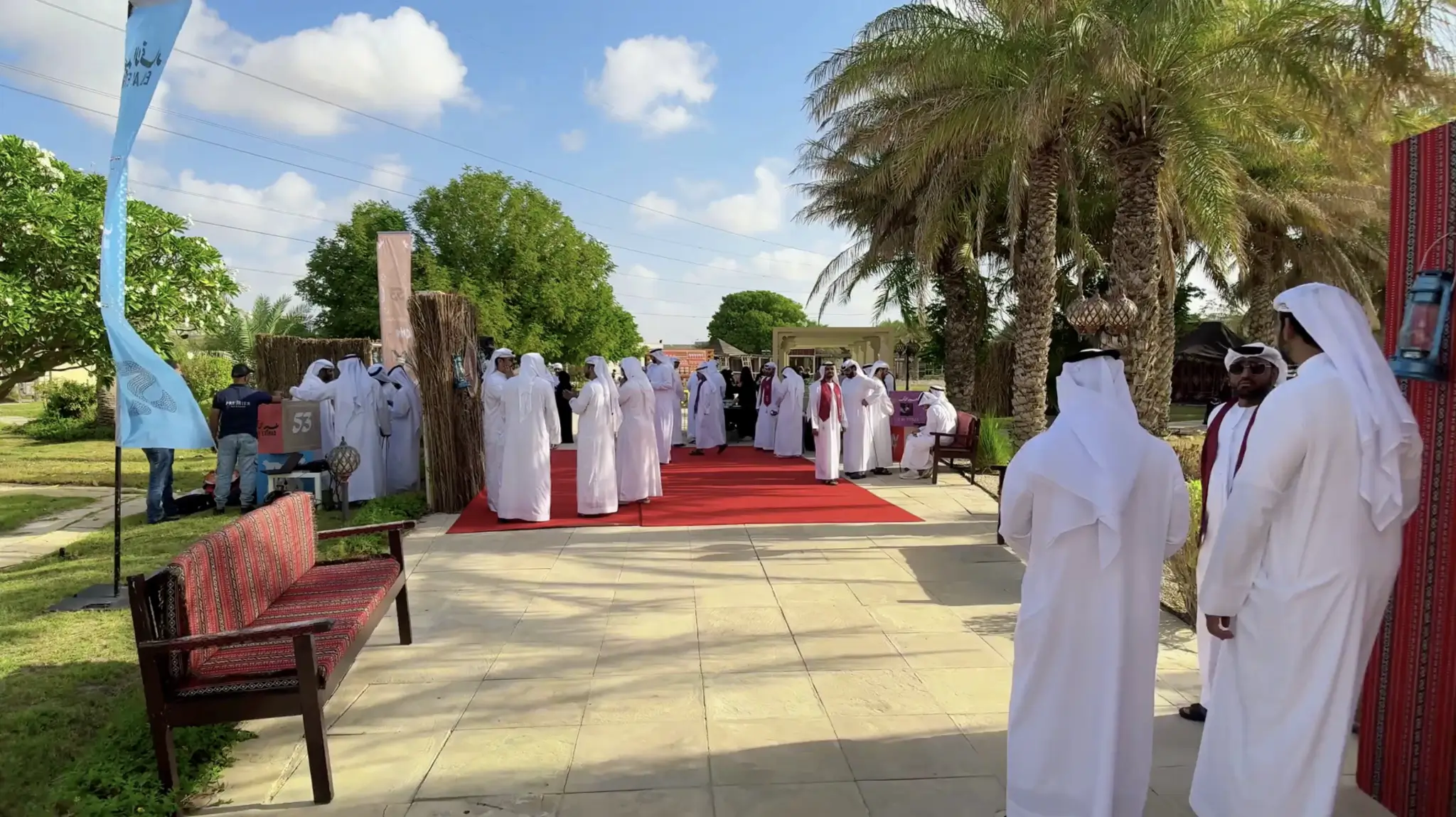
Covering one of the nation's largest cultural events. Our team captured cinematic highlights of live performances, cultural showcases, and large-scale crowd celebrations.
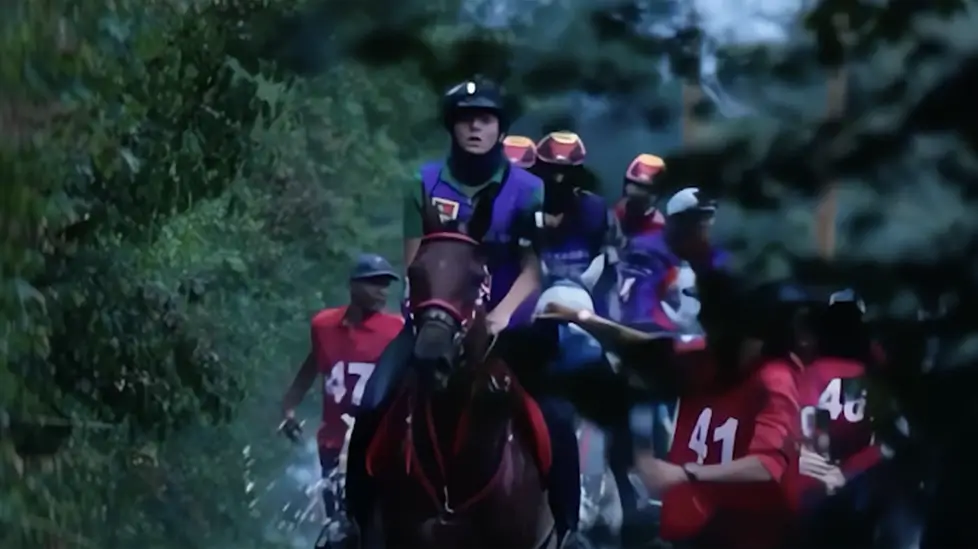
Elite national and international equestrian sports and racing events. Capturing these events requires high-speed action tracking, precision timing, and navigating prestige VIP and royal protocols.
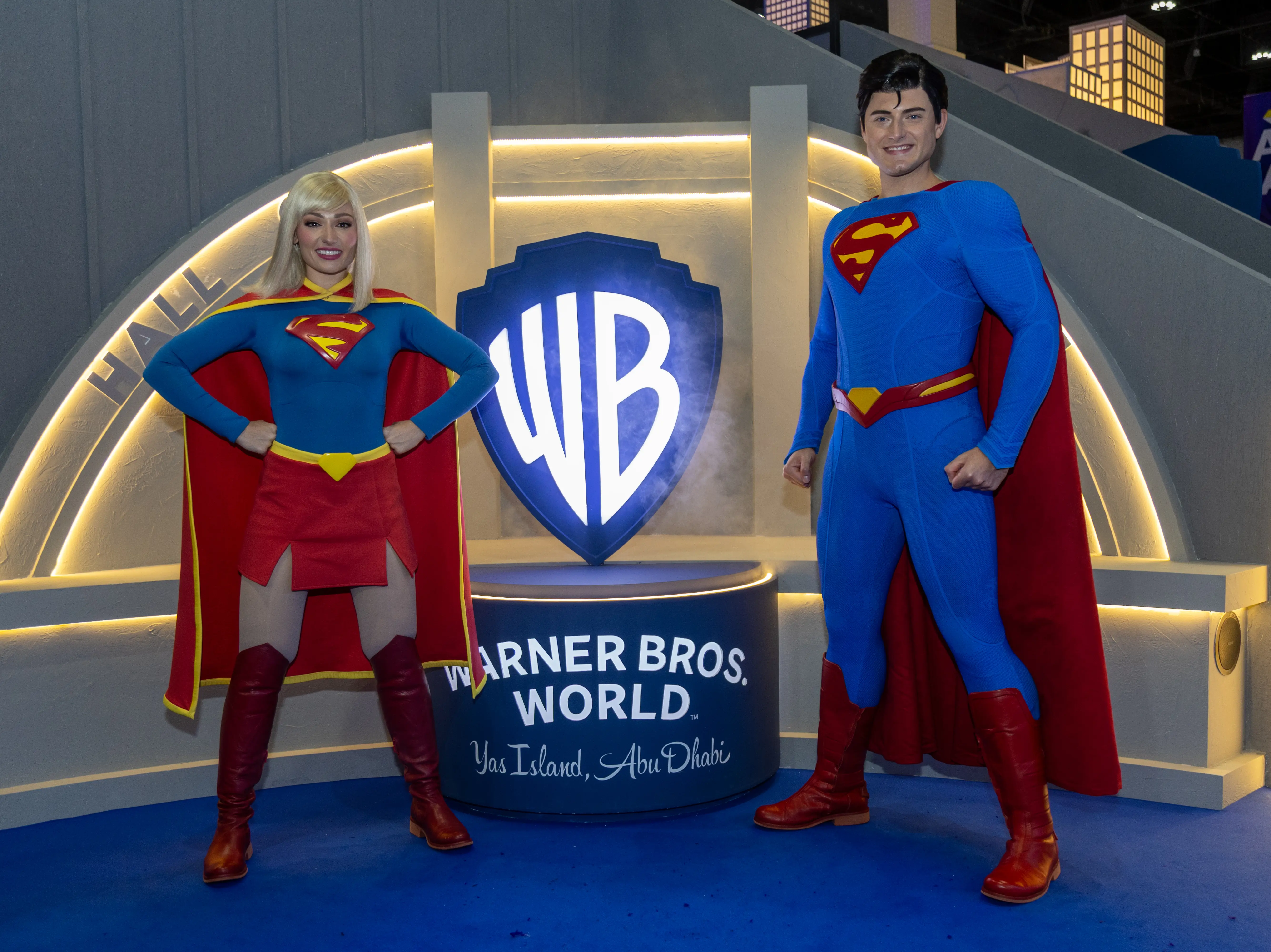
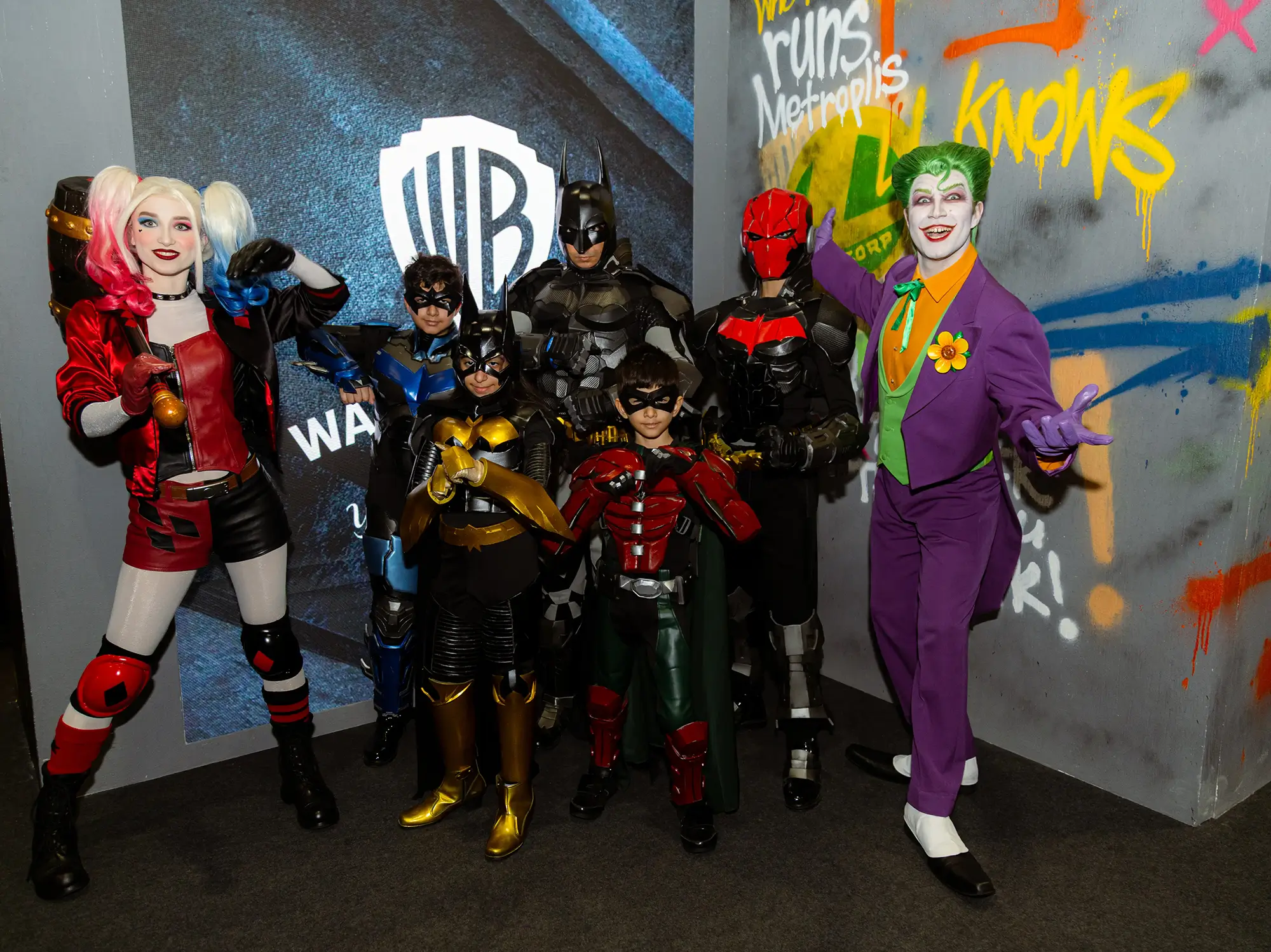
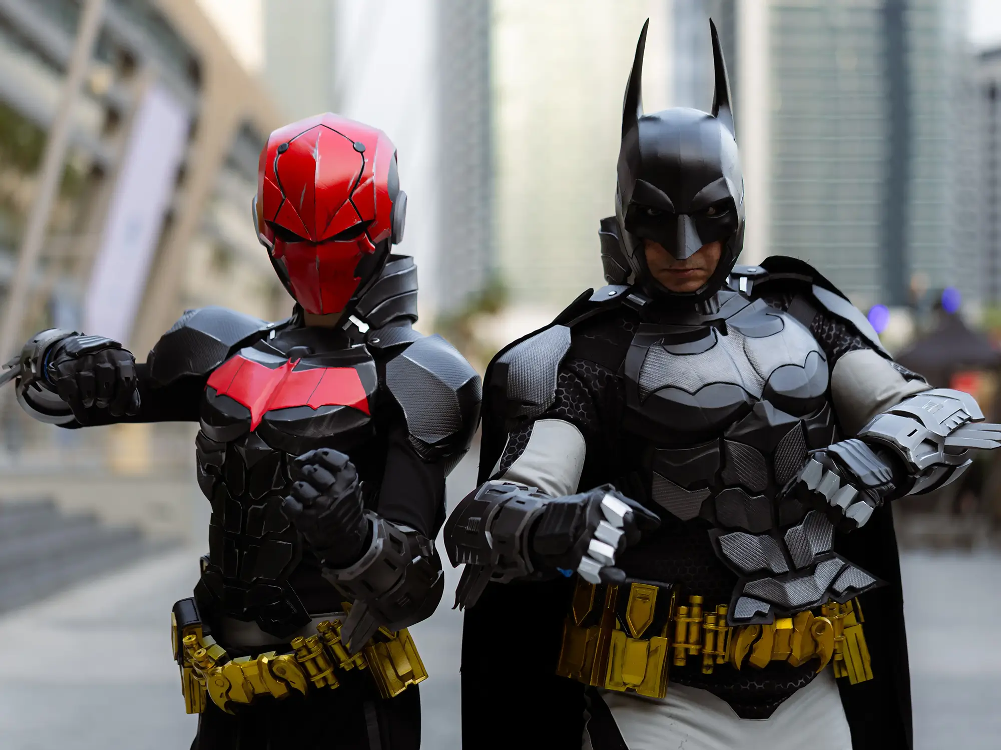
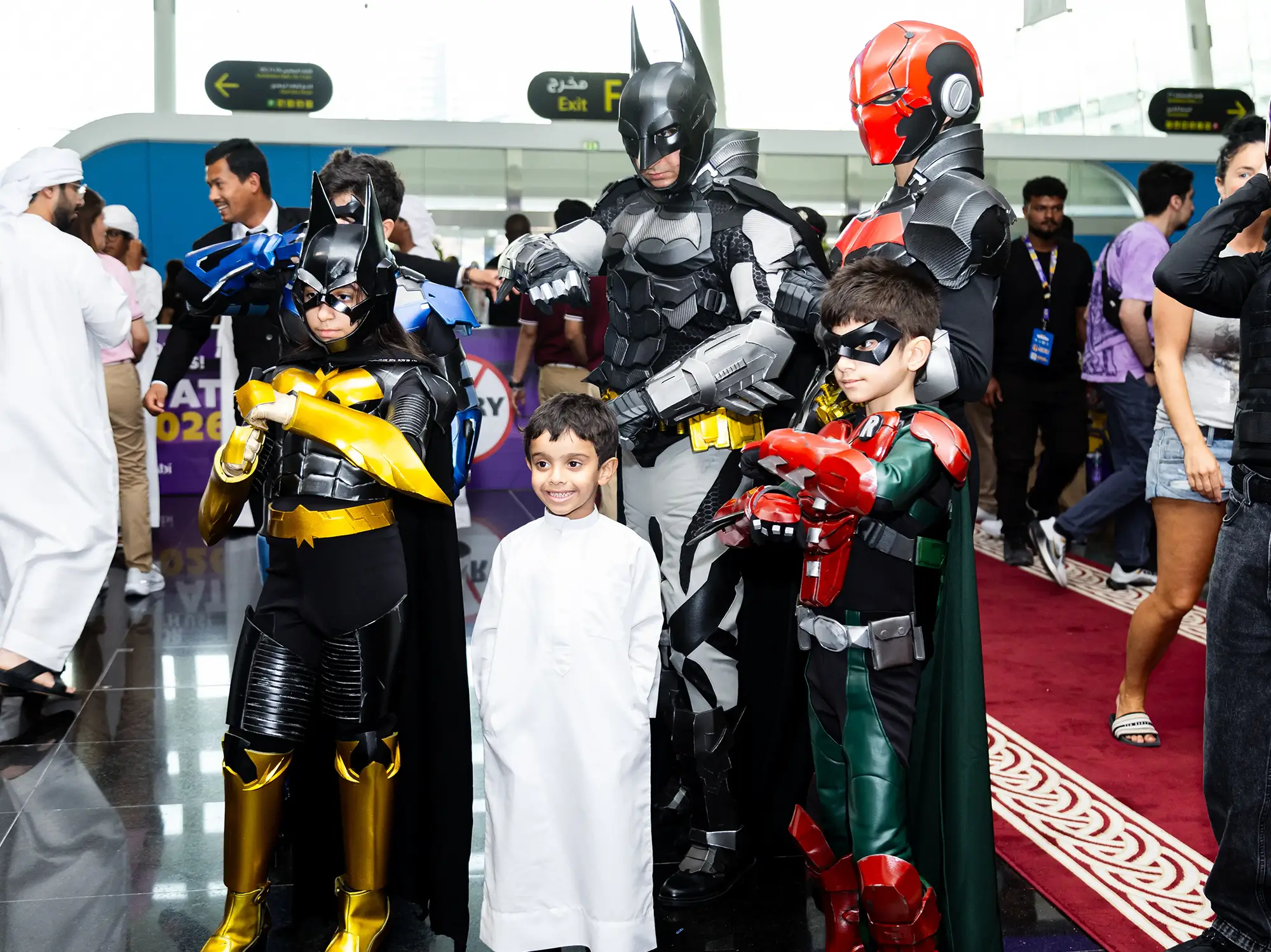
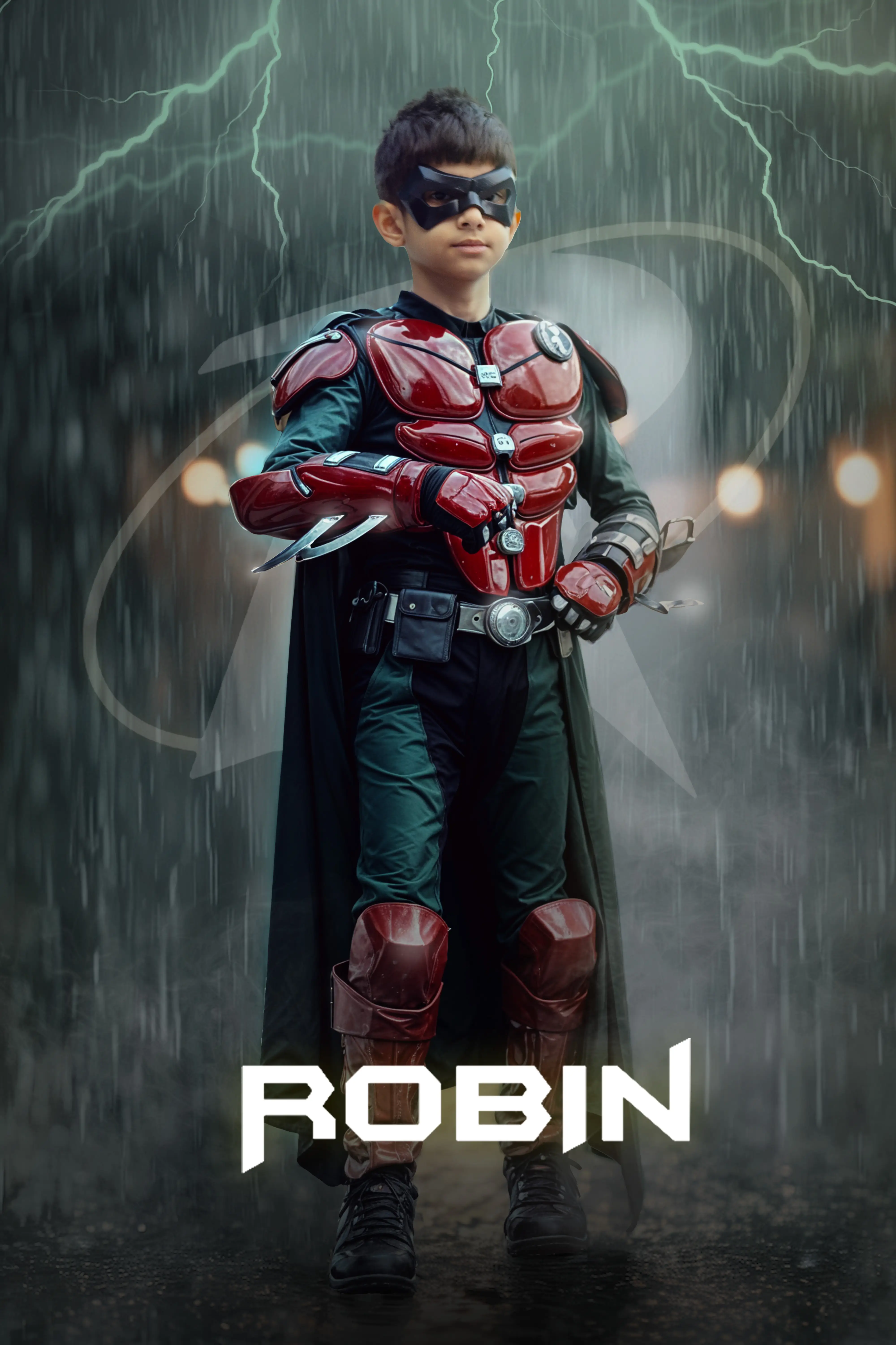
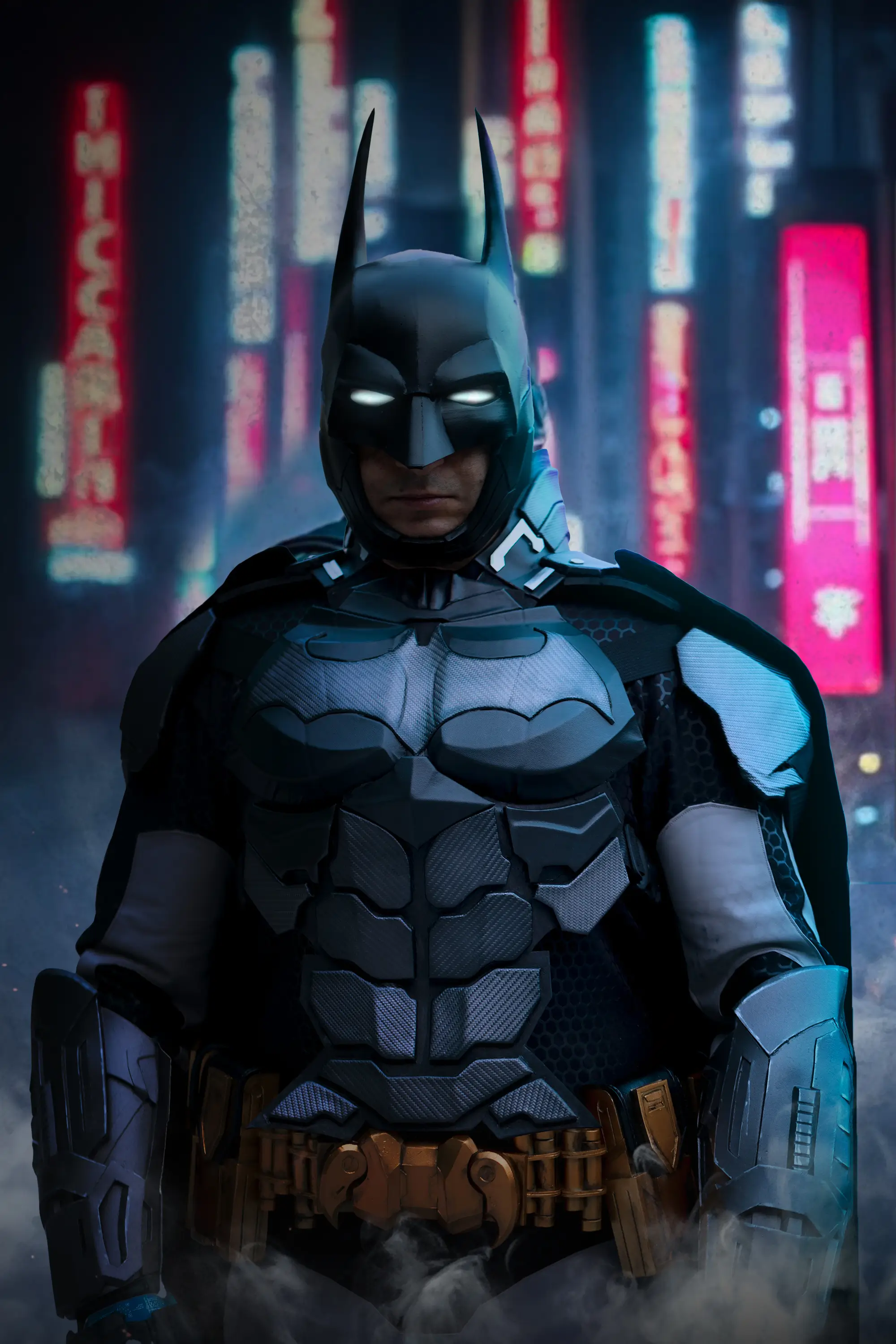
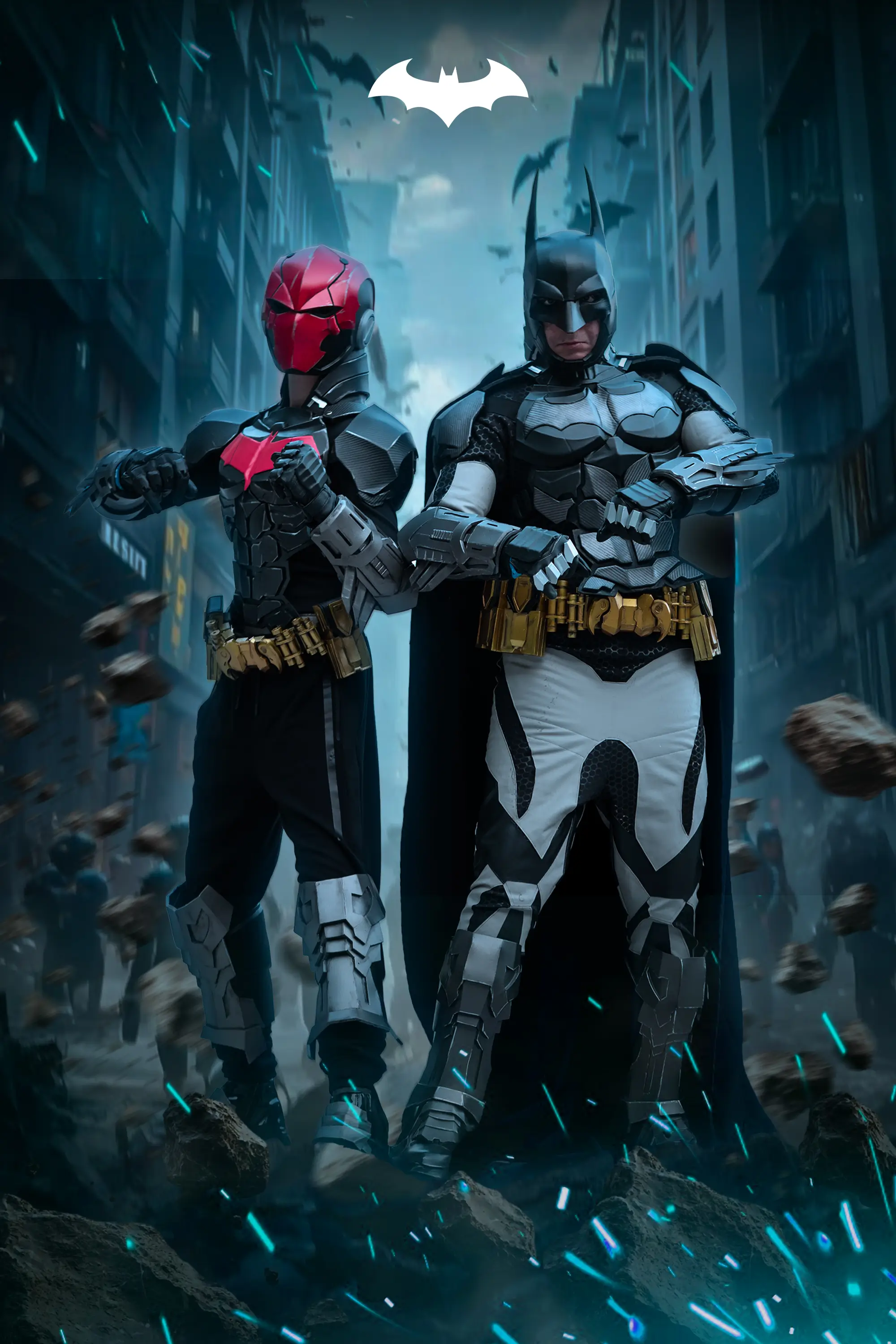
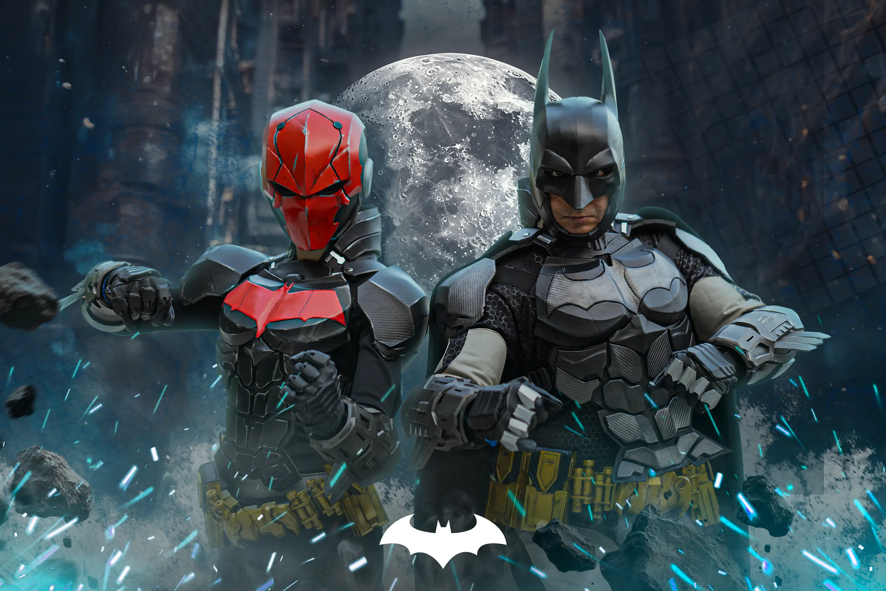
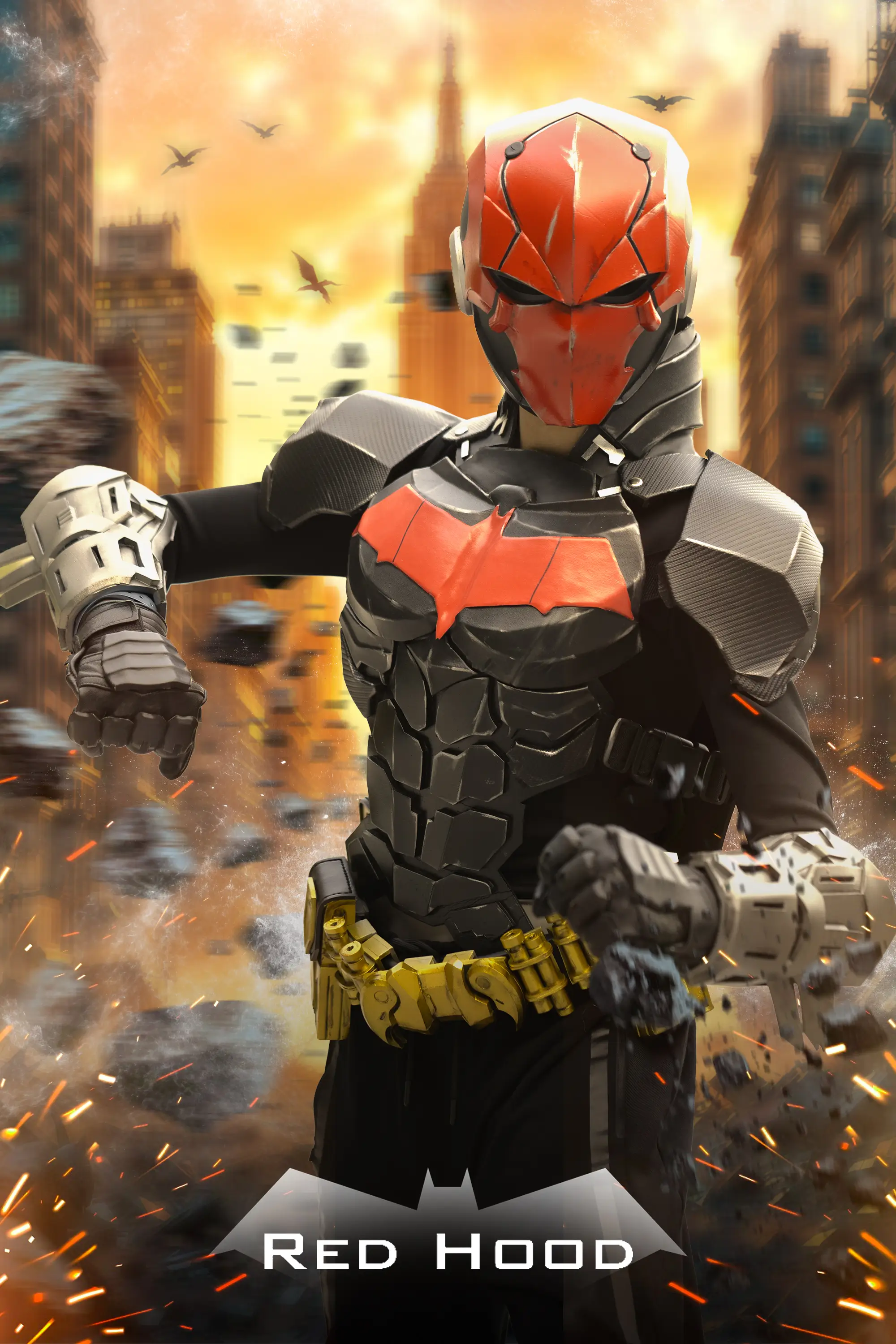
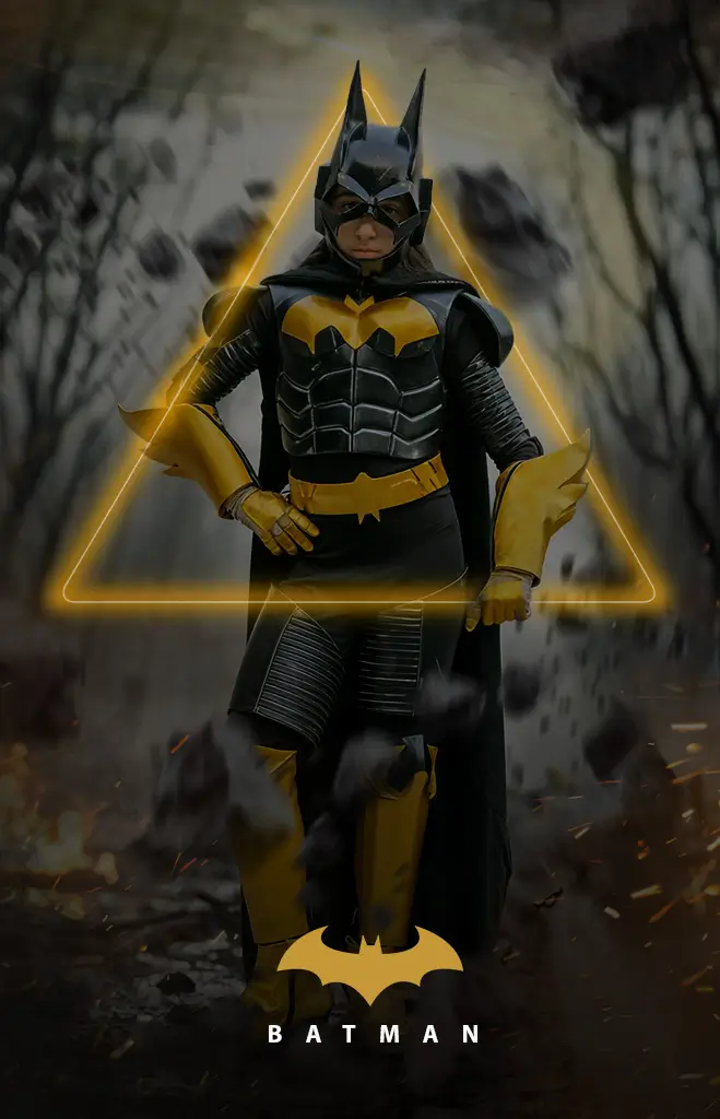
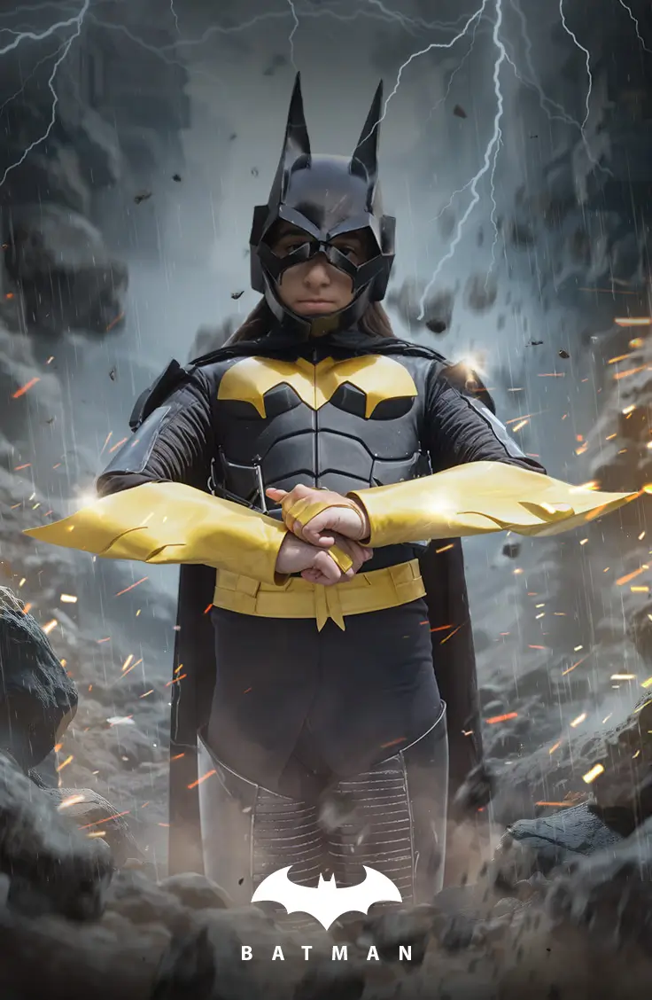
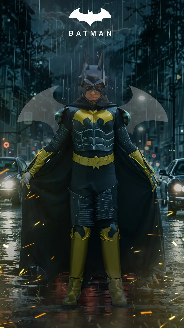
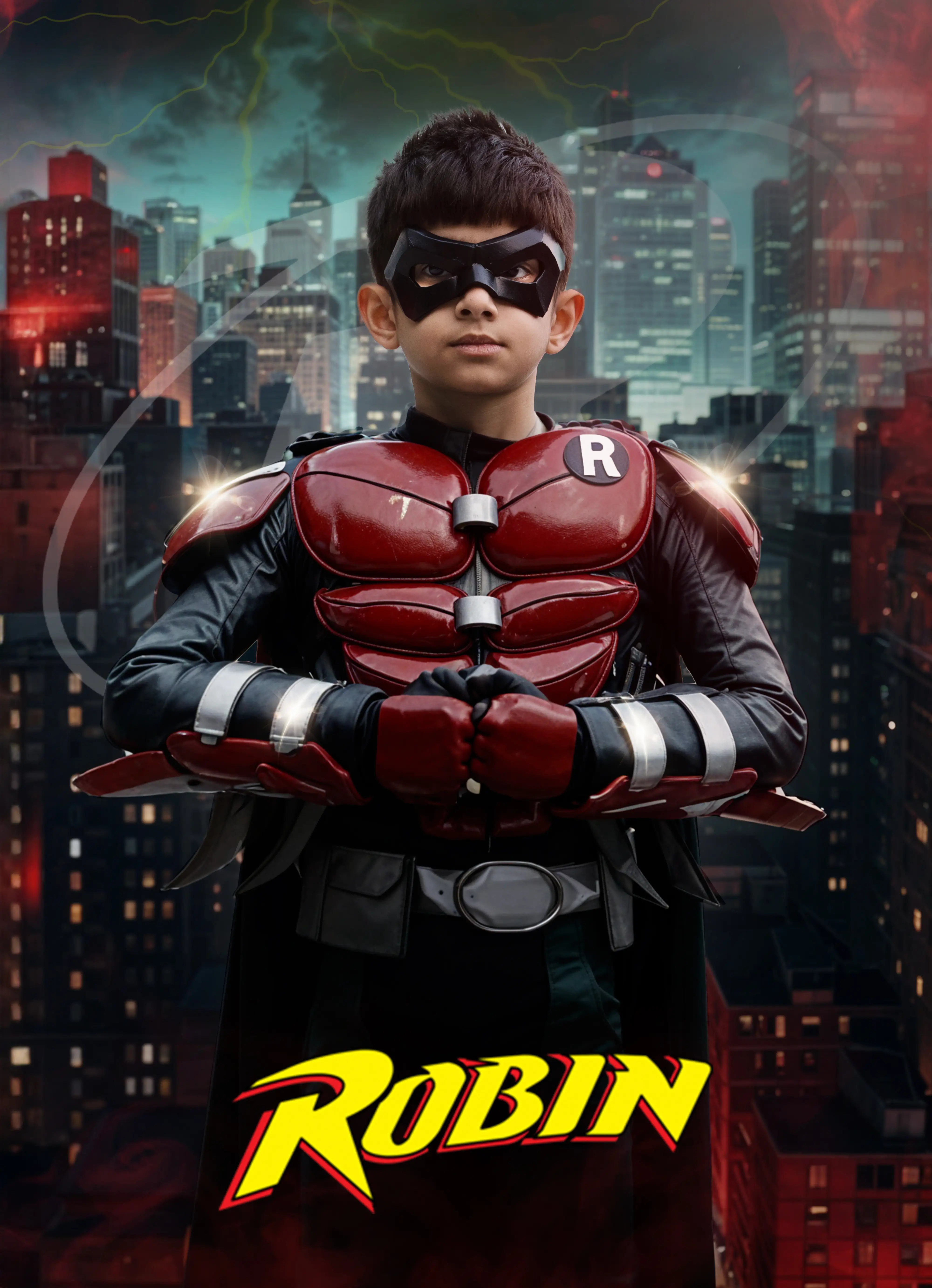
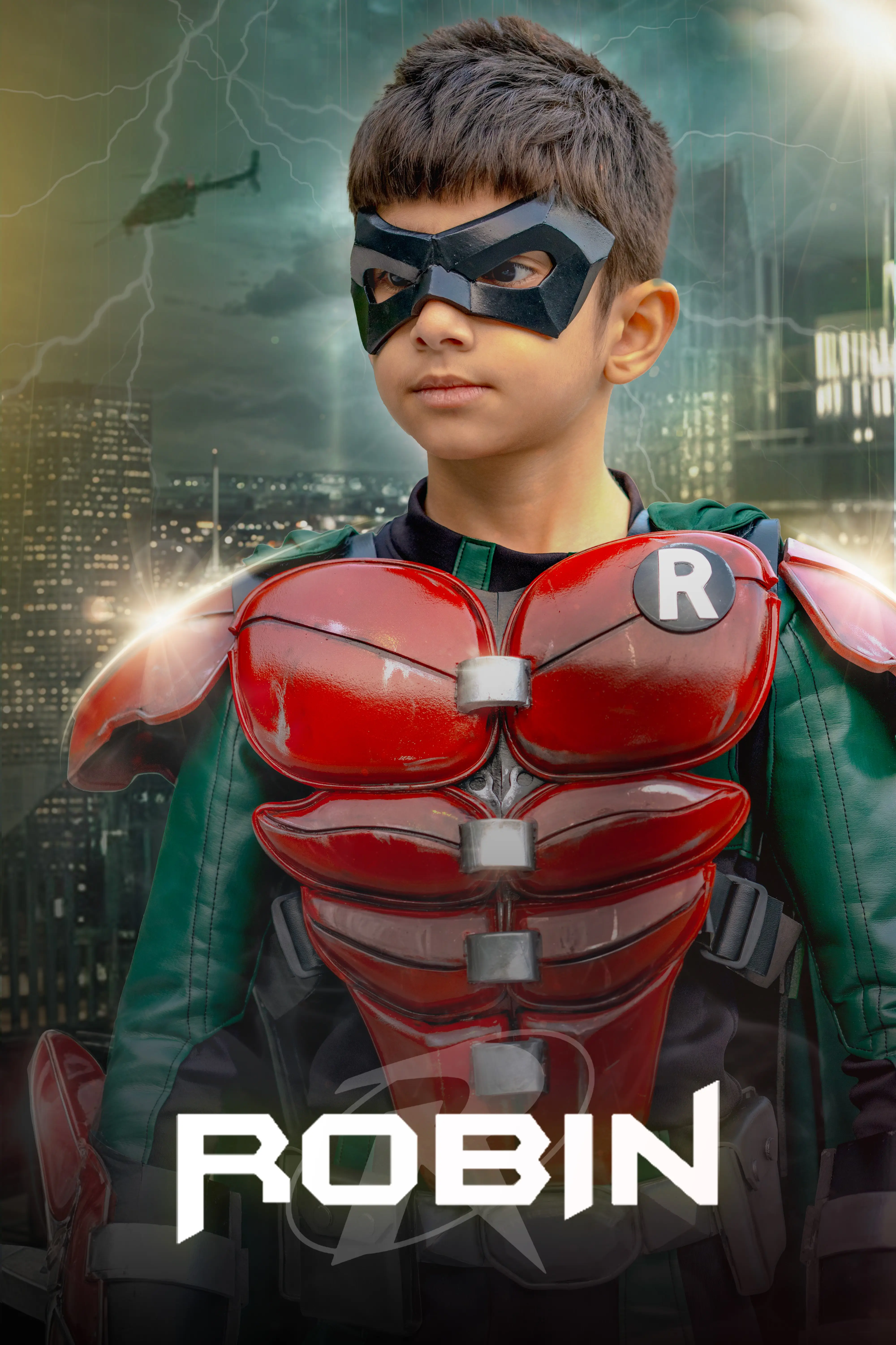
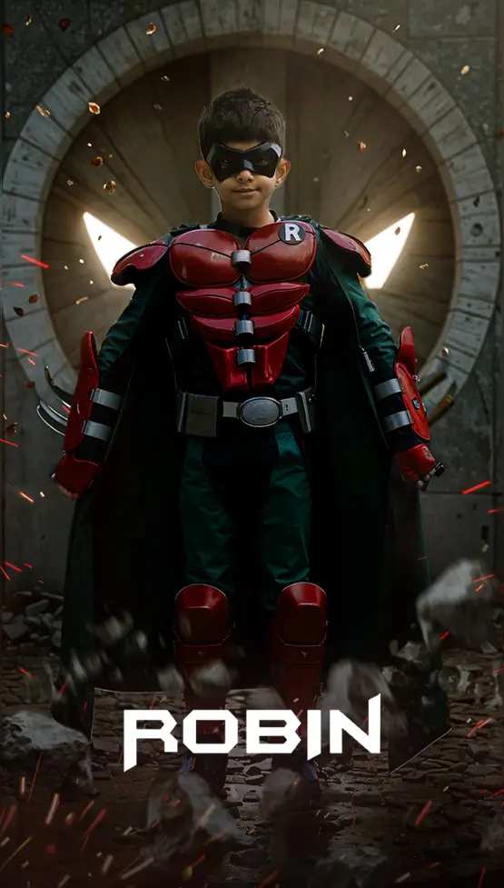
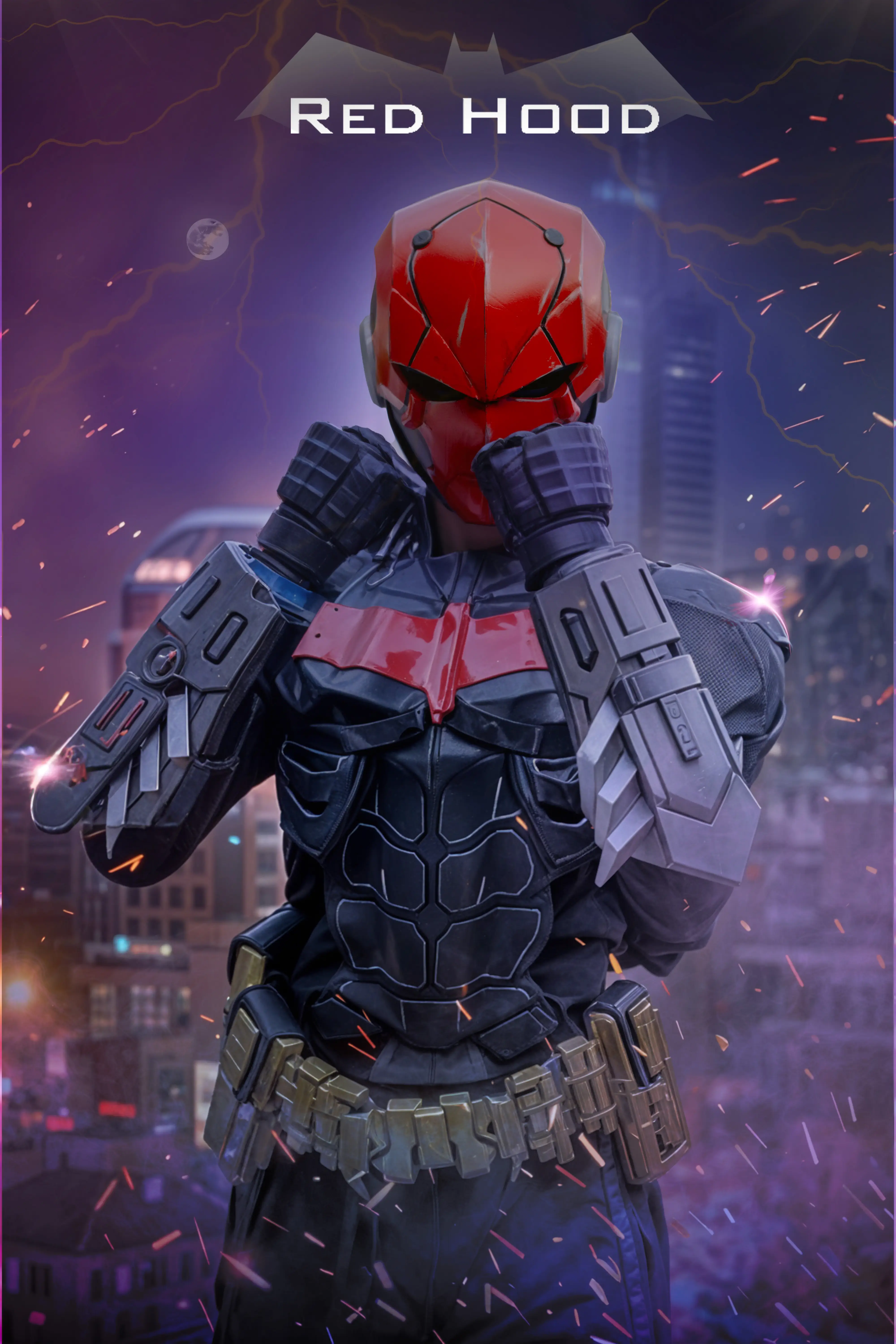
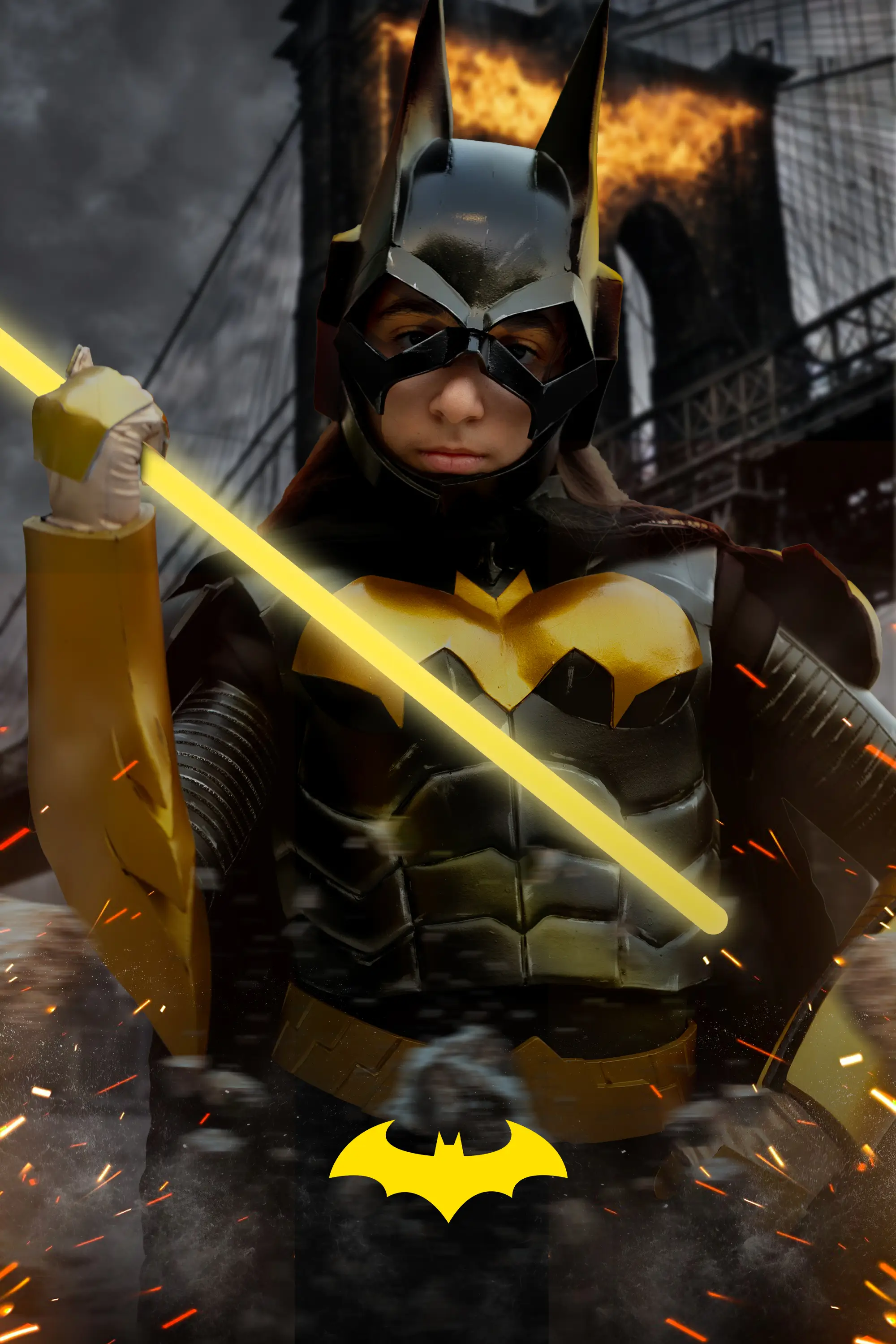
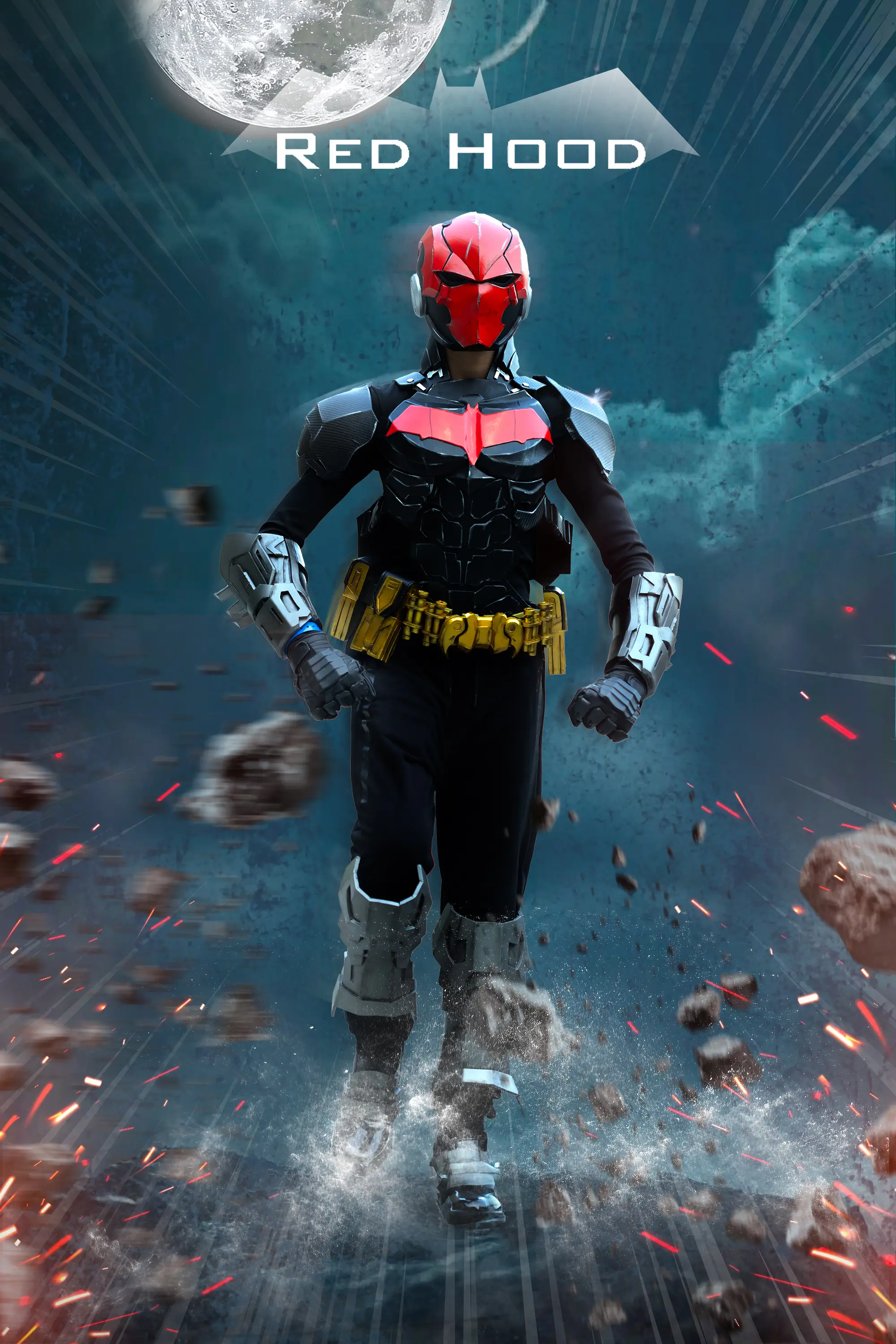
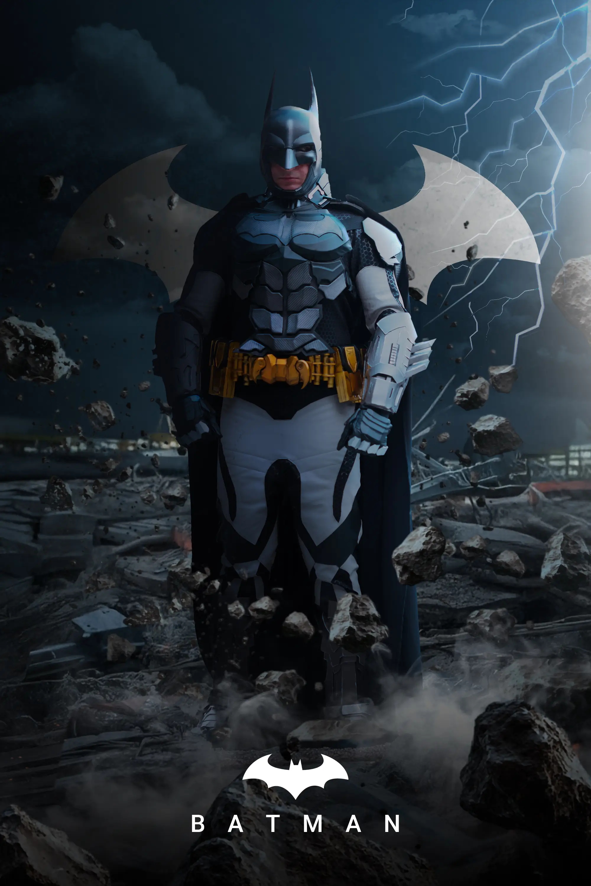
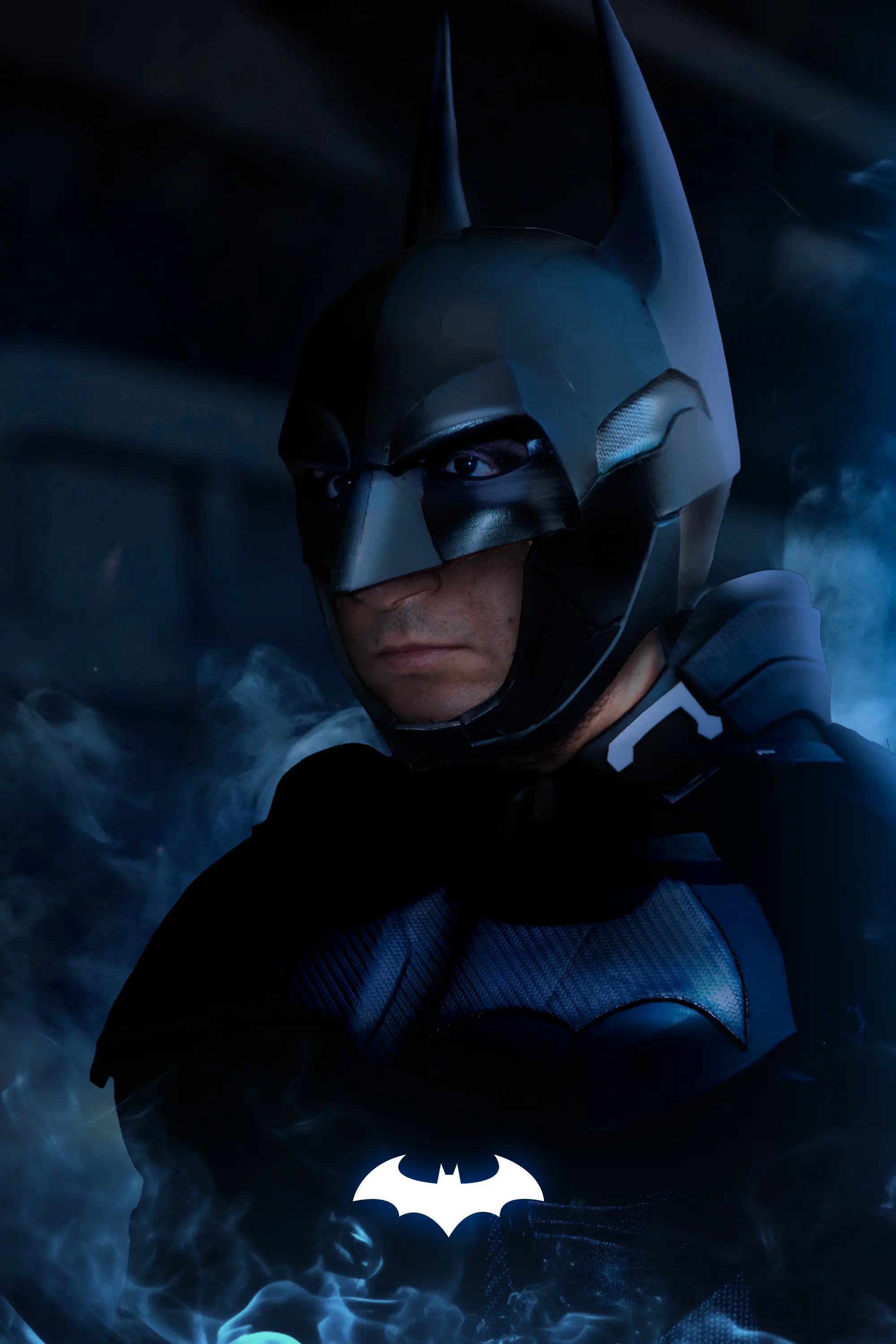
At the region’s largest pop-culture festival, we led dedicated media coverage for Warner Bros., focusing on iconic characters like Batman, Robin, and Red Hood. We executed live, on-site editing and cinematic portraiture for standout cosplayers to instantly deliver premium assets.
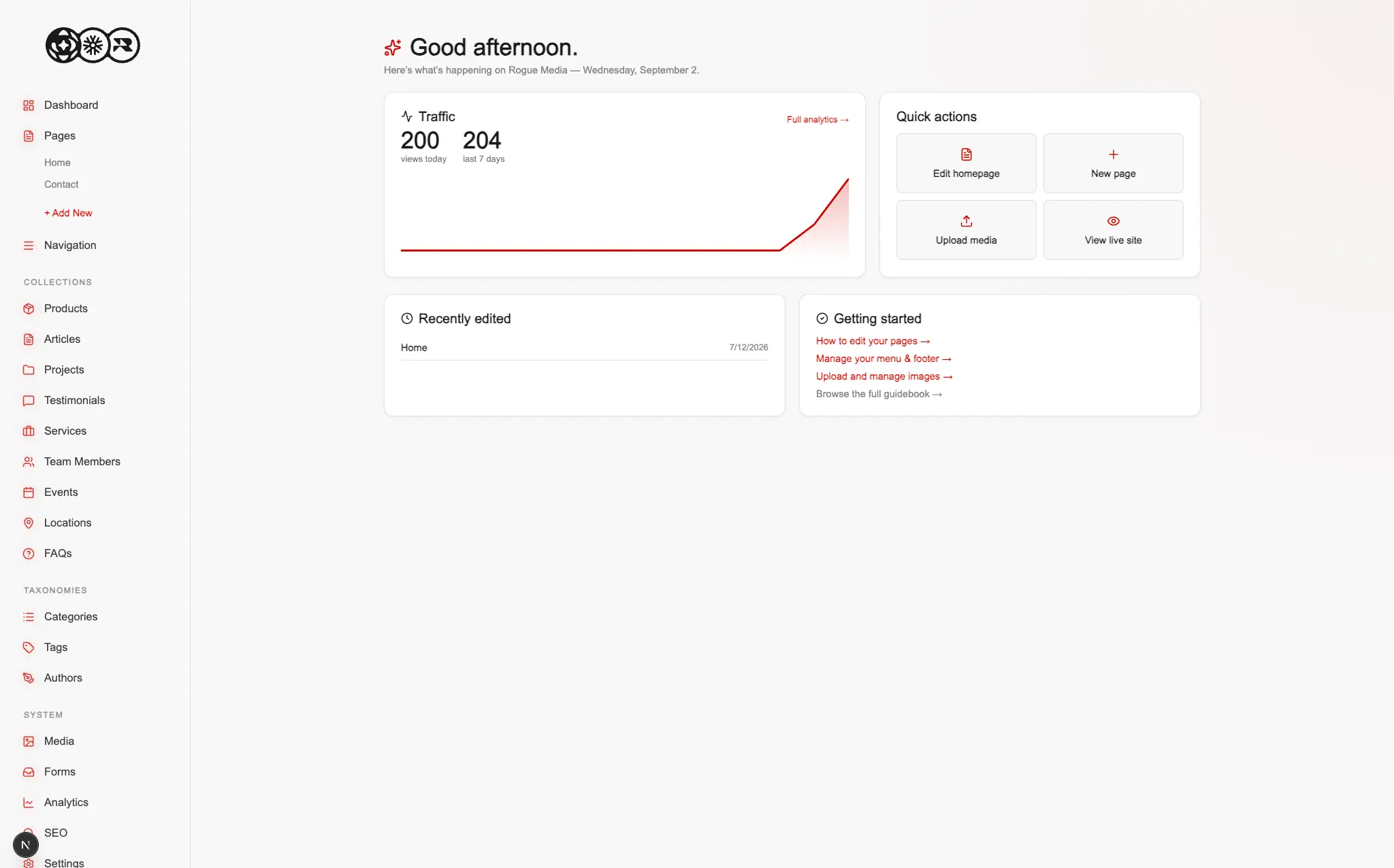
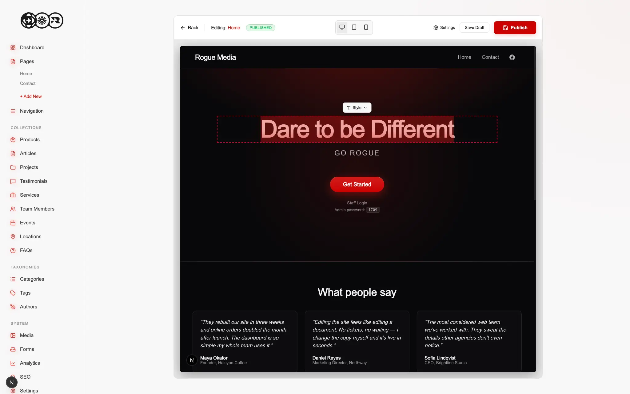
Clients constantly ask for the flexibility of a massive platform like WordPress but immediately get overwhelmed by the sheer volume of bloated menus and tools they will literally never touch. On the development side, maintaining these heavy monolithic sites means dealing with sluggish performance and endless backend clutter. We needed a way to migrate existing clients off these archaic setups without forcing them to abandon the plugin ecosystems they already rely on or making them learn a completely alien interface.
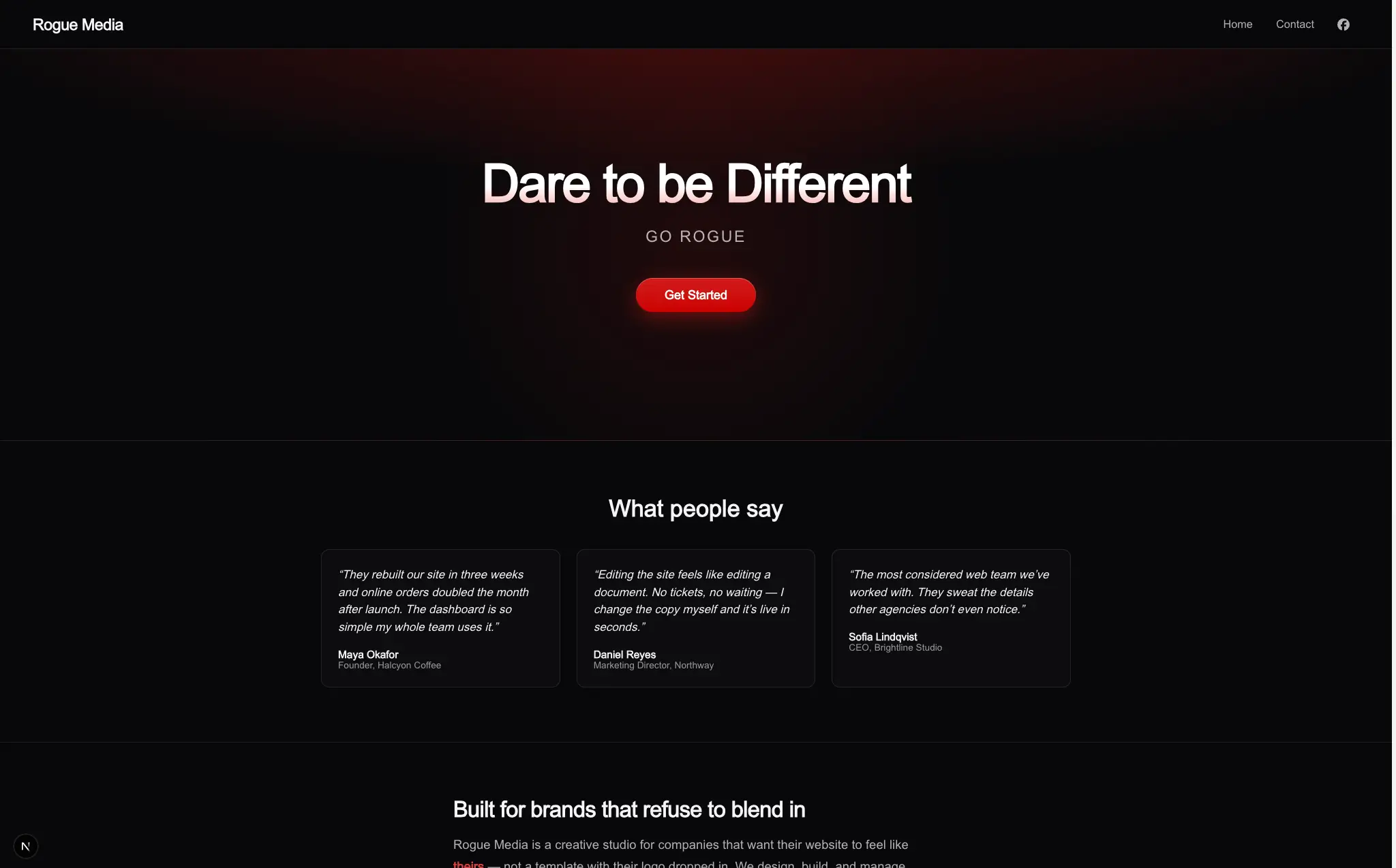
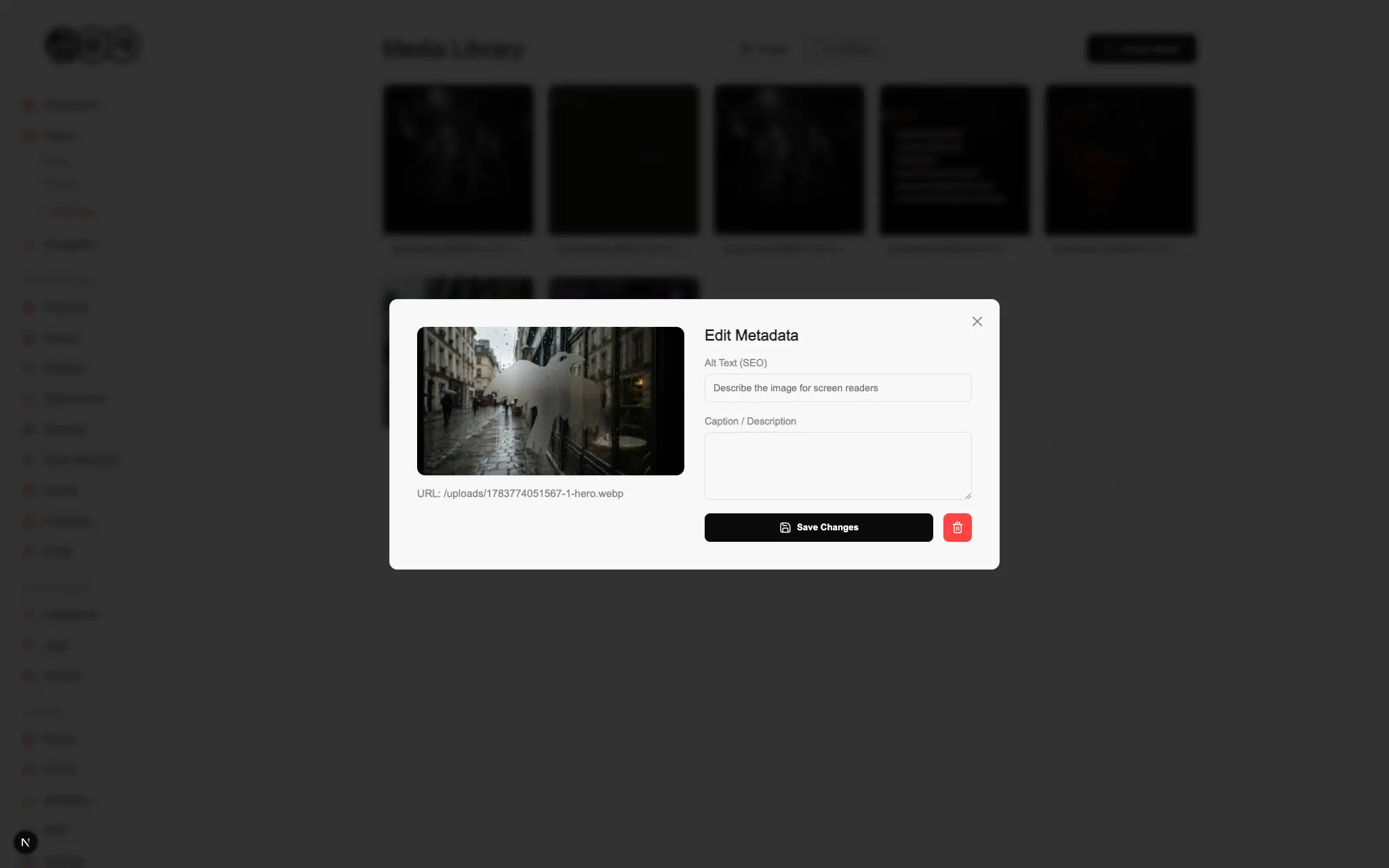
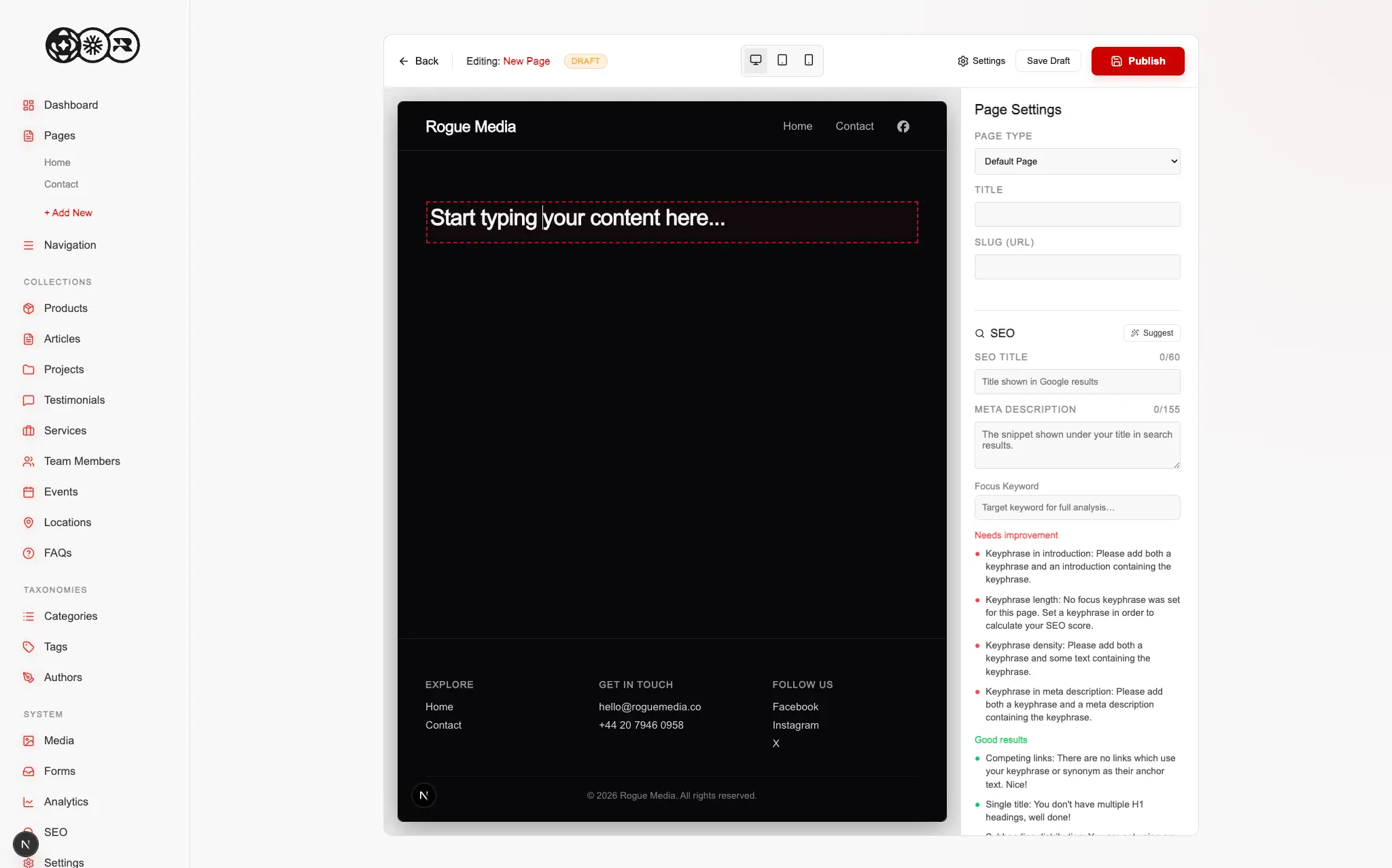
We built the Rogue Management System to sit right in the sweet spot between ultimate customizability and everyday usability. It is an infinitely deployable React based platform that delivers the exact feature set you would expect from a heavyweight CMS but strips away all the unnecessary baggage. By connecting directly to existing WordPress plugins, we give clients the specific functionality they need in a lightweight, incredibly fast package that actually makes sense to look at and use.
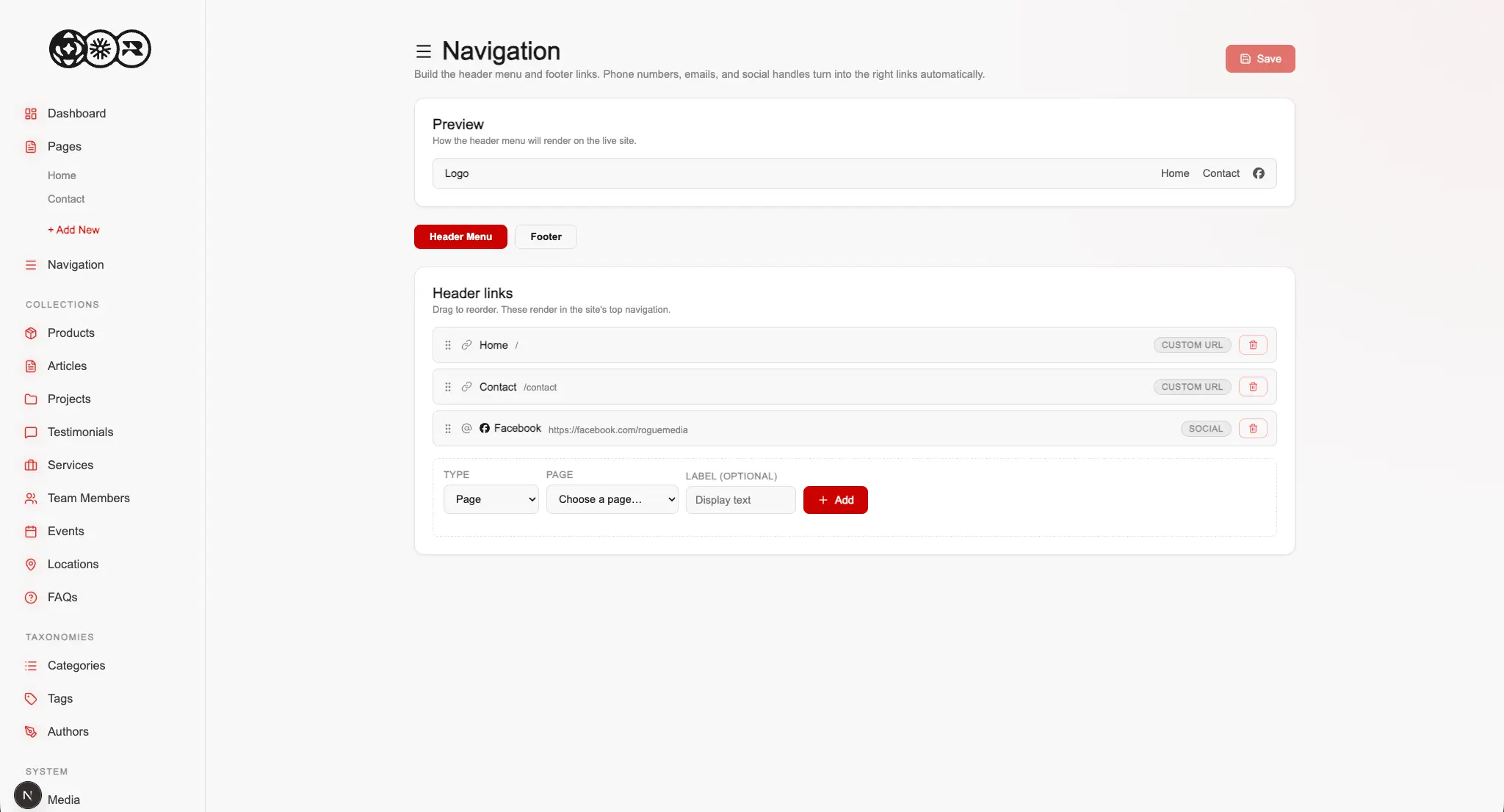
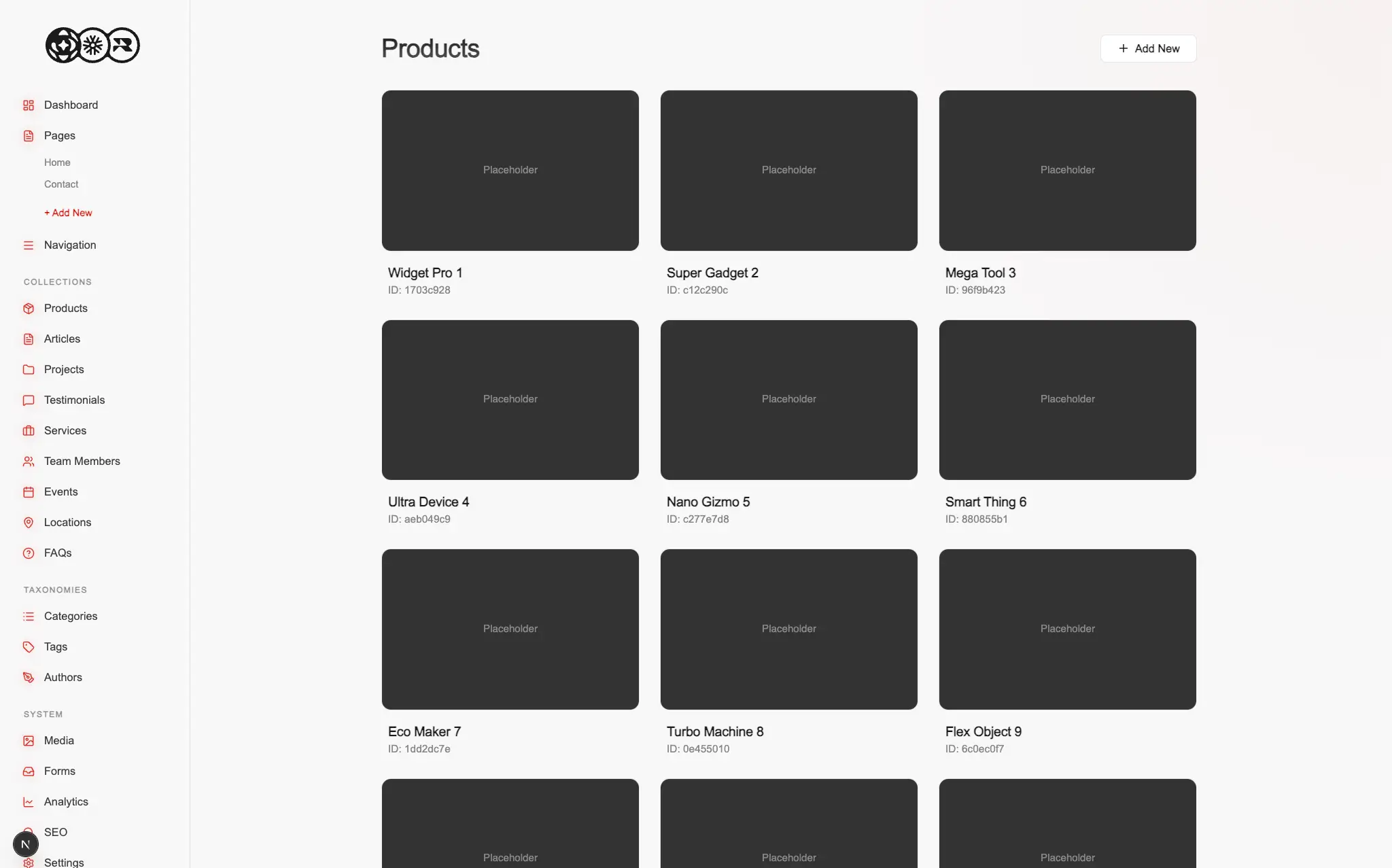
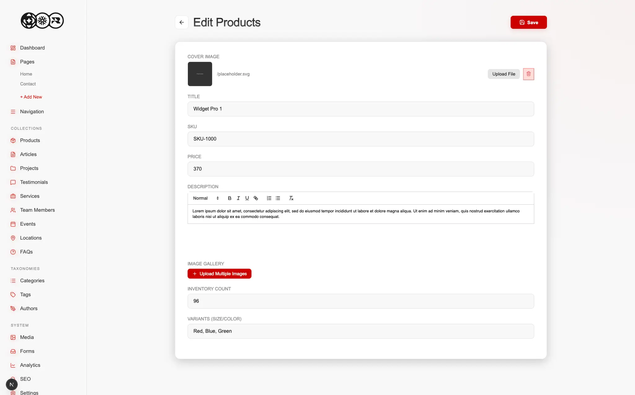
Rolling this out meant designing an architecture that feels familiar enough for legacy users while vastly improving the actual mechanics of managing content. We structured the backend to mirror the most intuitive parts of older systems, allowing us to smoothly transition clients from their previous websites without causing workflow panic. The result is a clean and scalable environment where spinning up a new client site is incredibly fast and handing over the keys does not require a massive training manual.